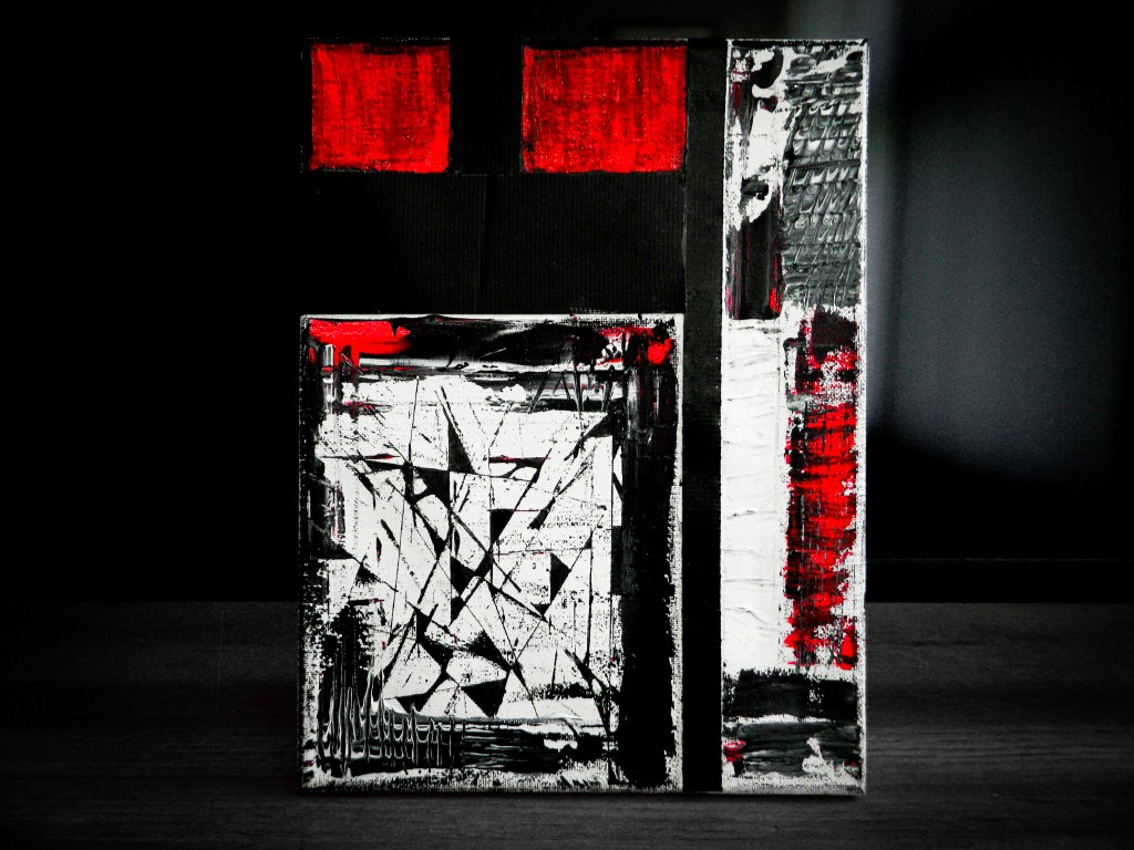
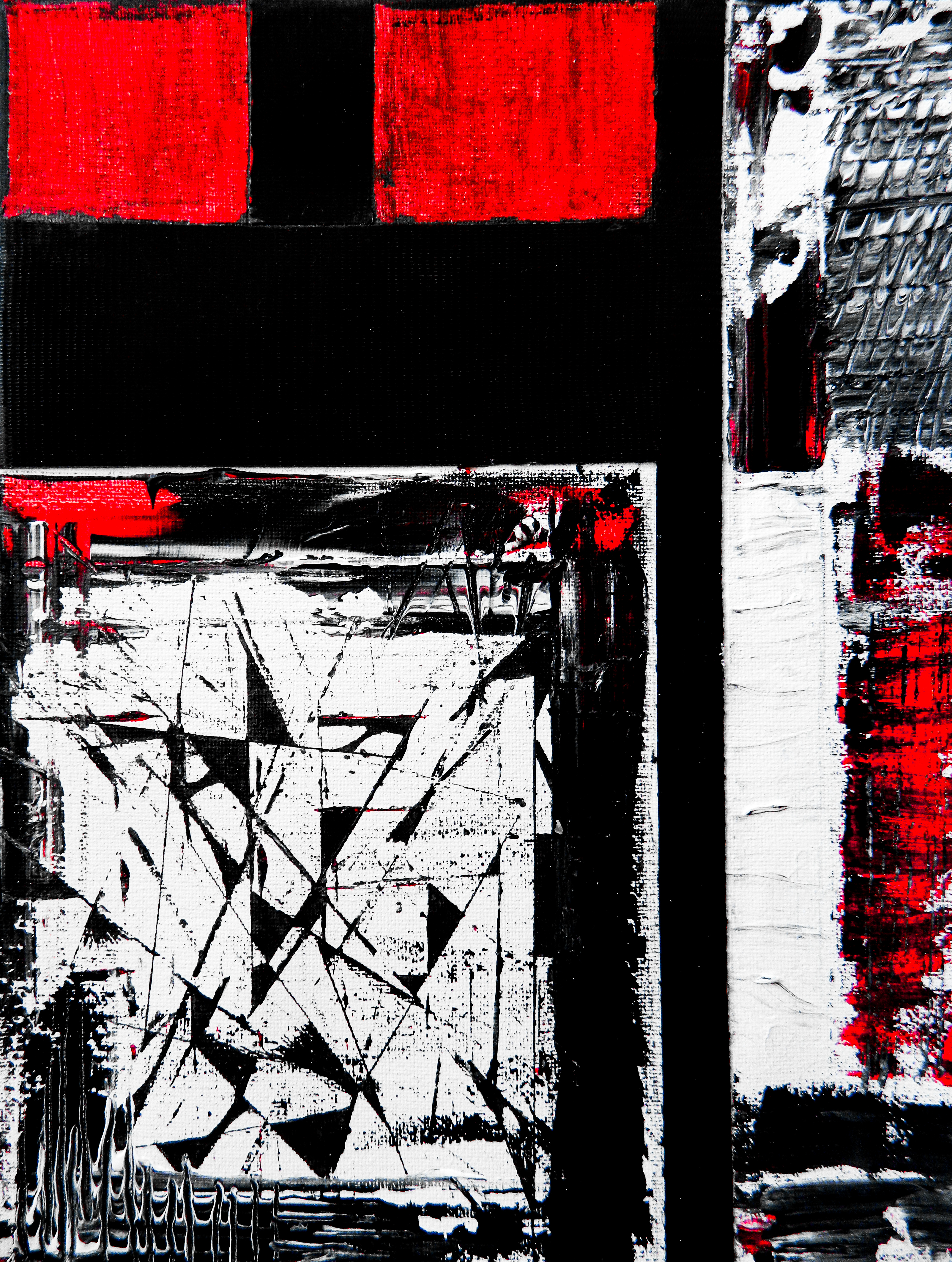
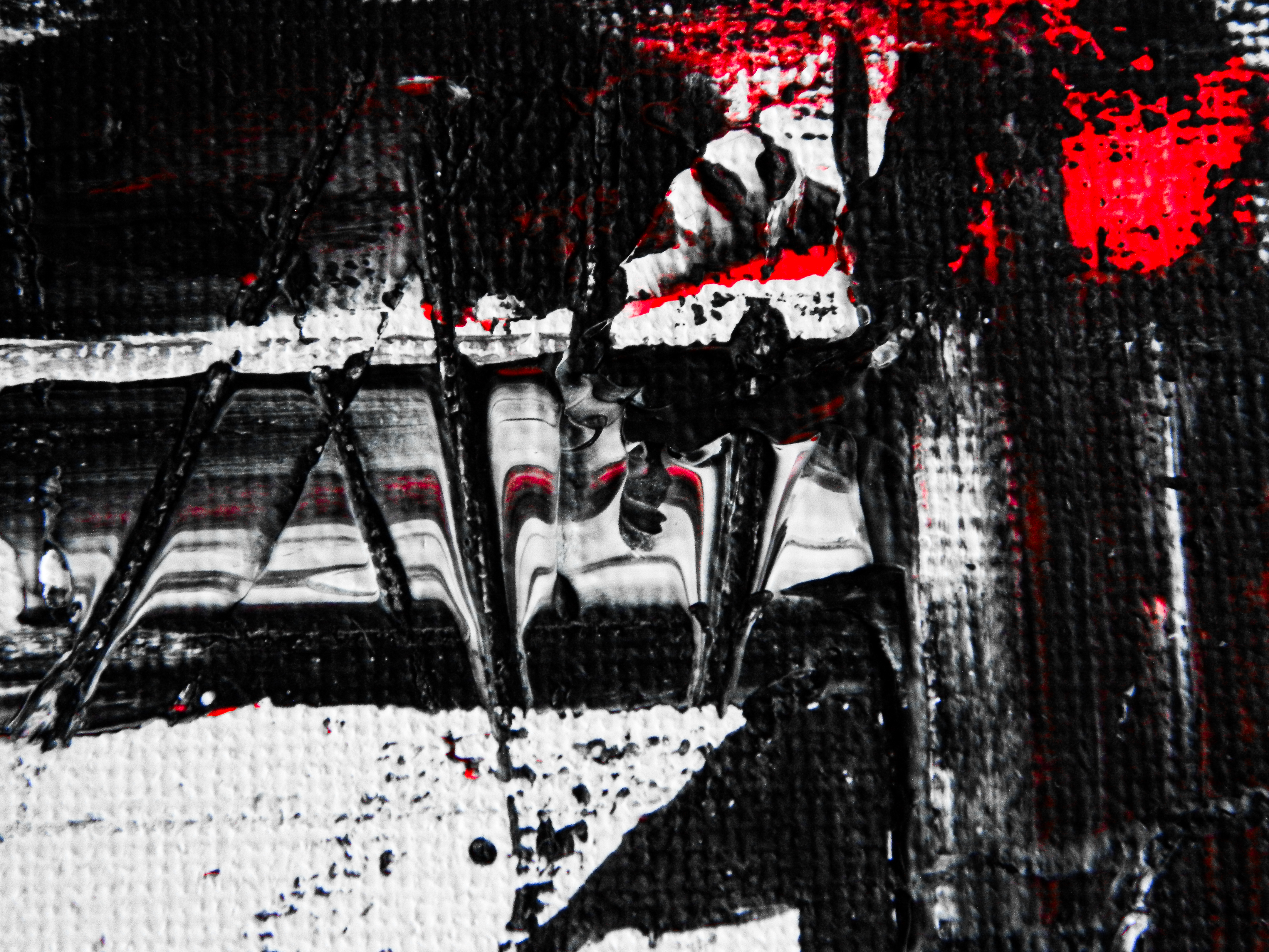
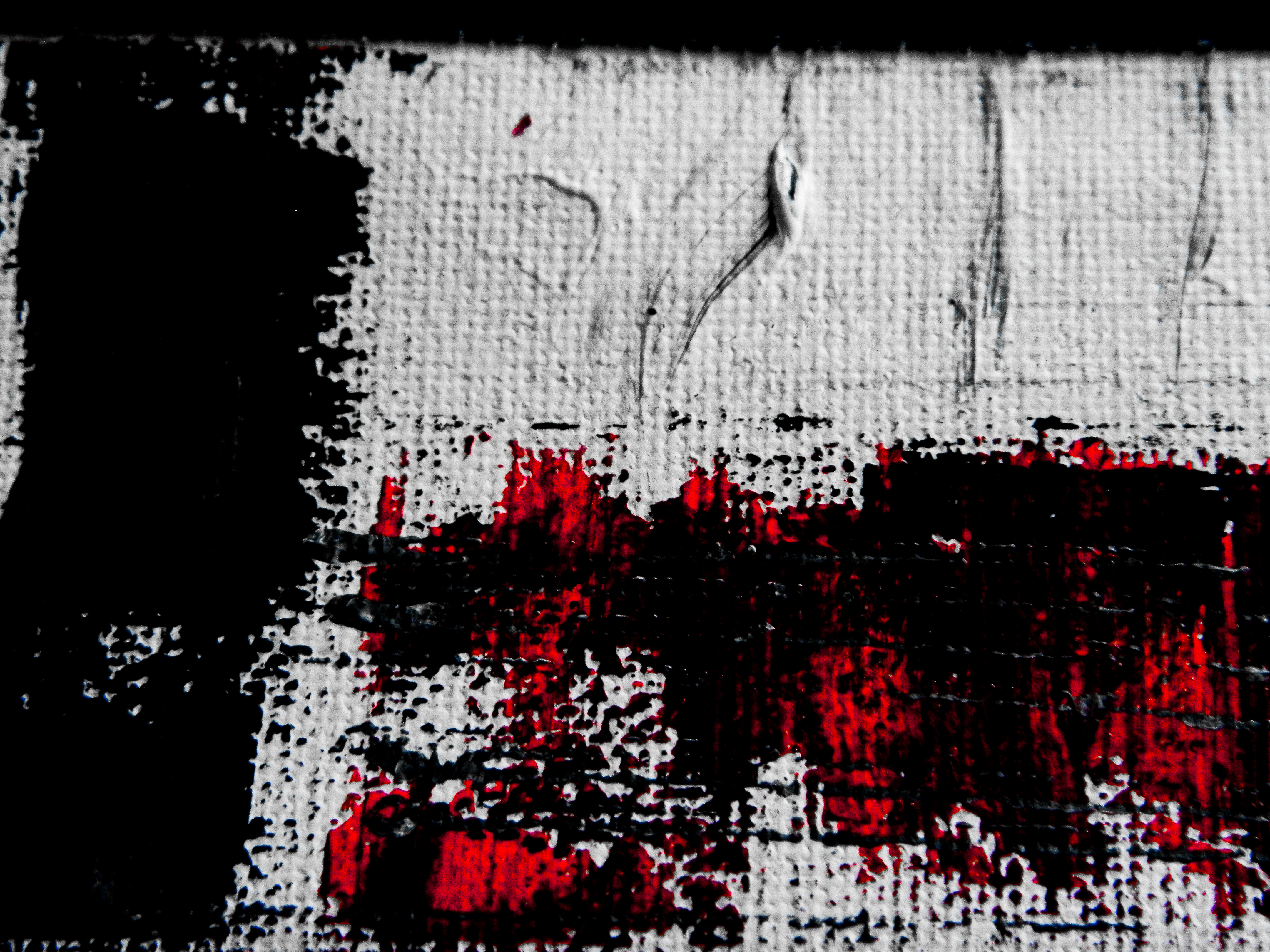
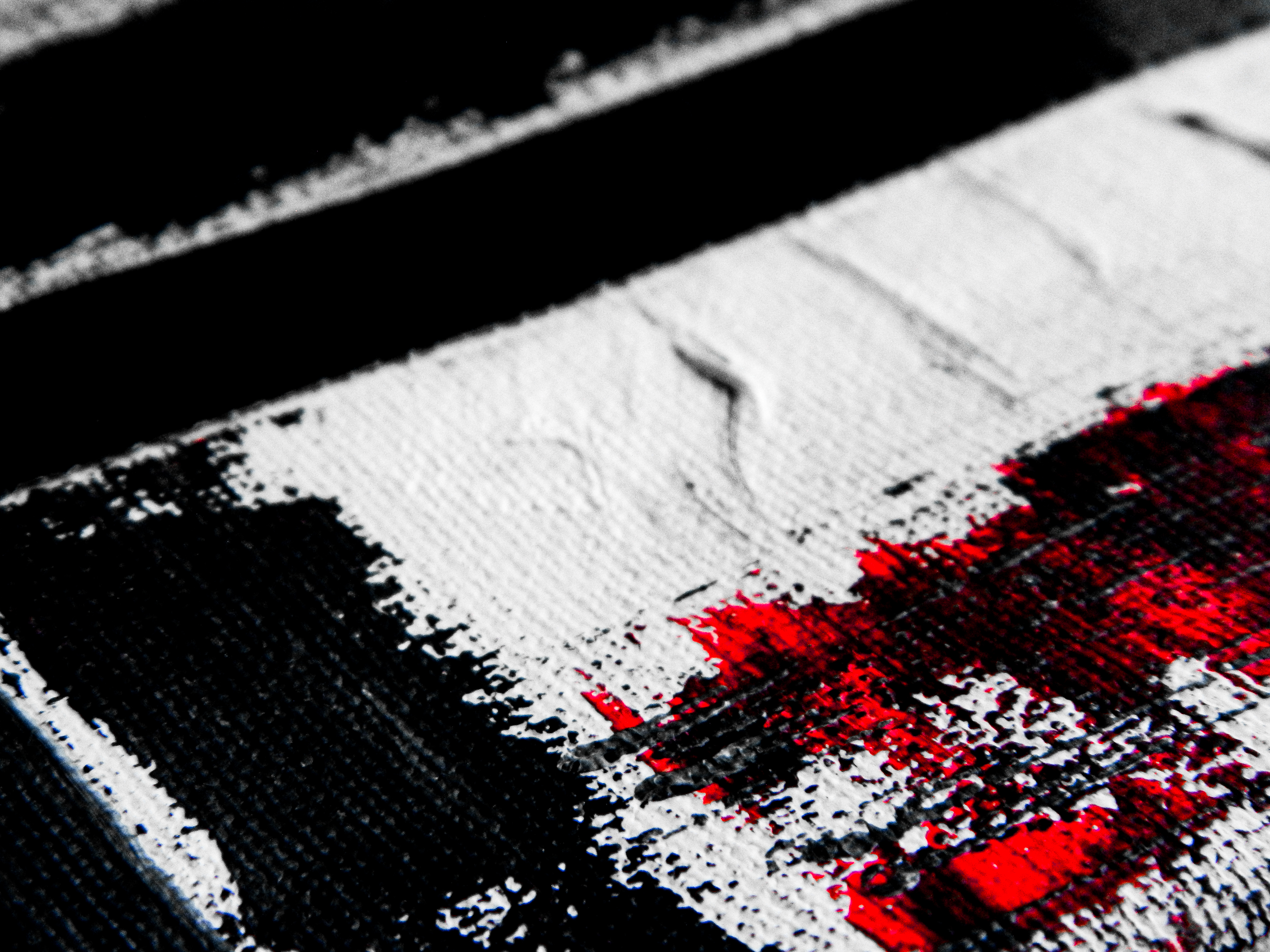
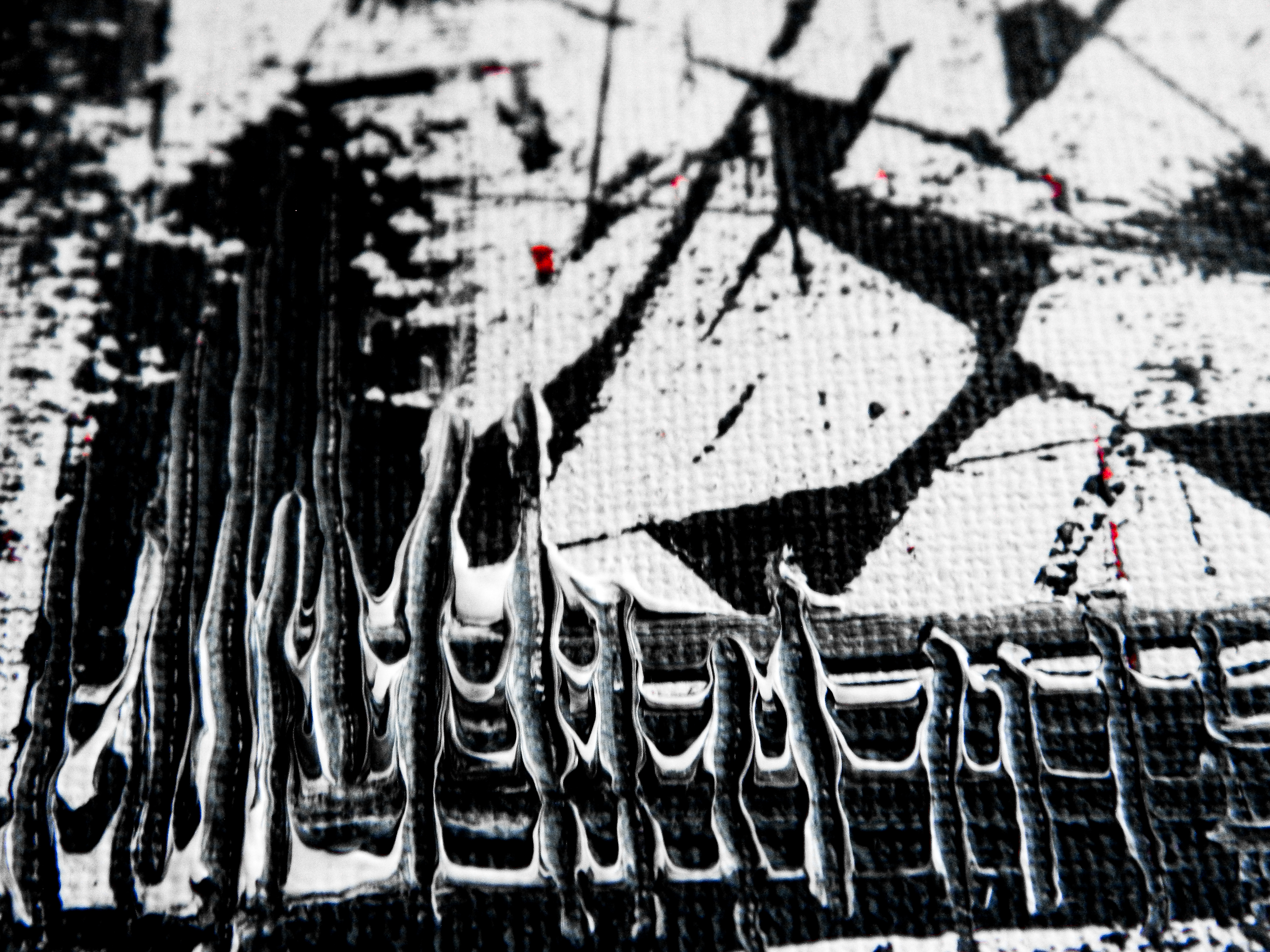
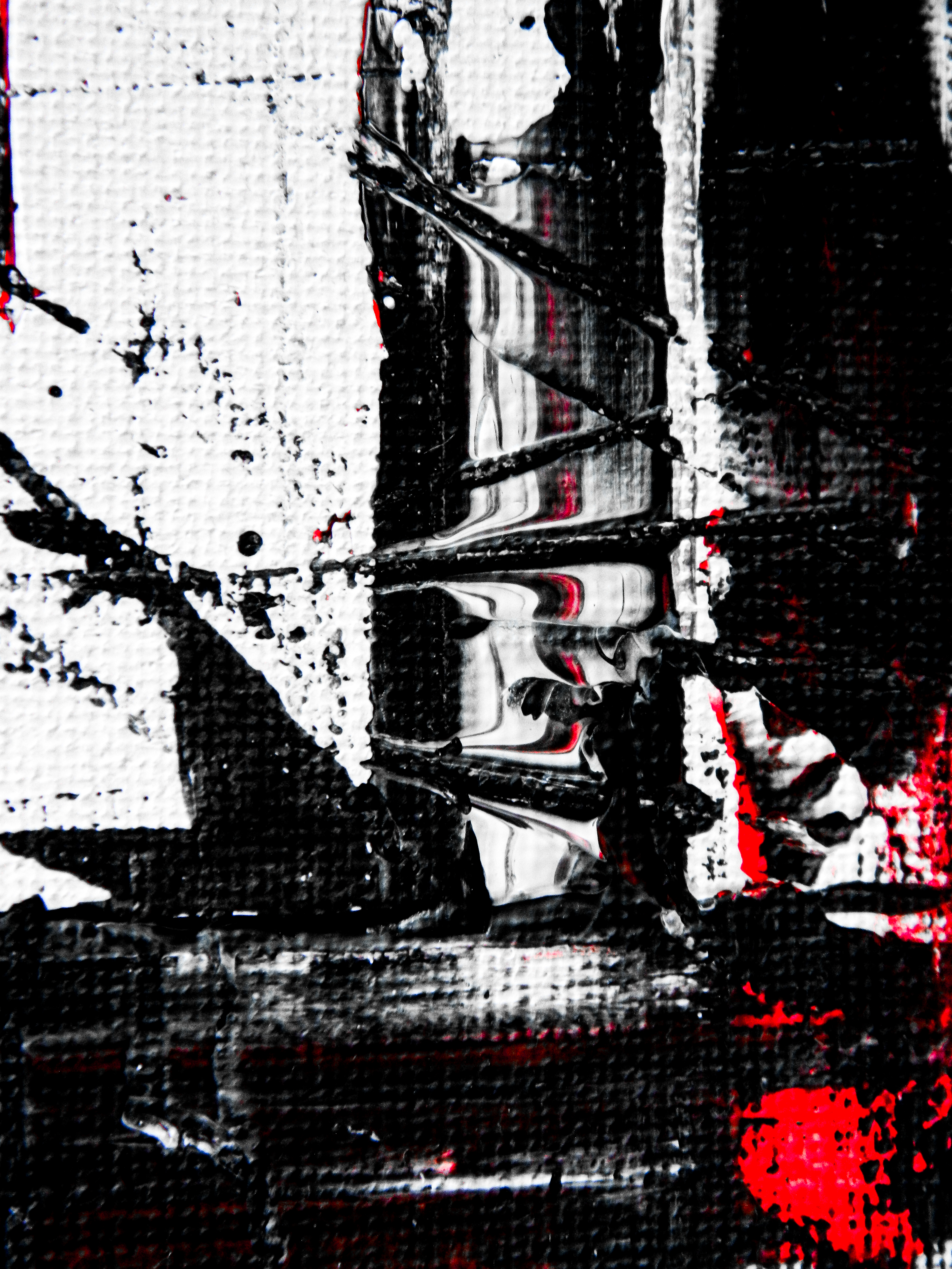
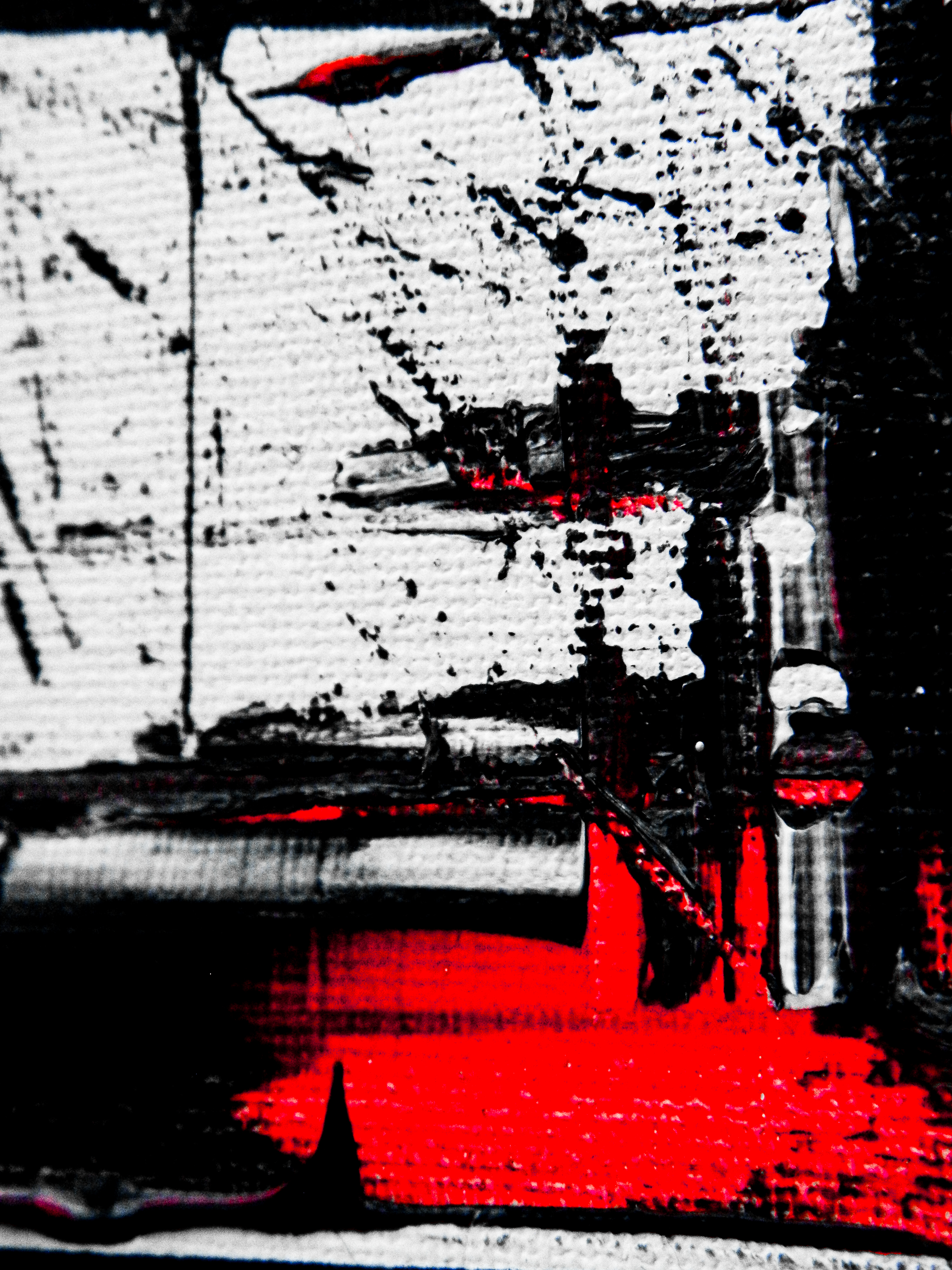
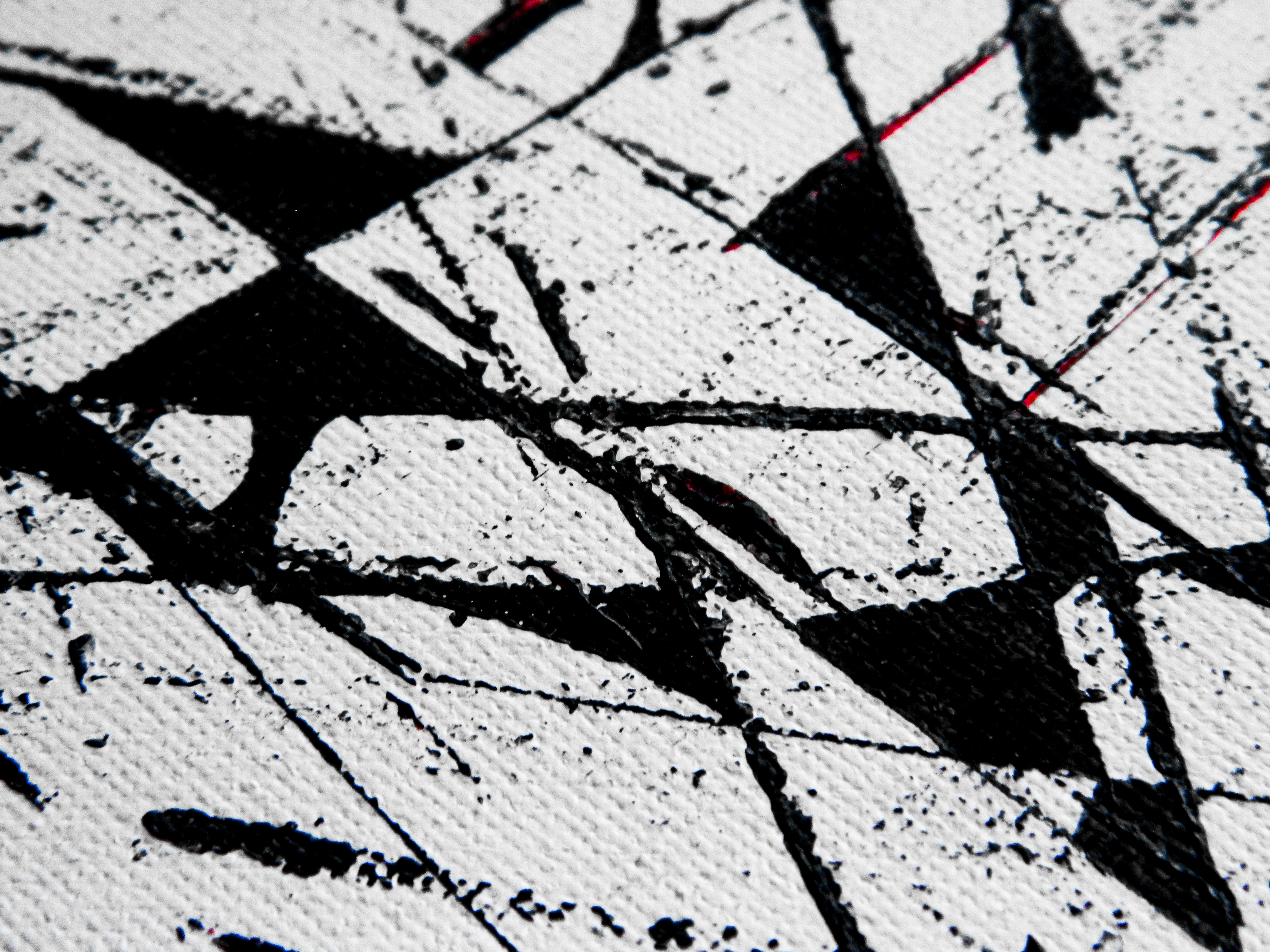
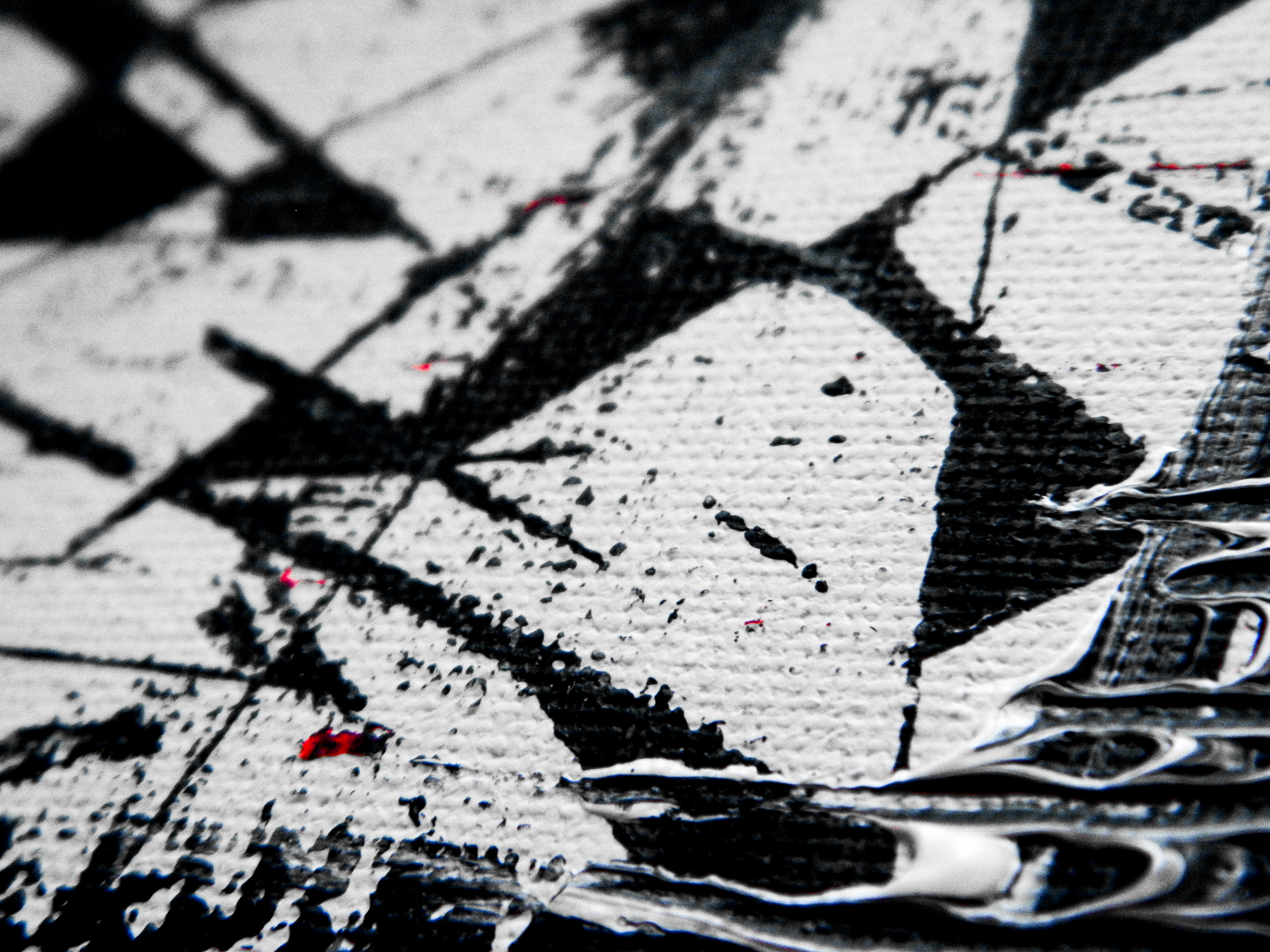
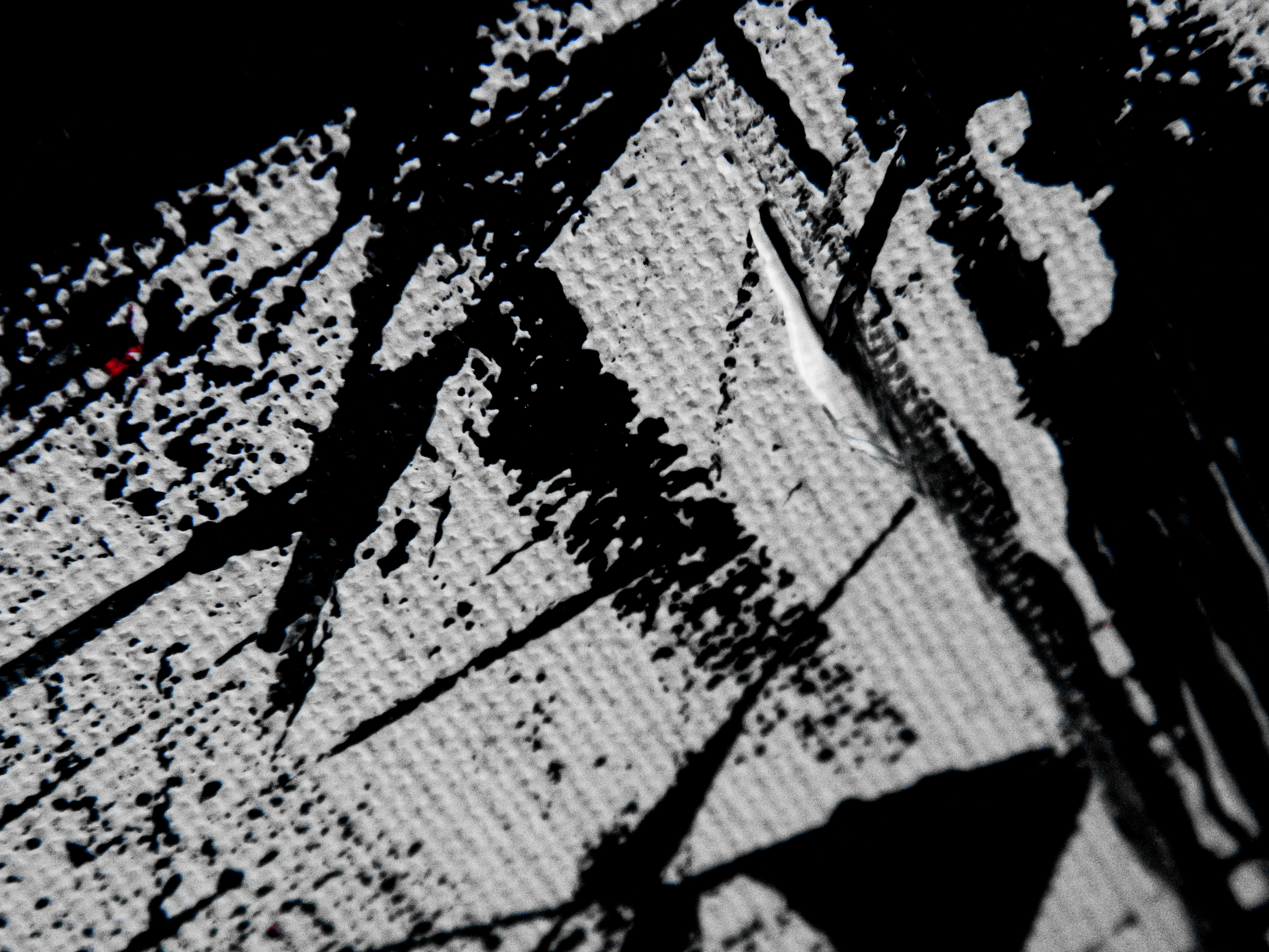
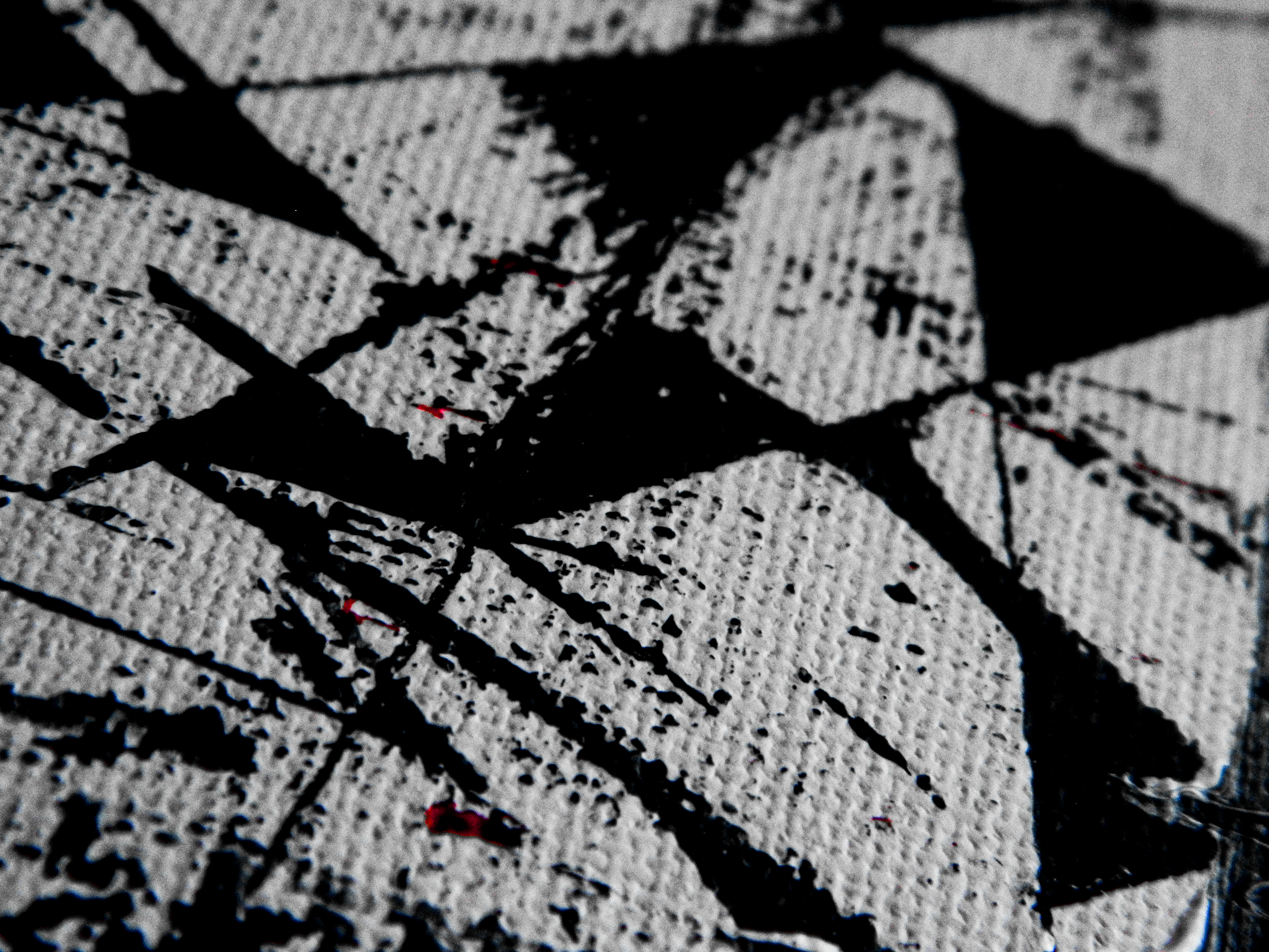
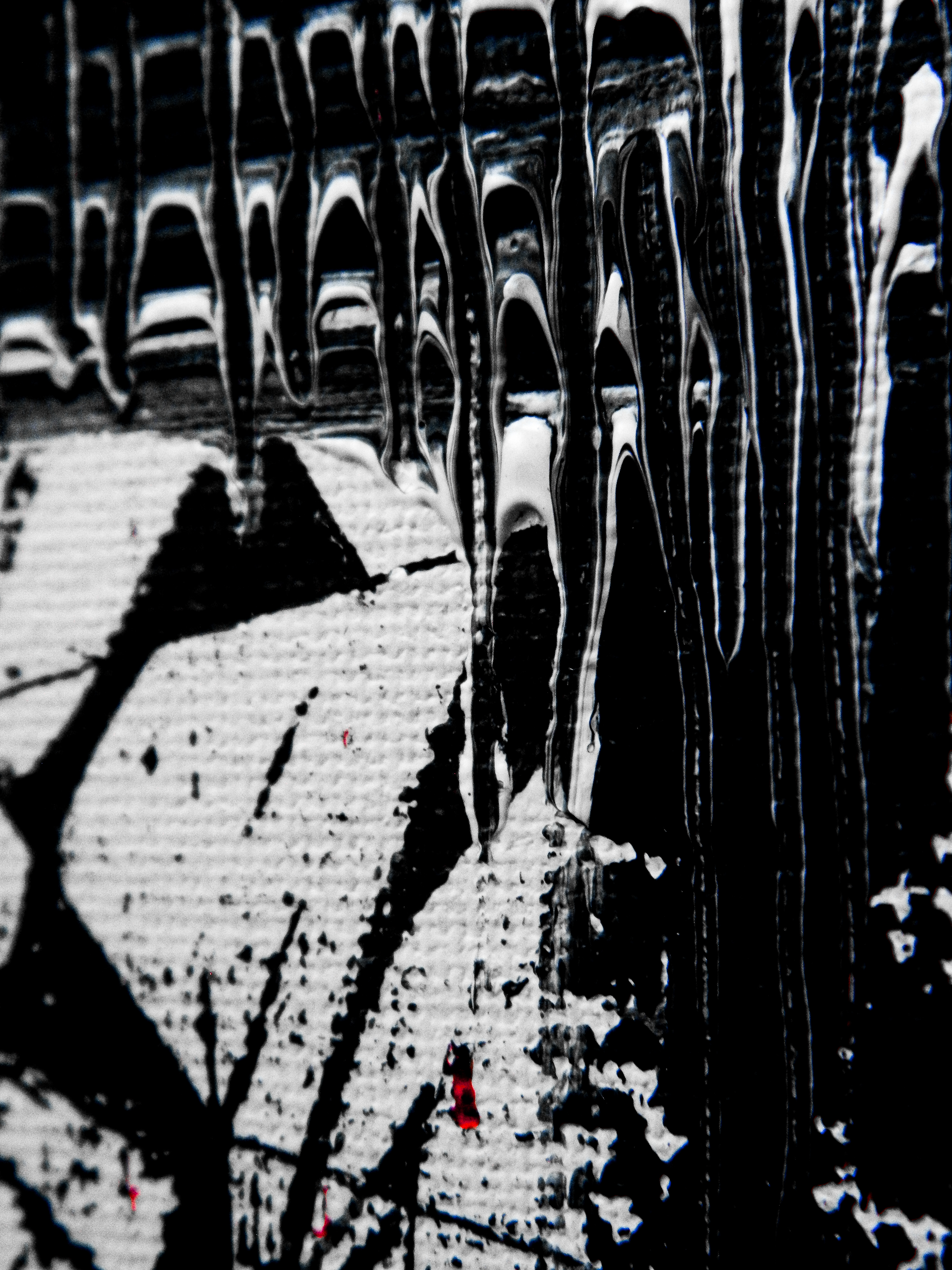
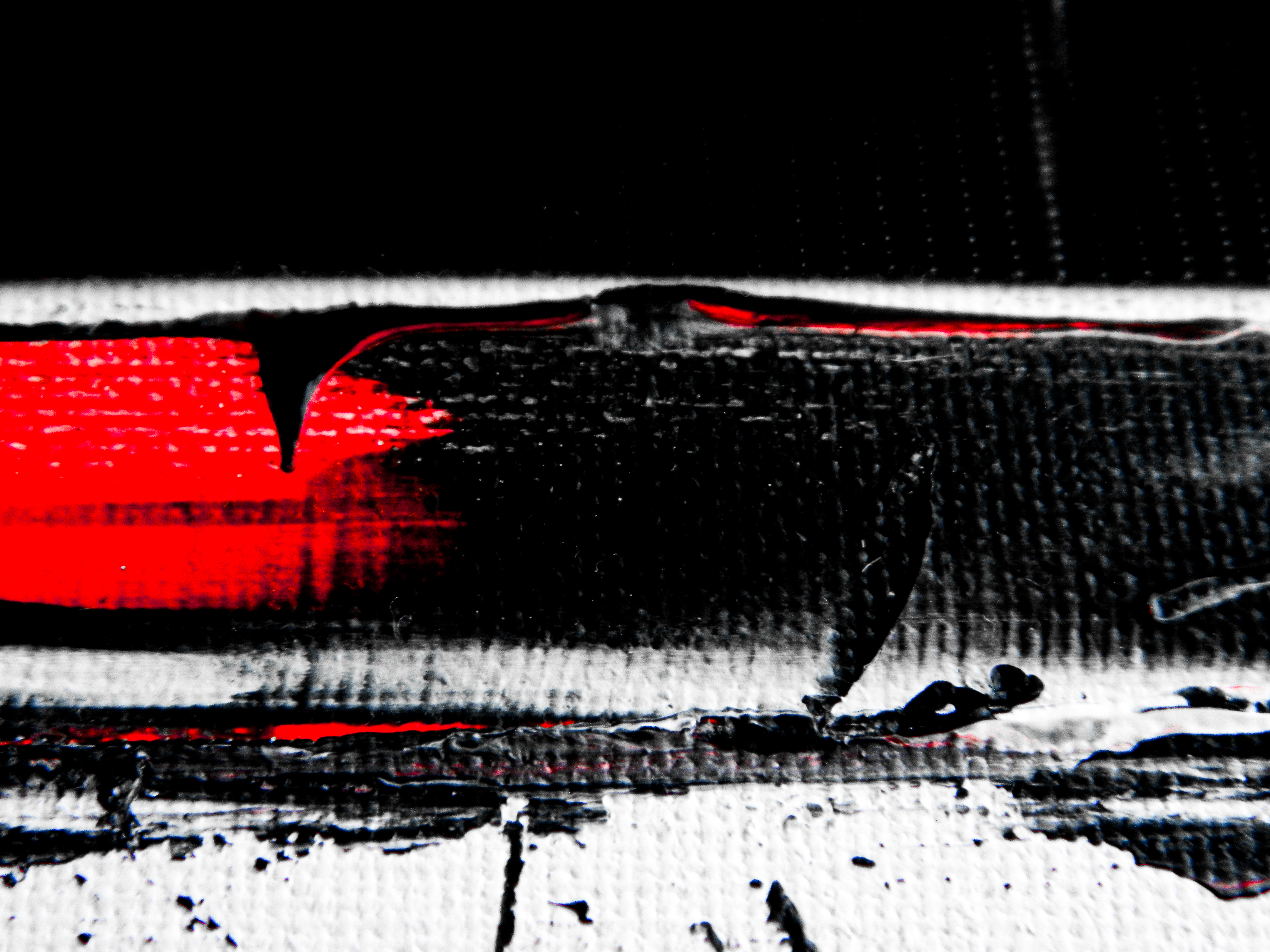
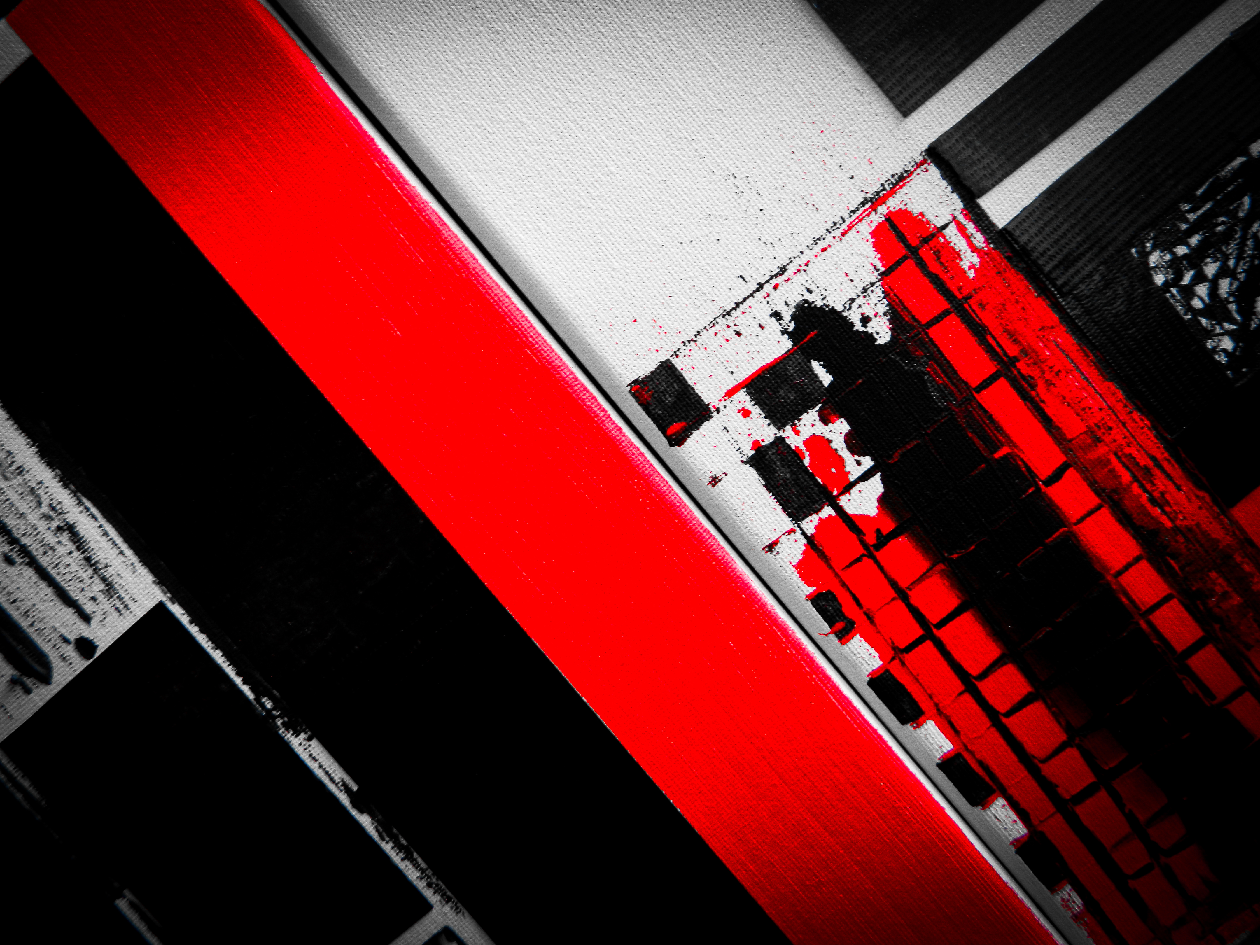
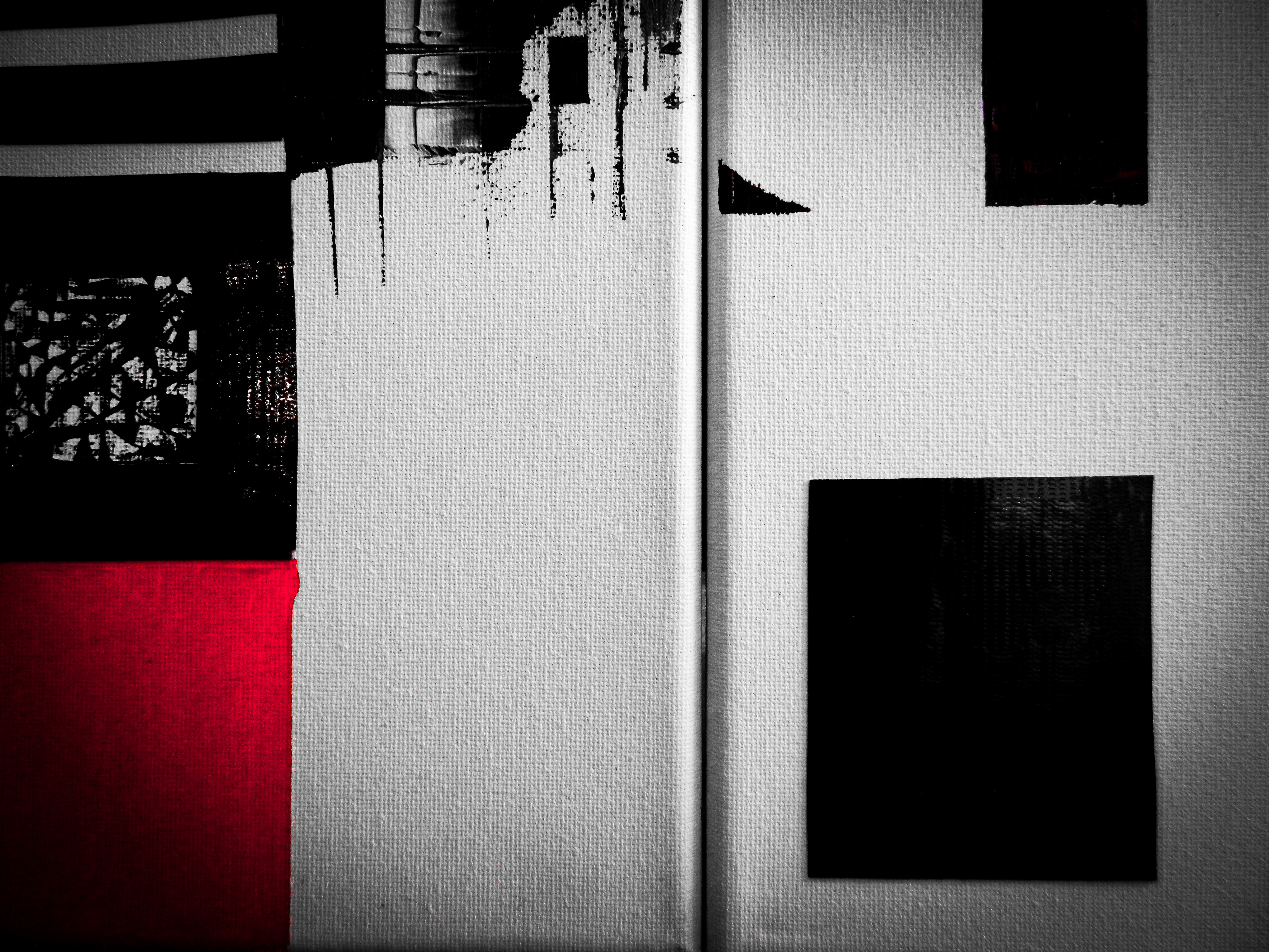
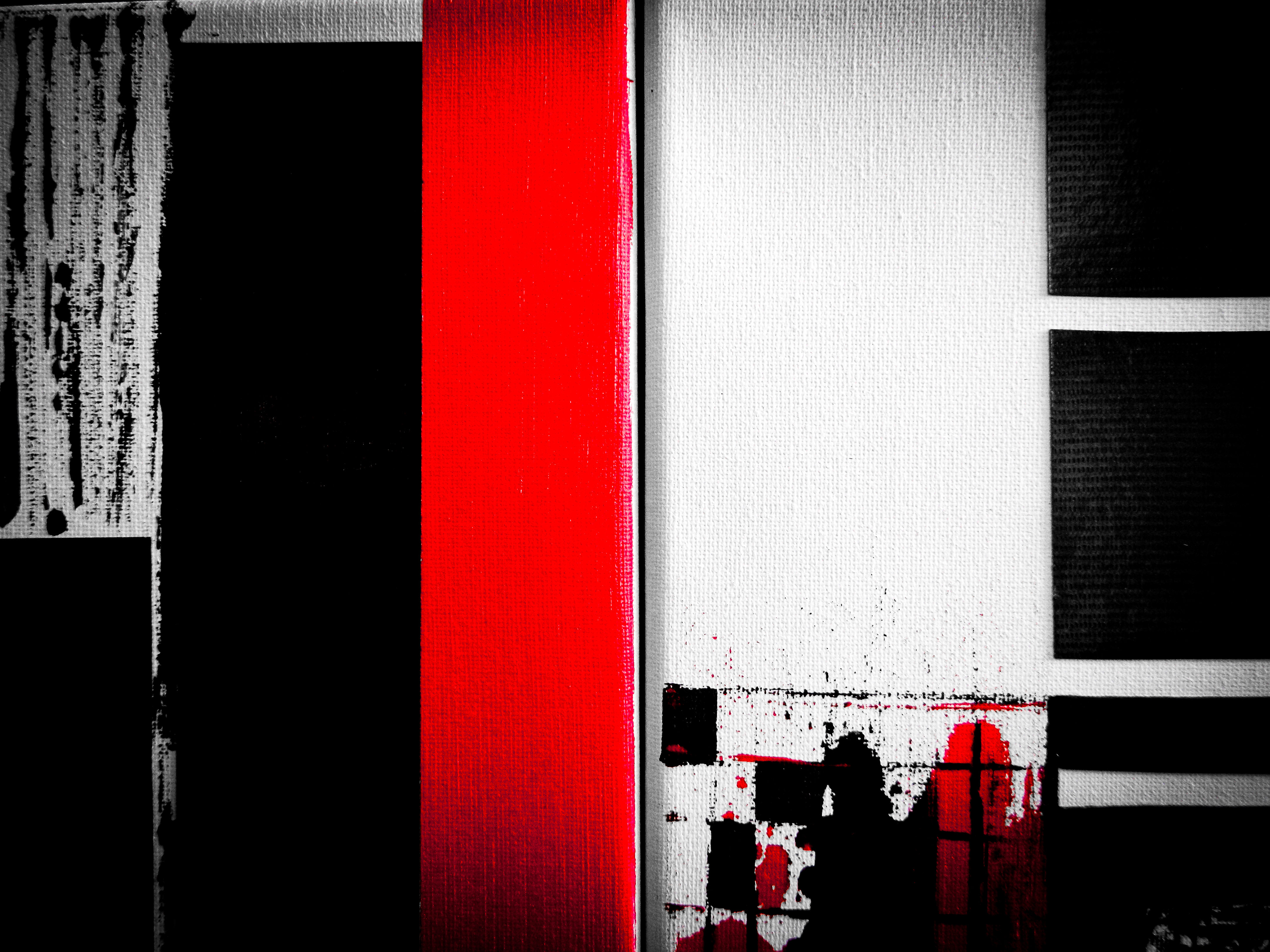
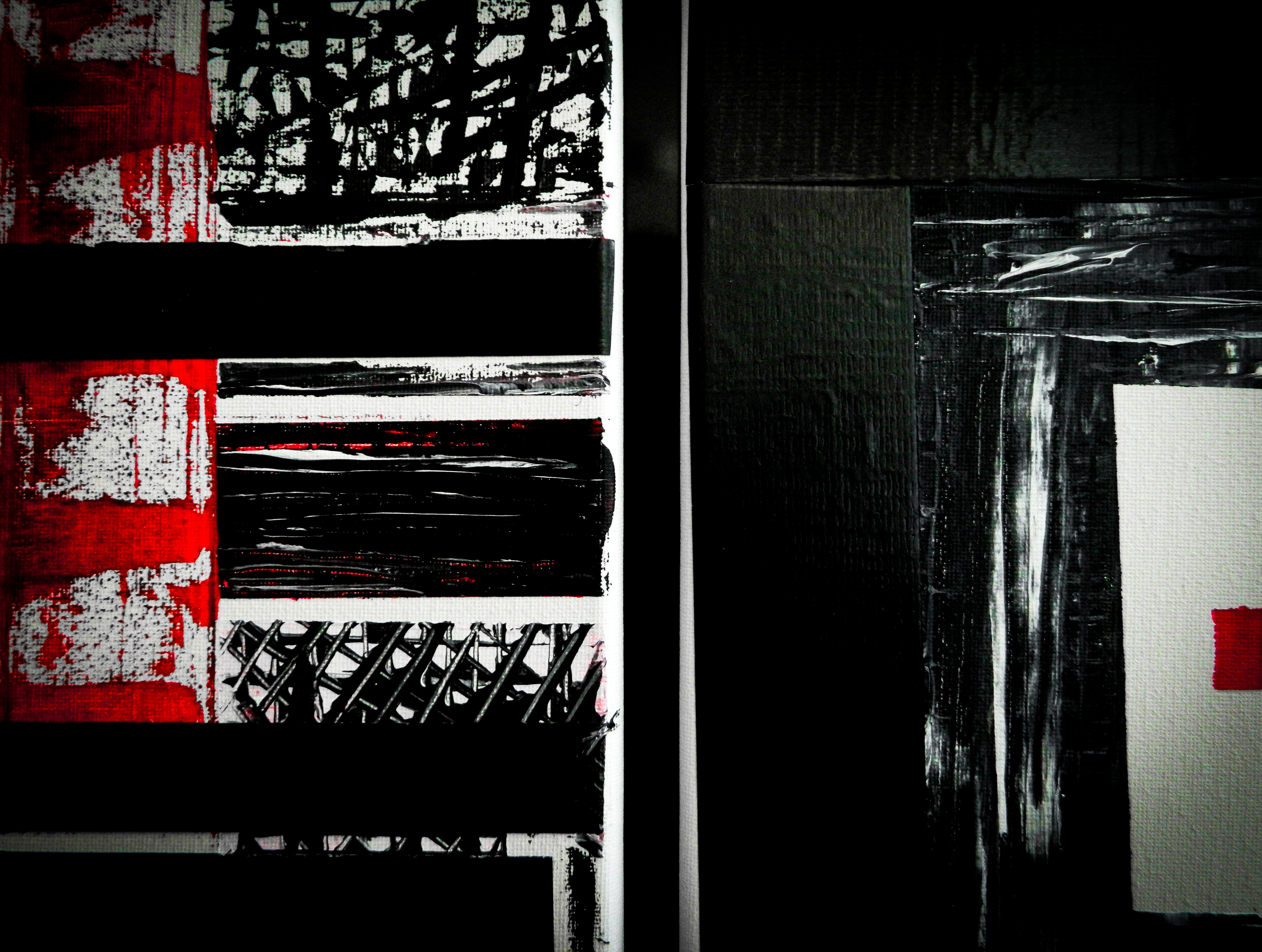
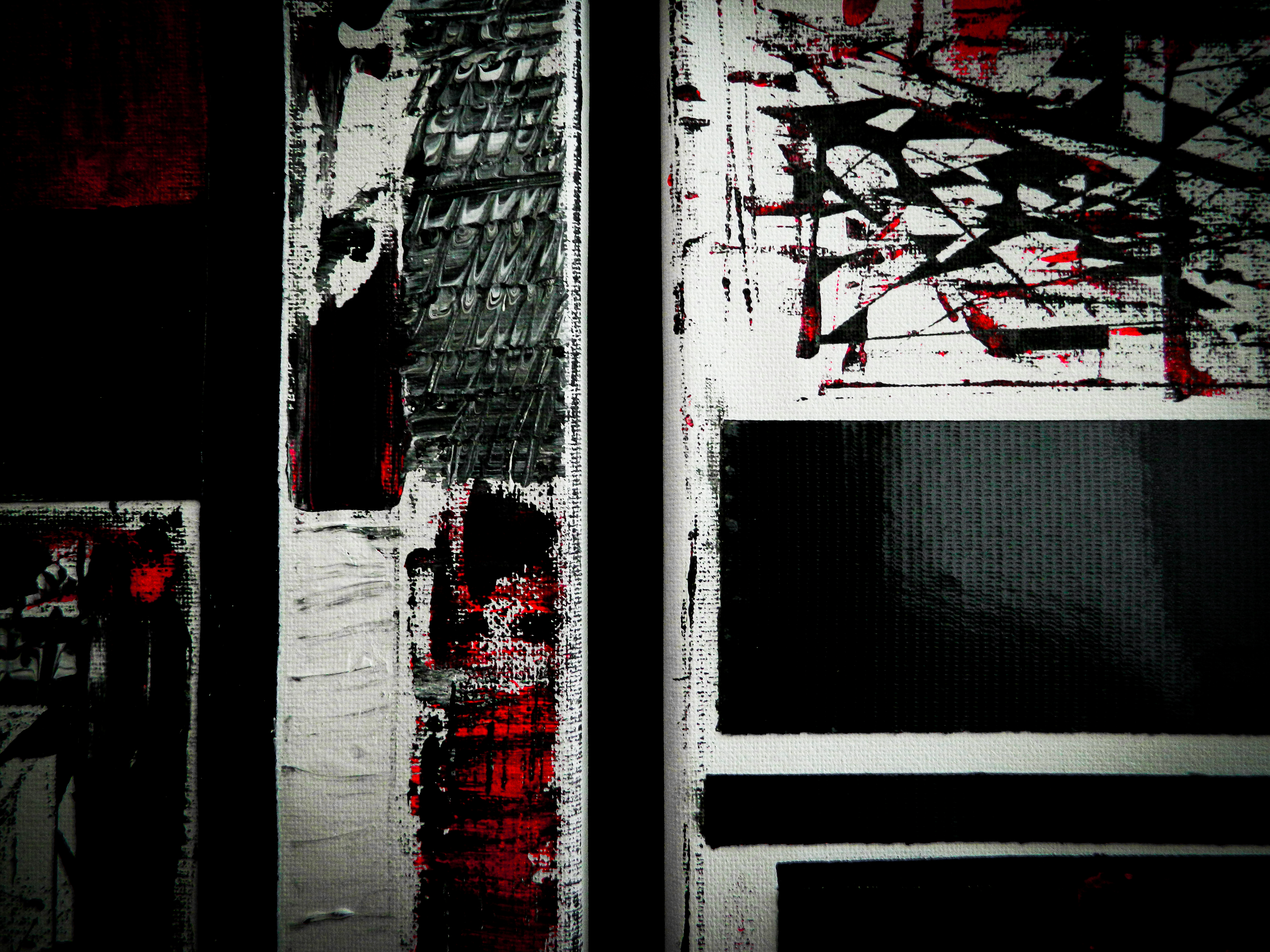
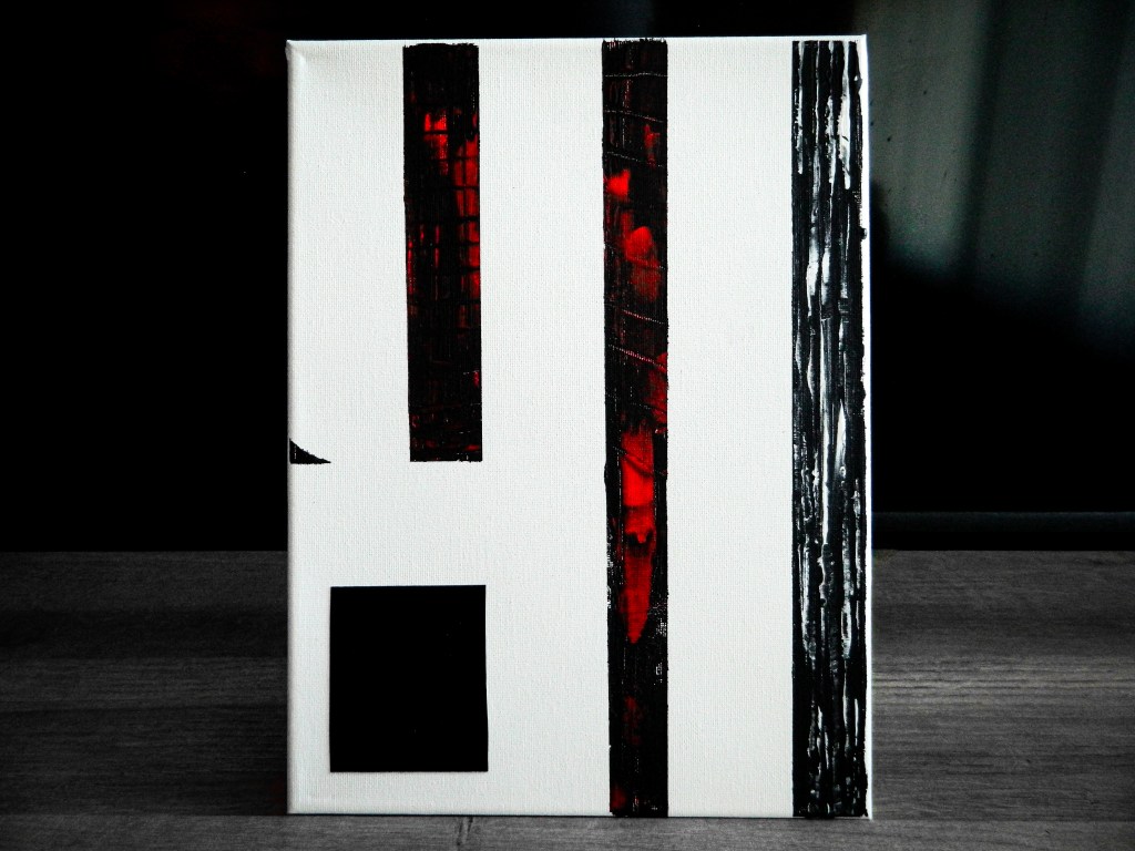
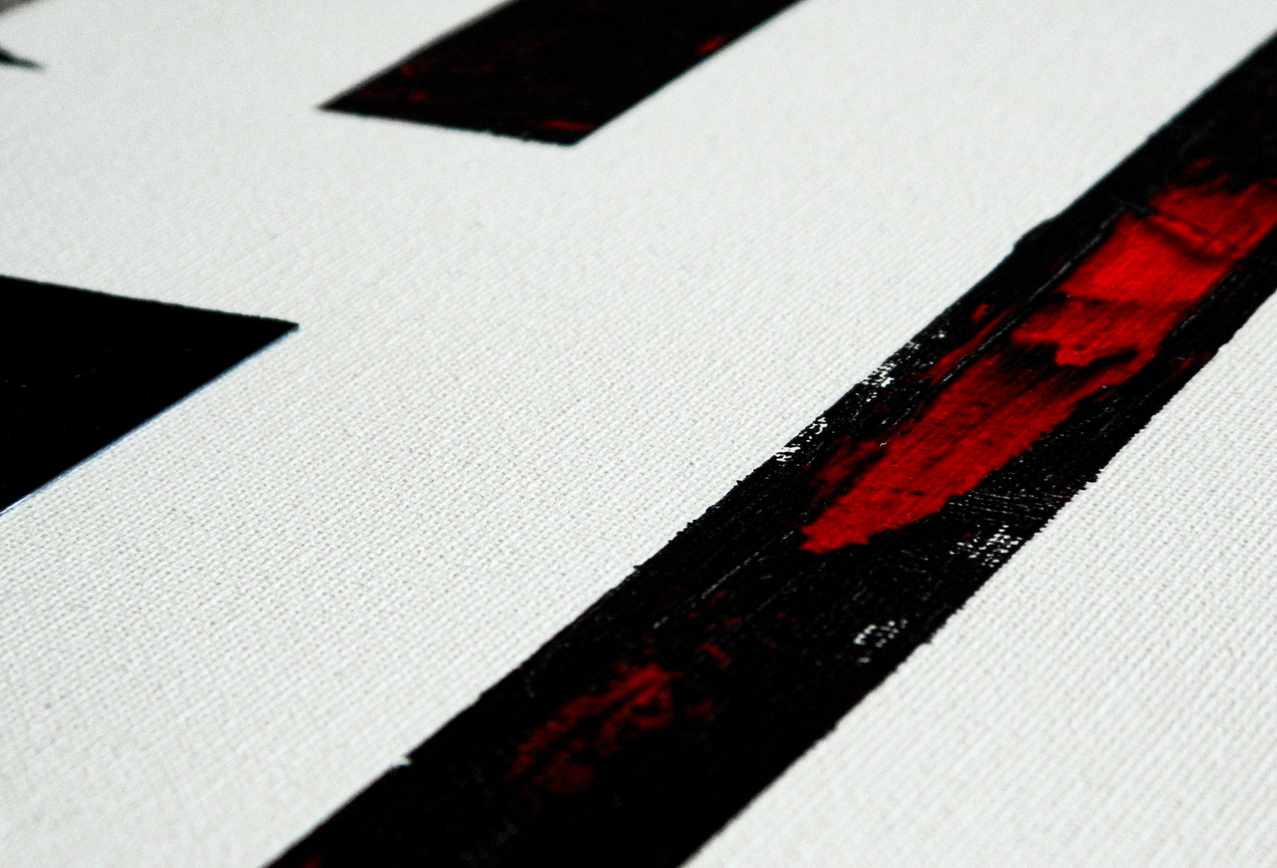
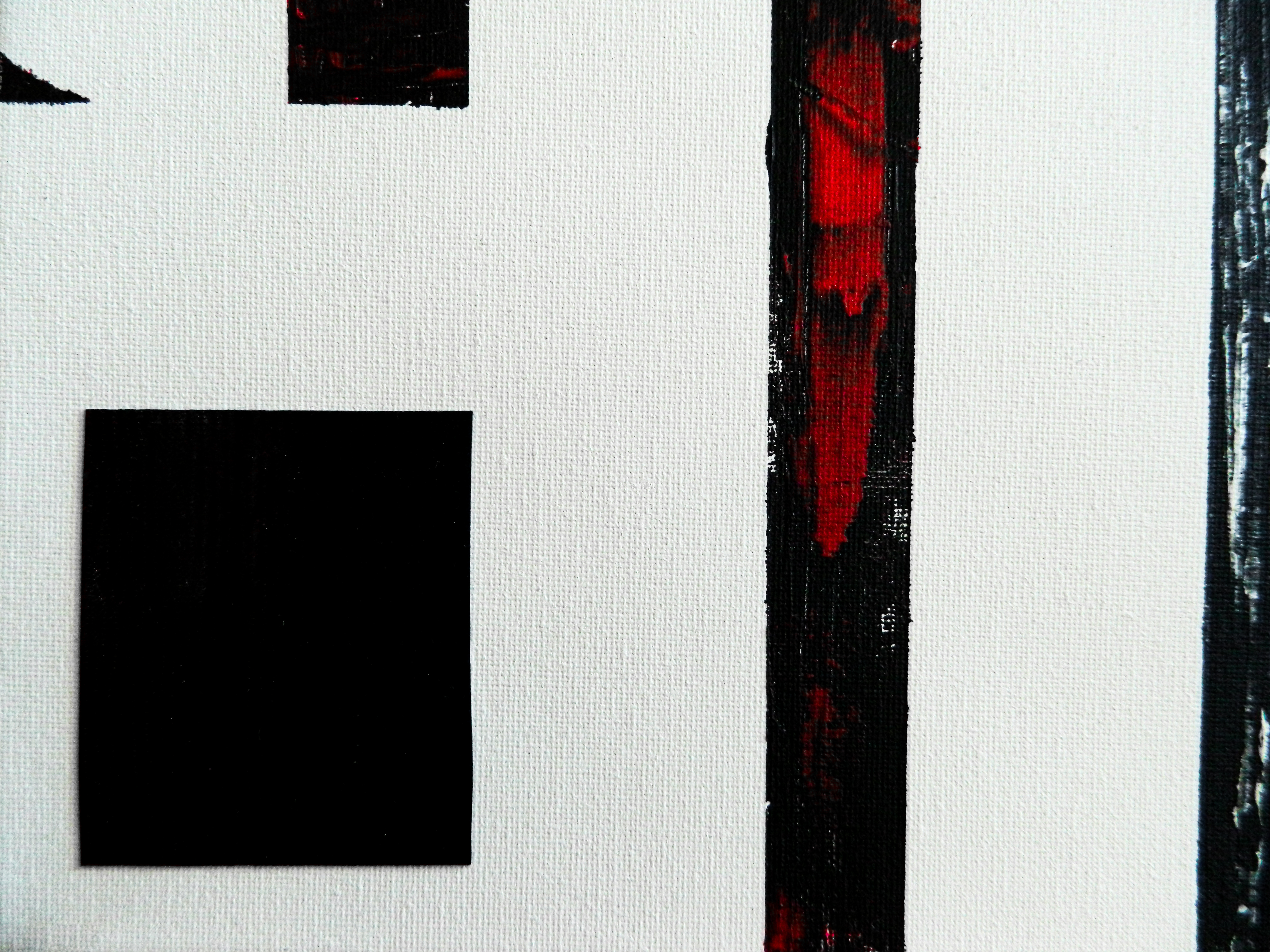
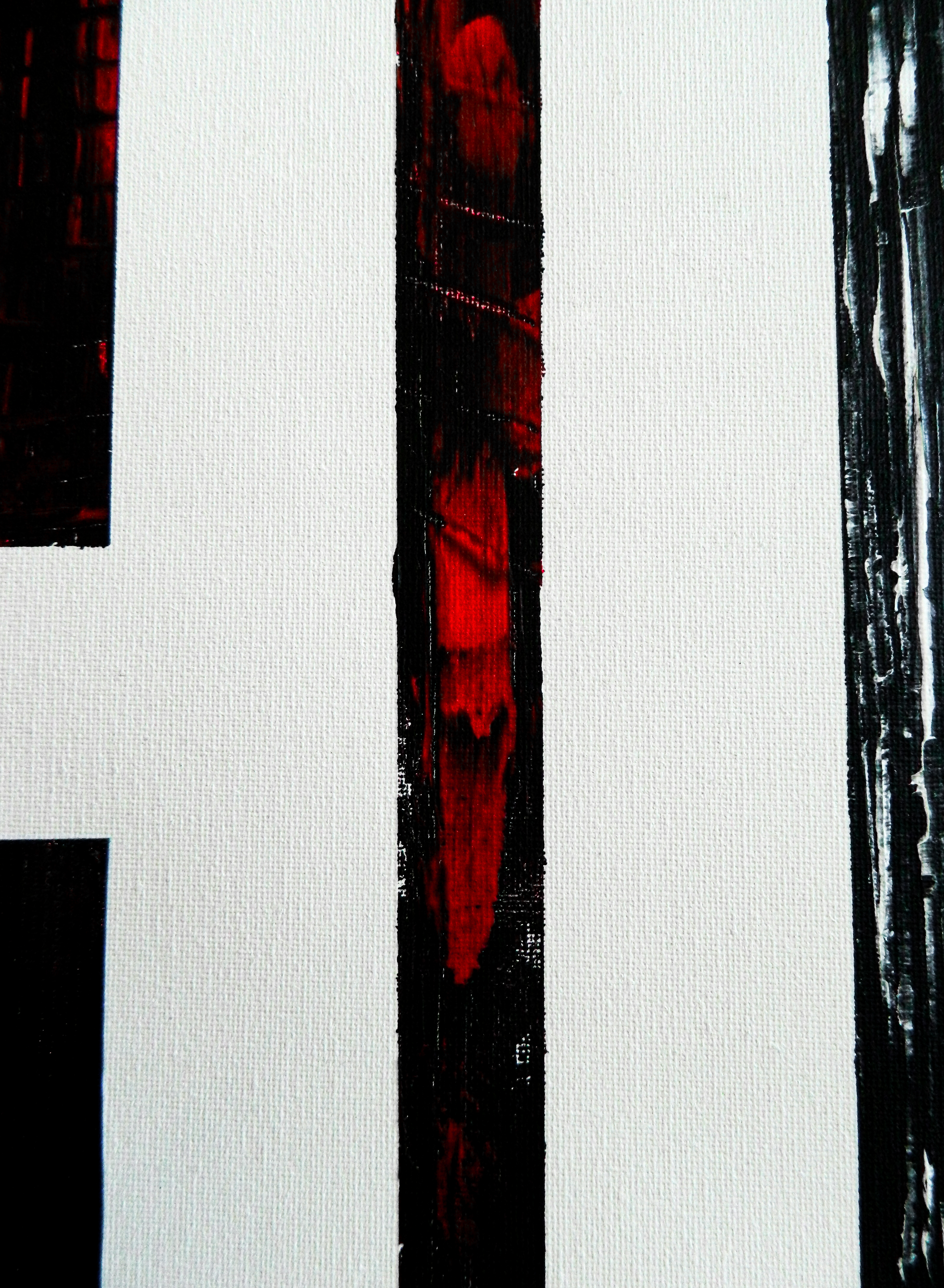
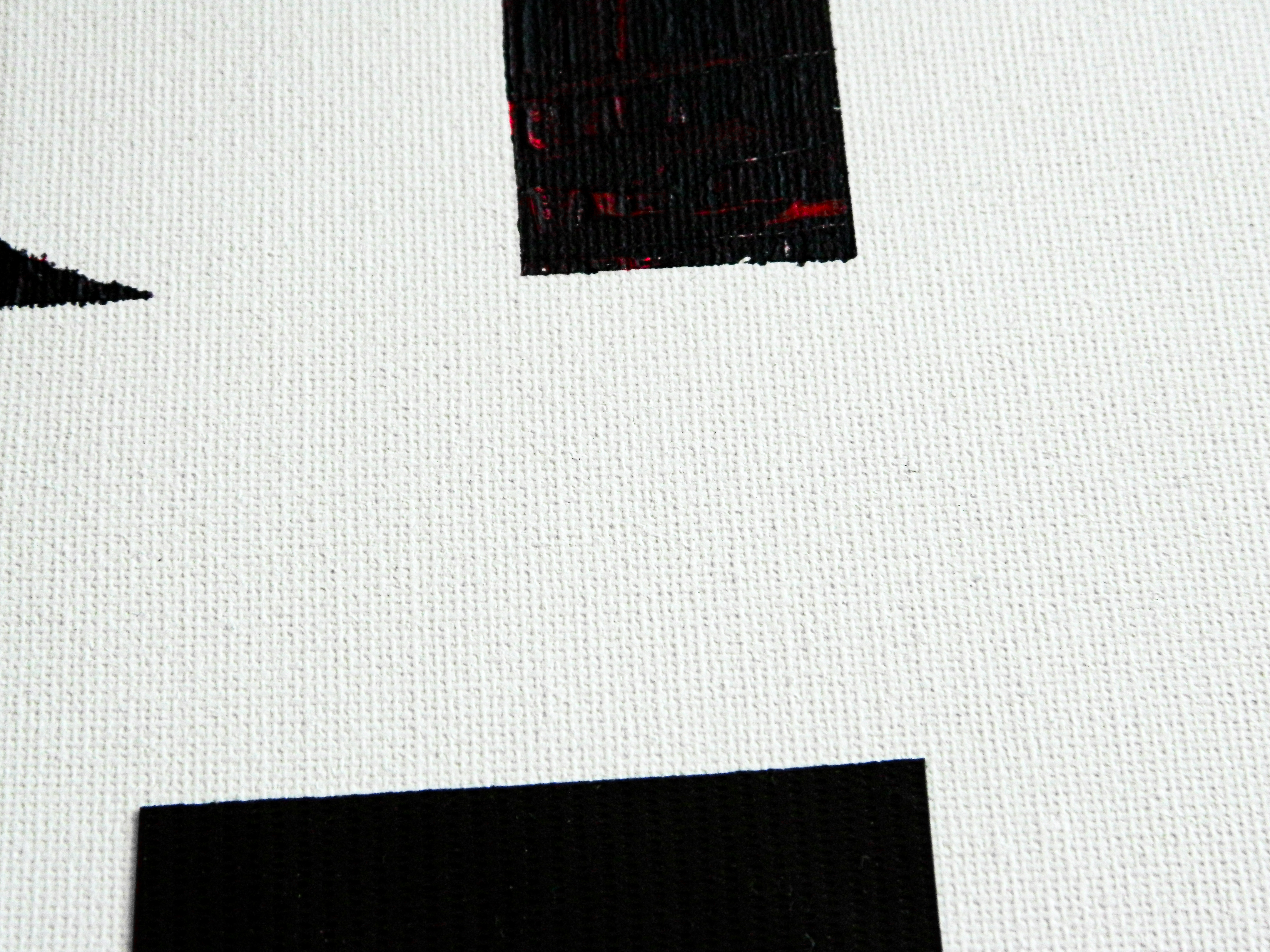
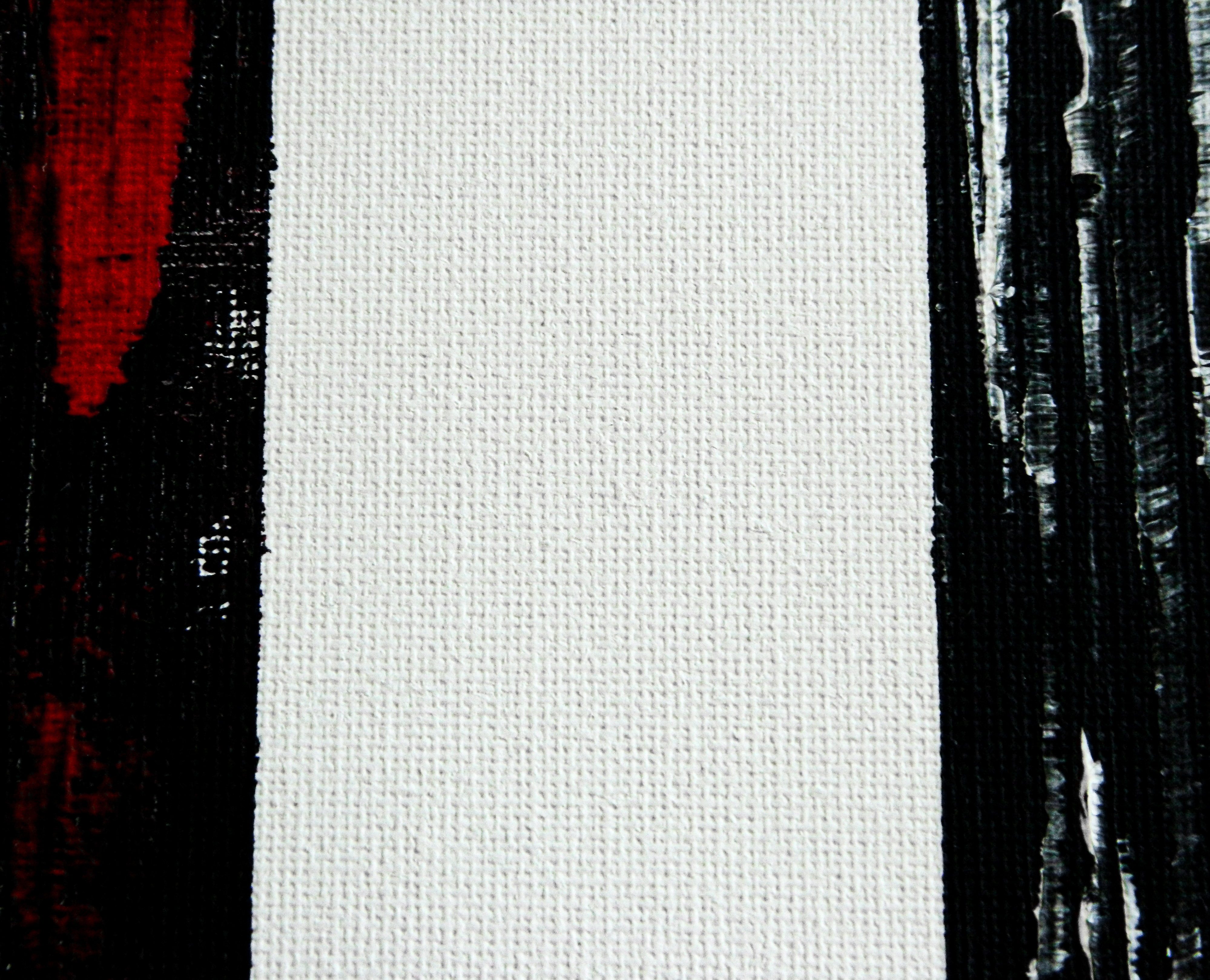
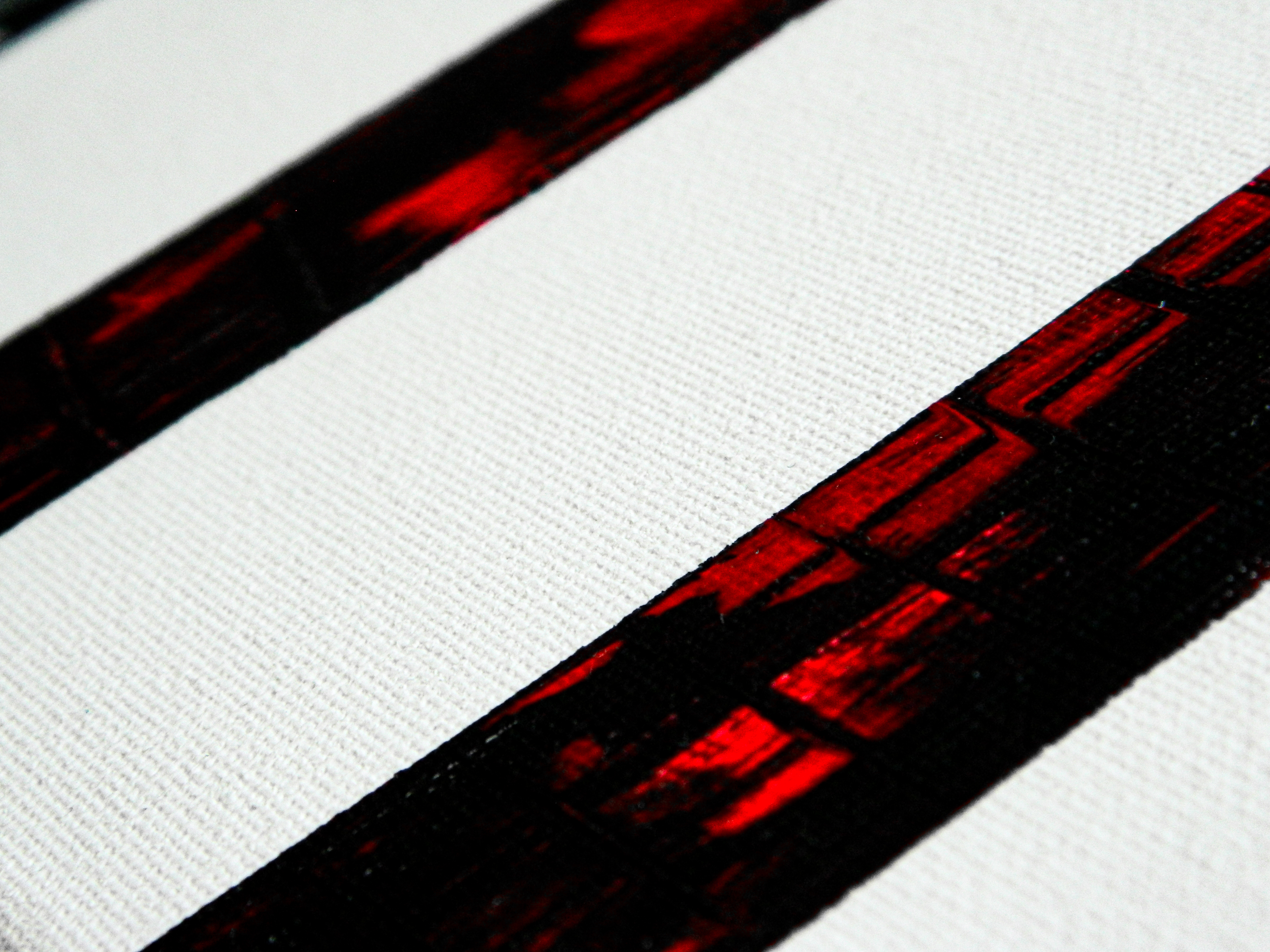
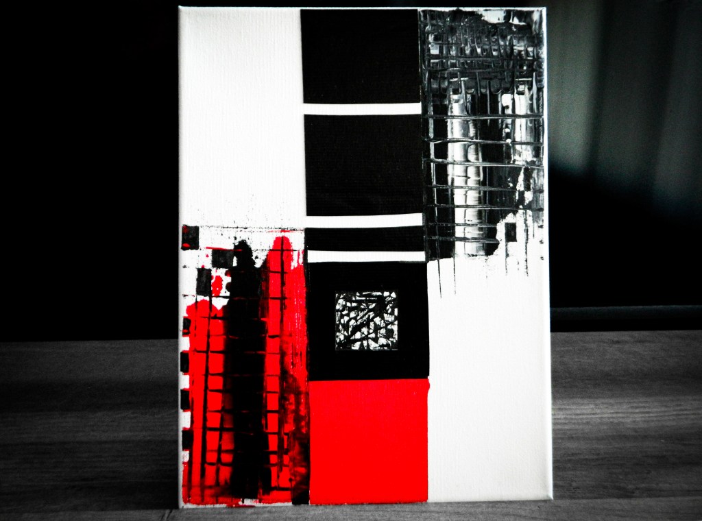
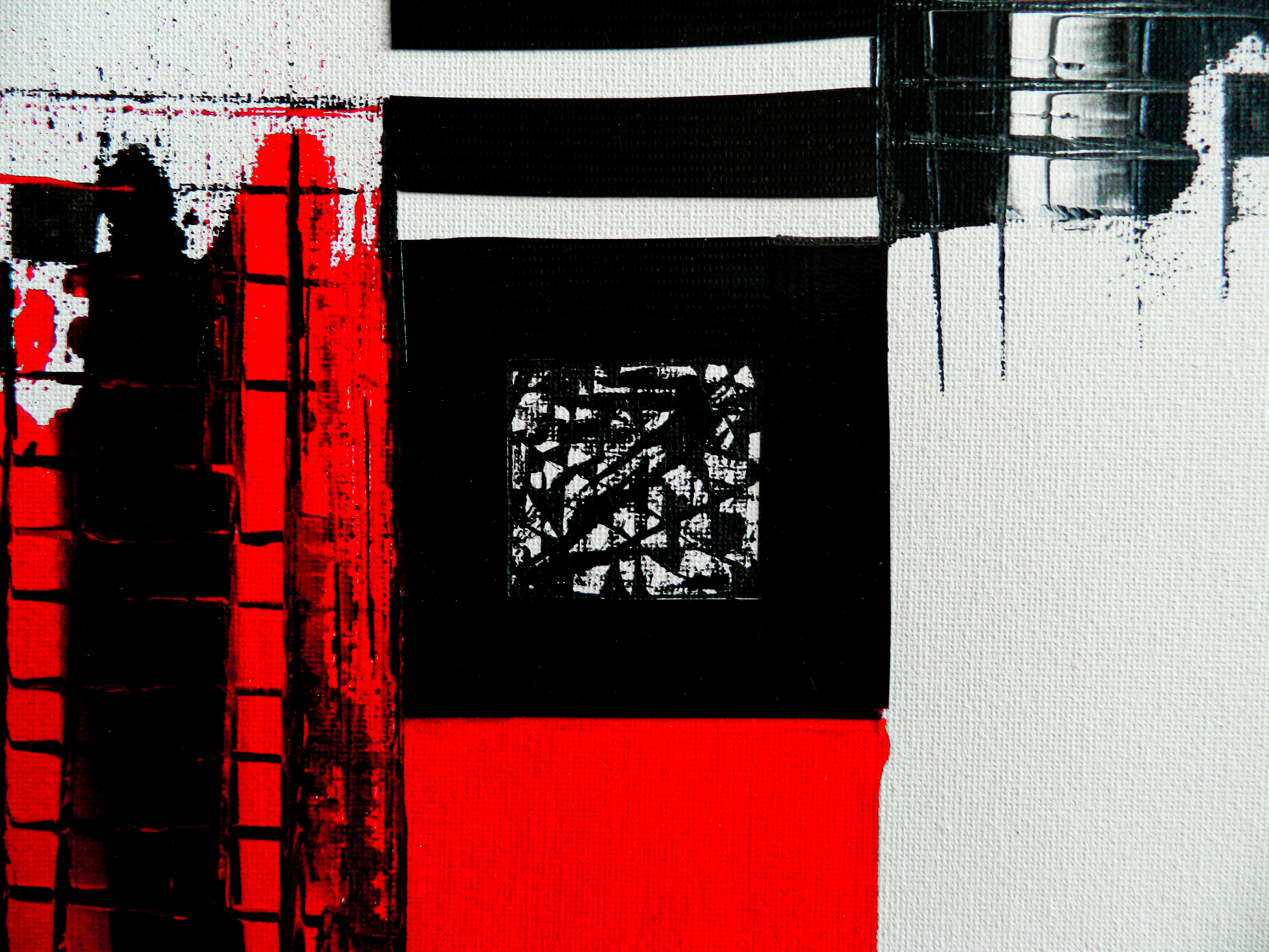
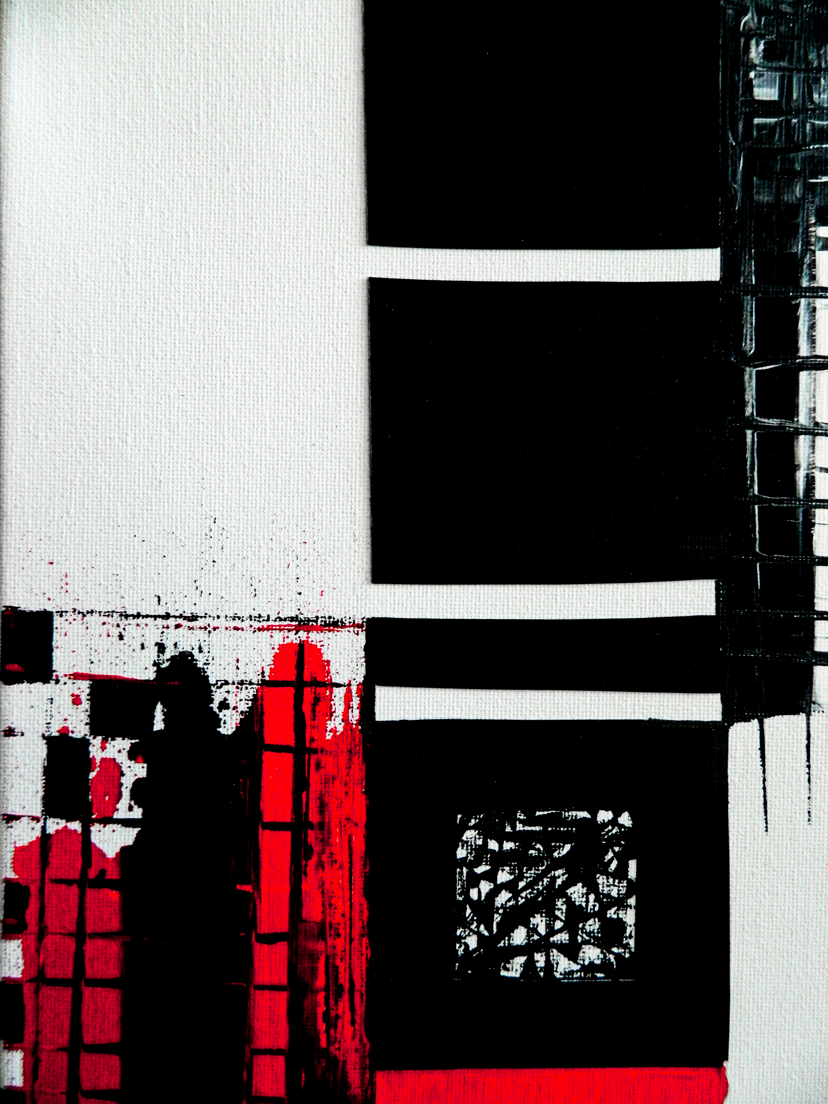
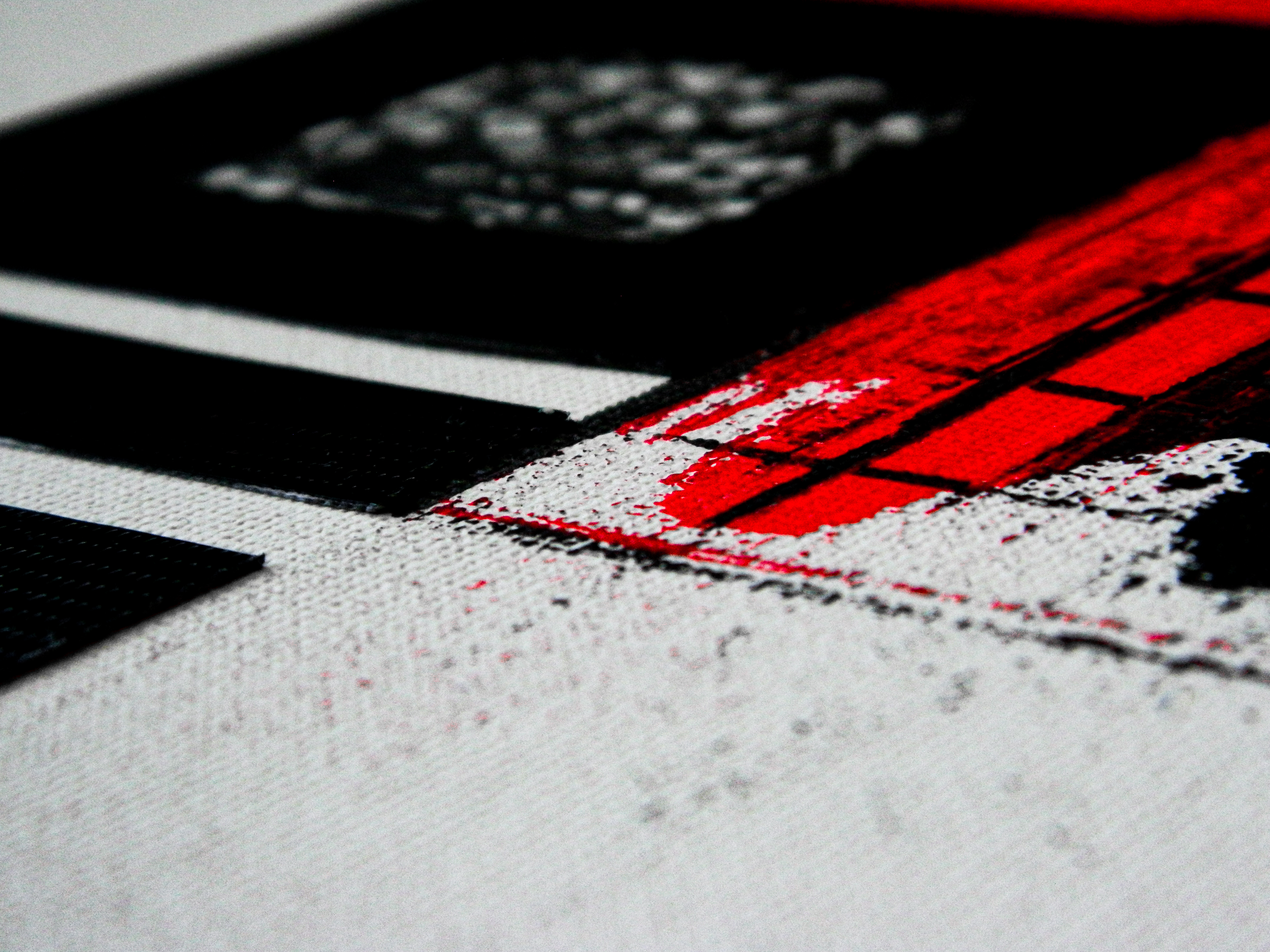
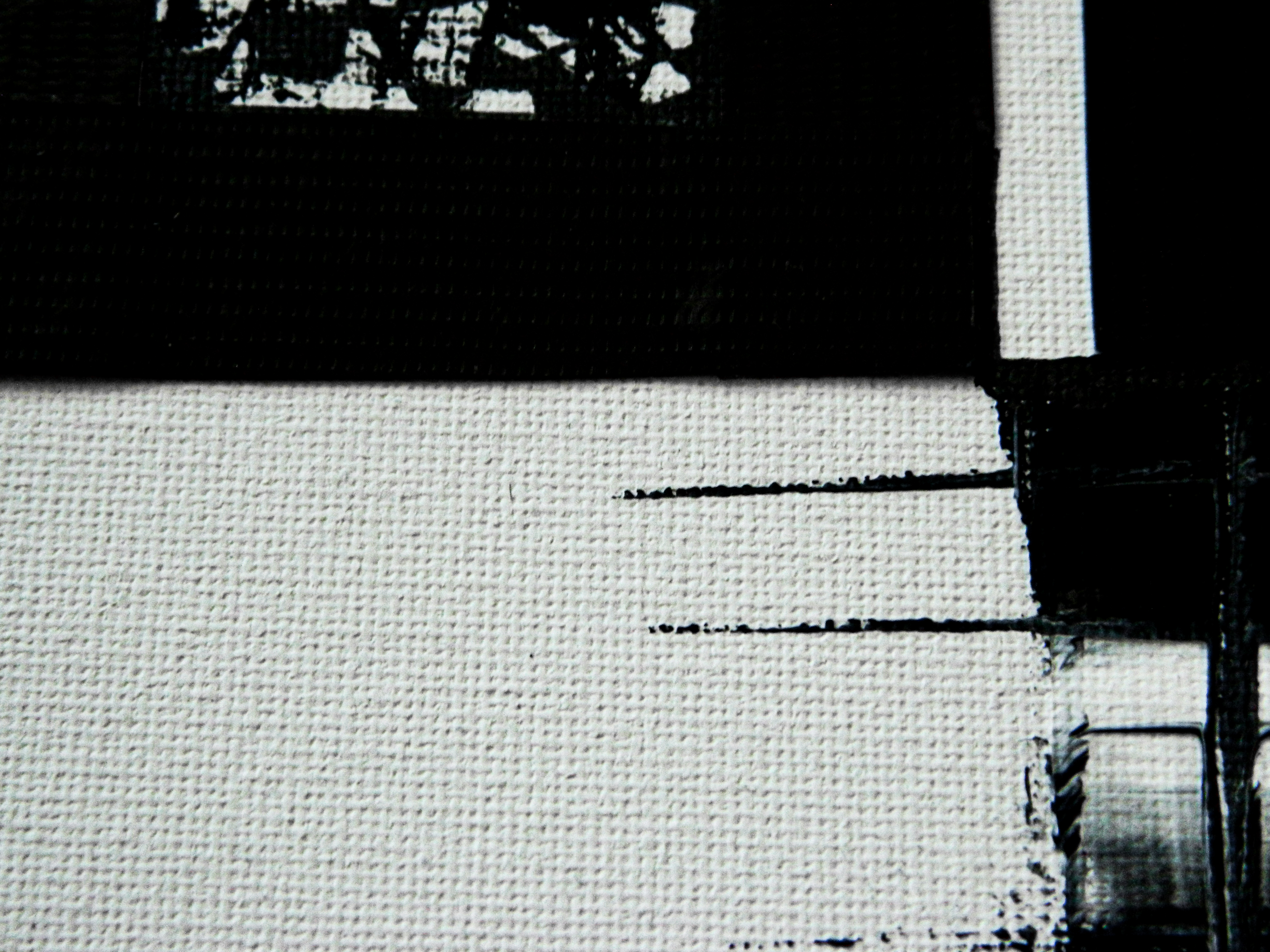
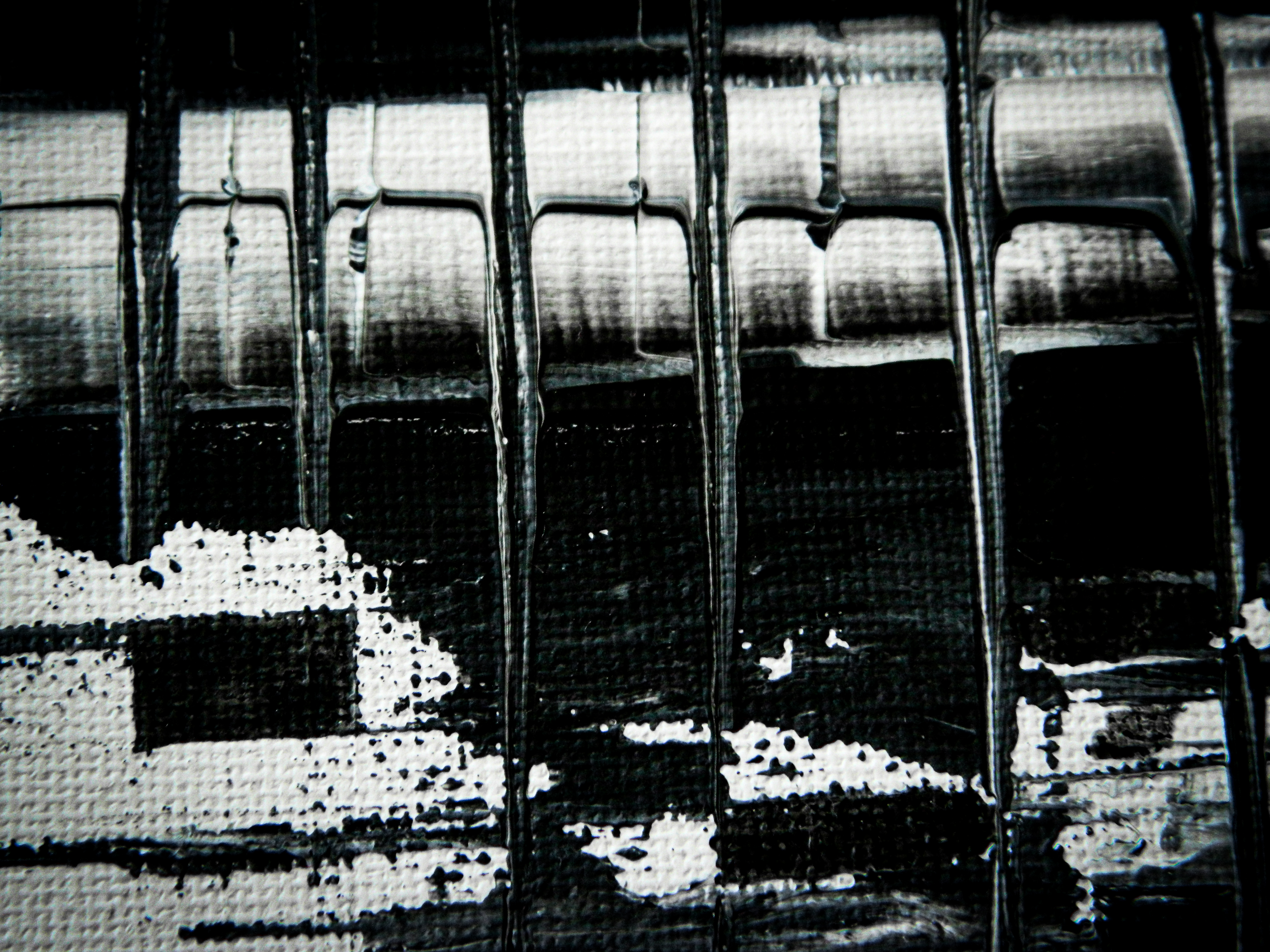
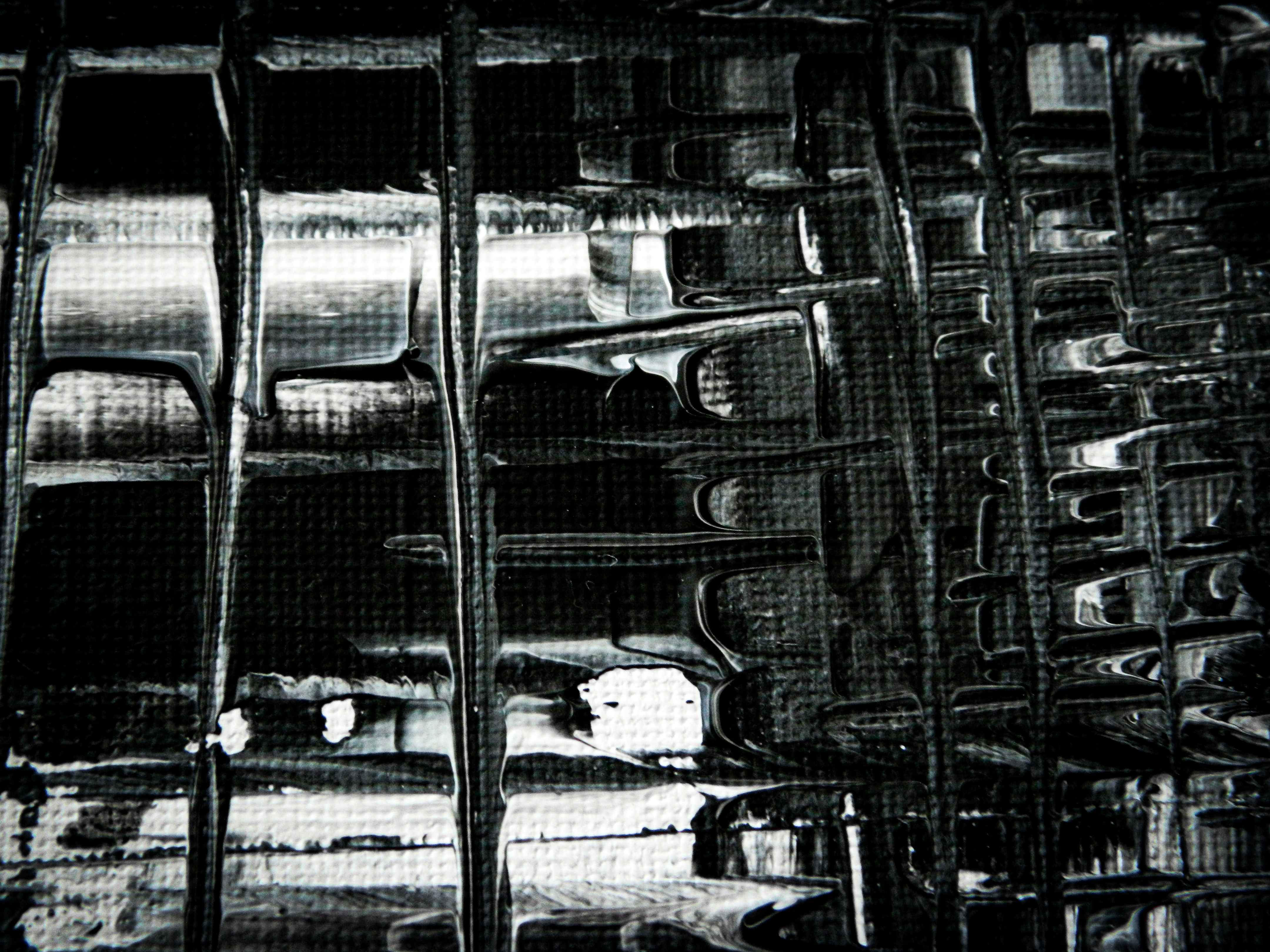
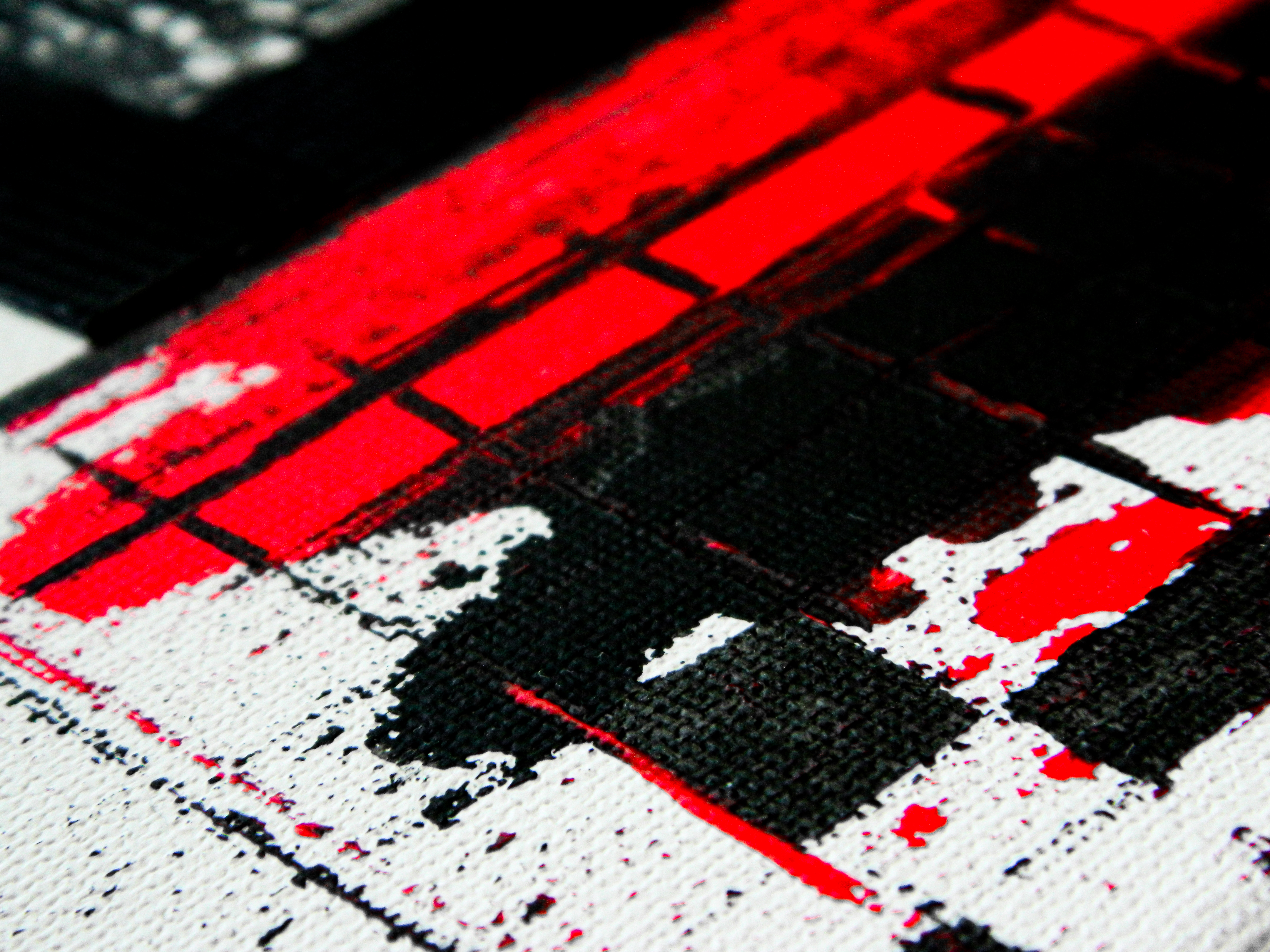
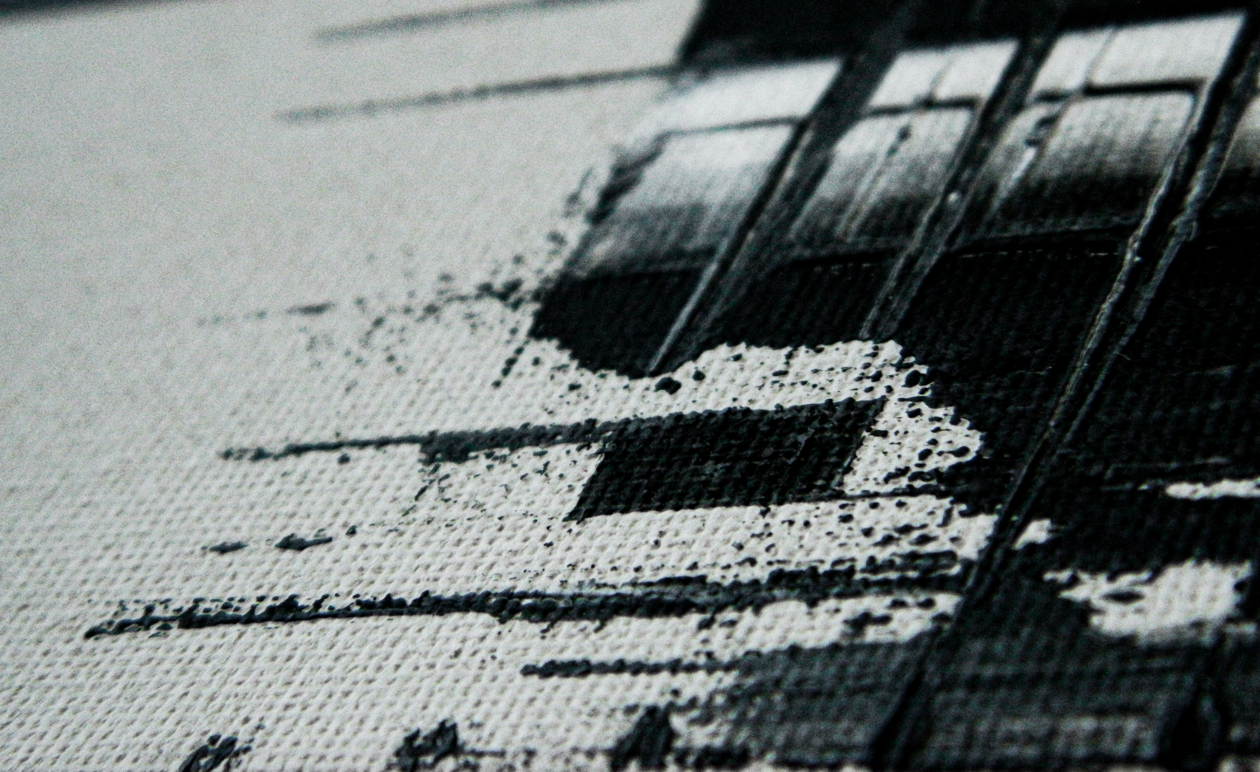
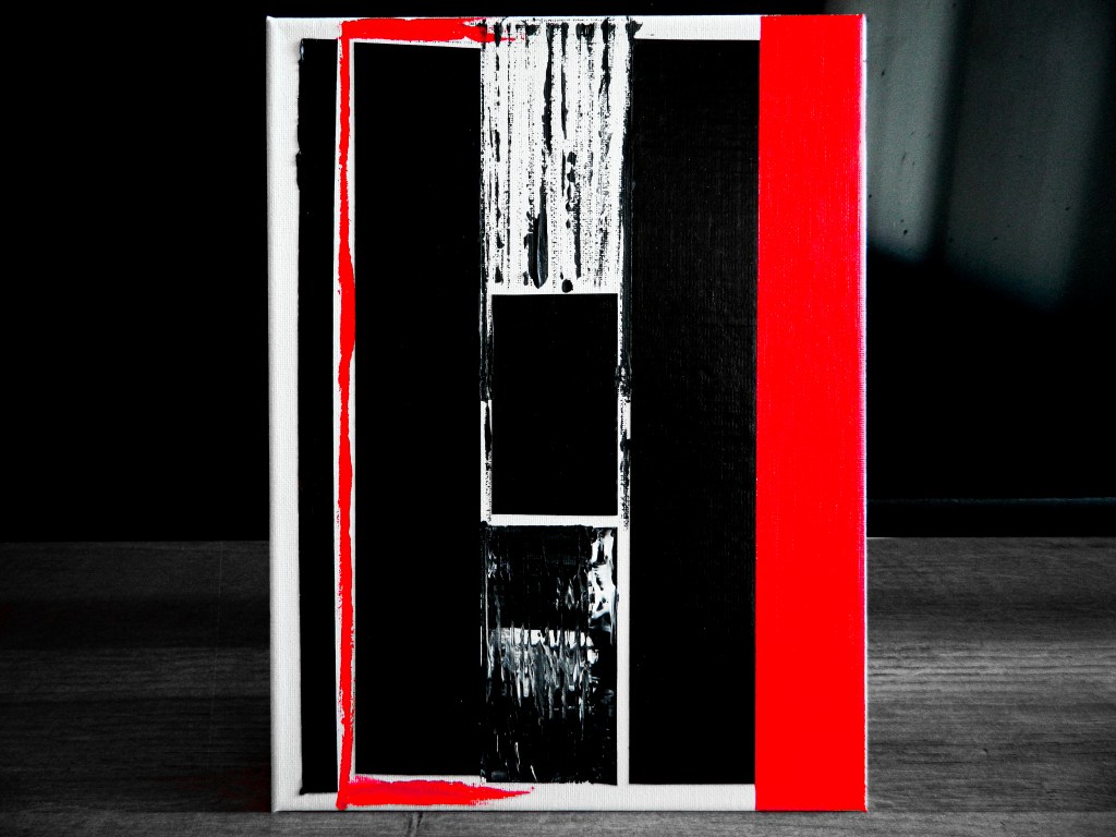
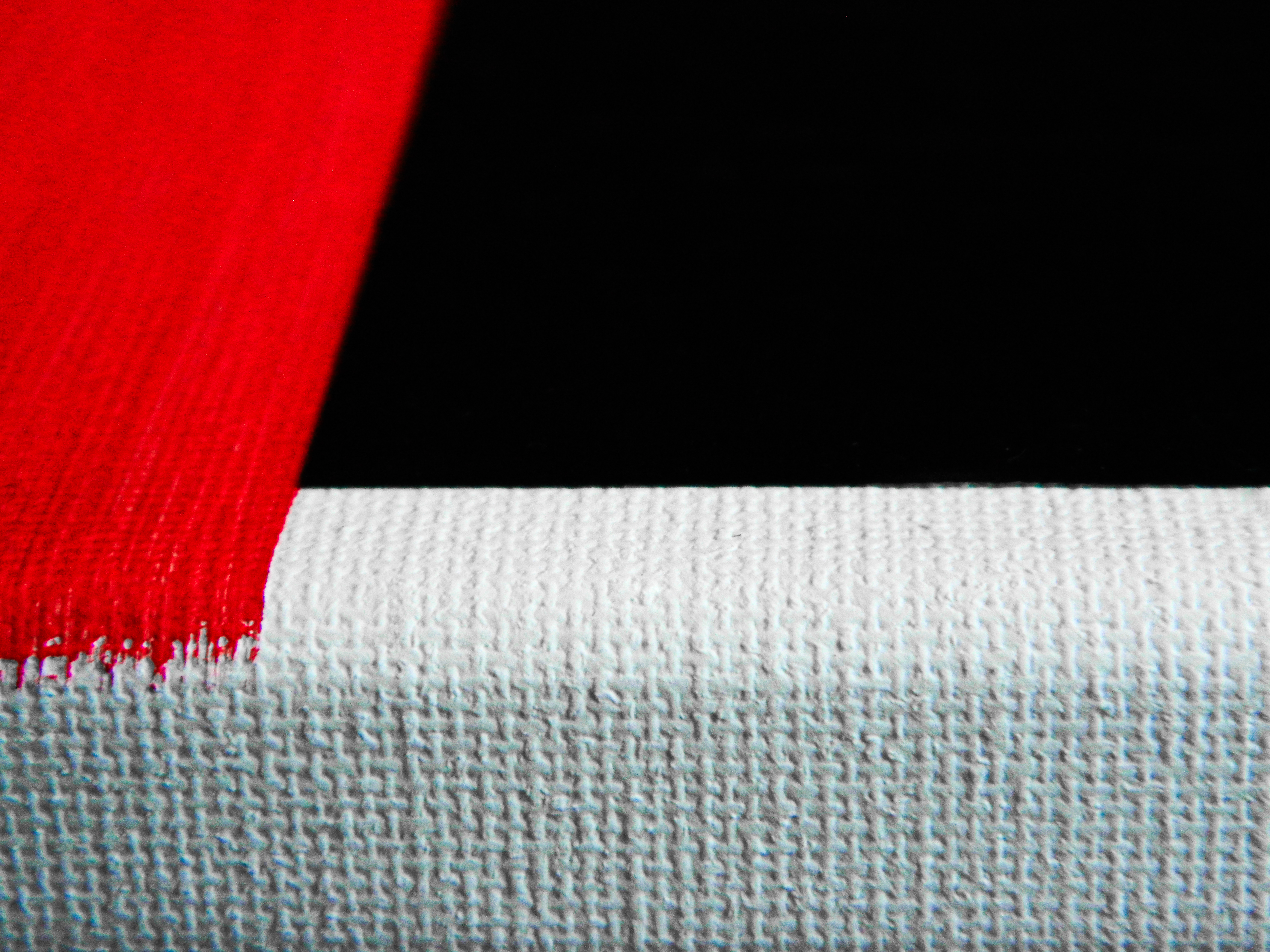
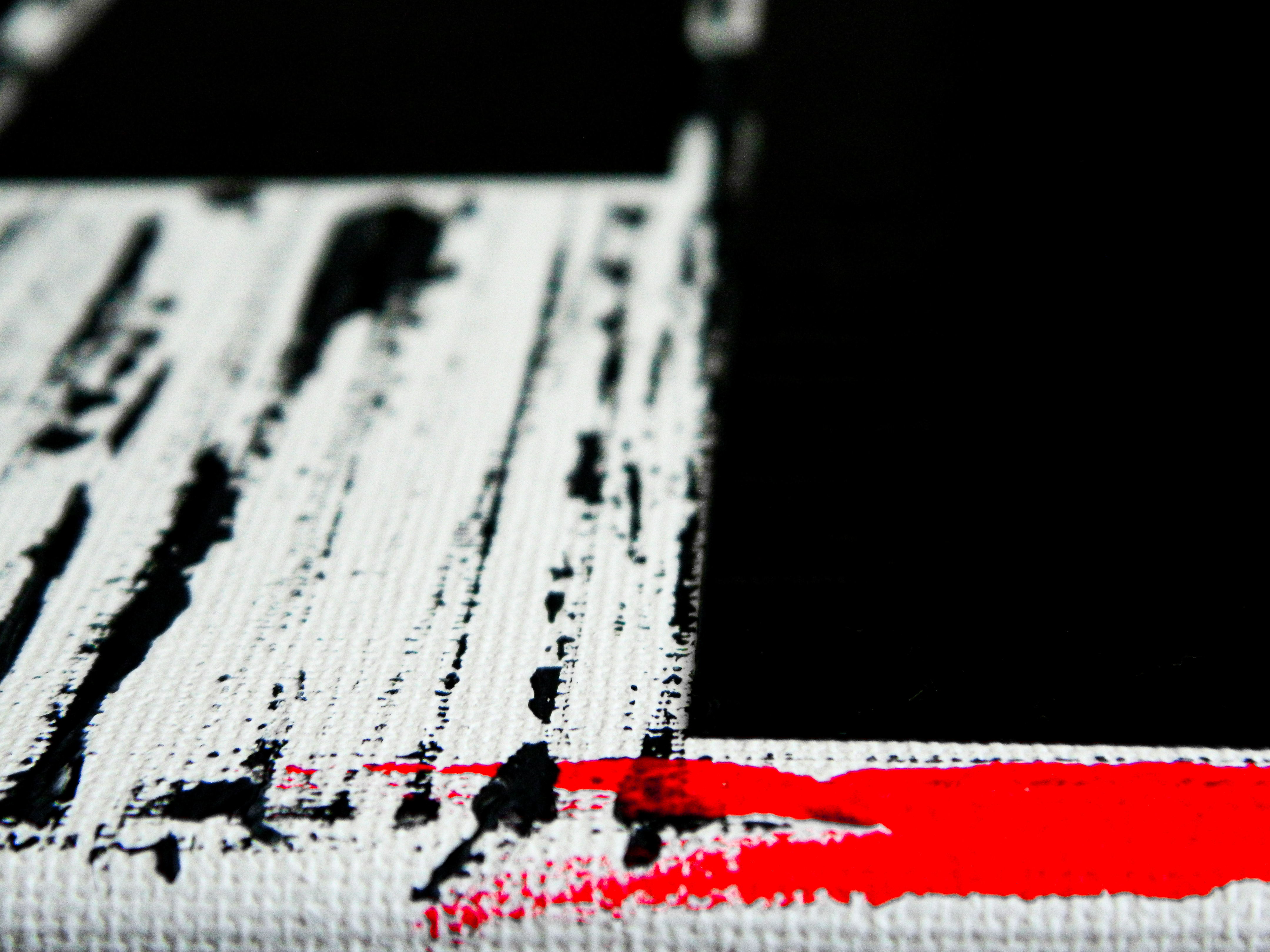
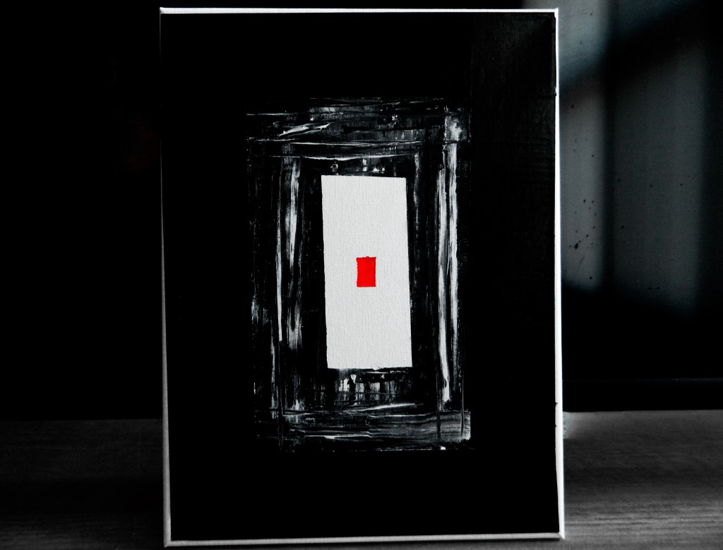
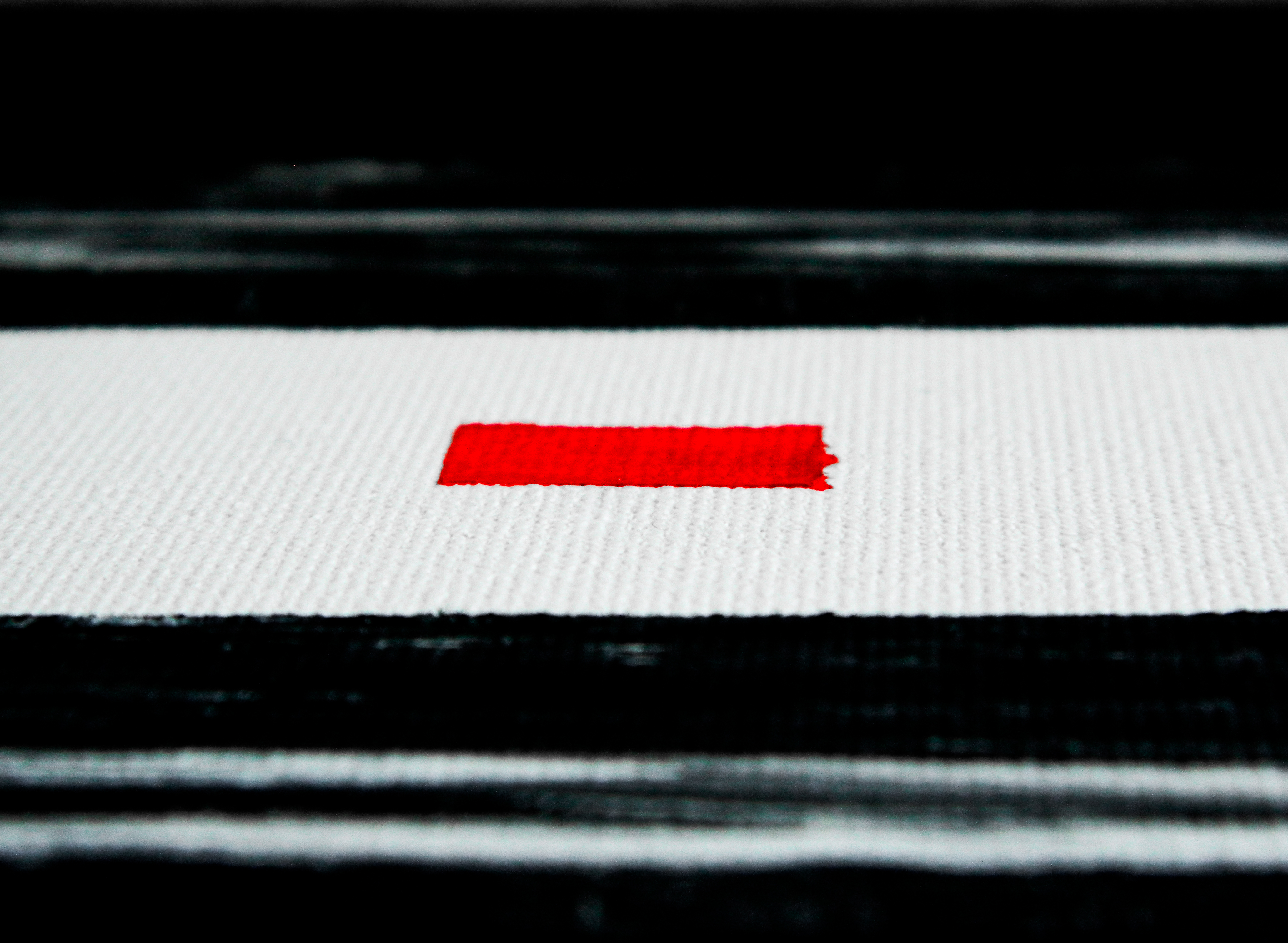
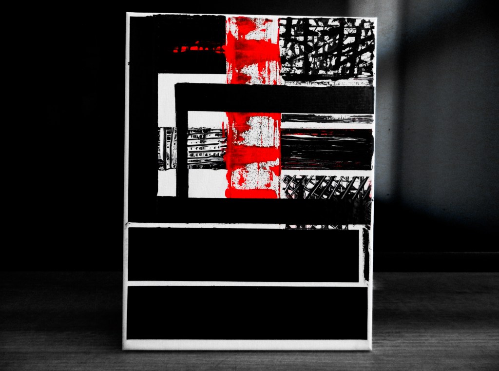
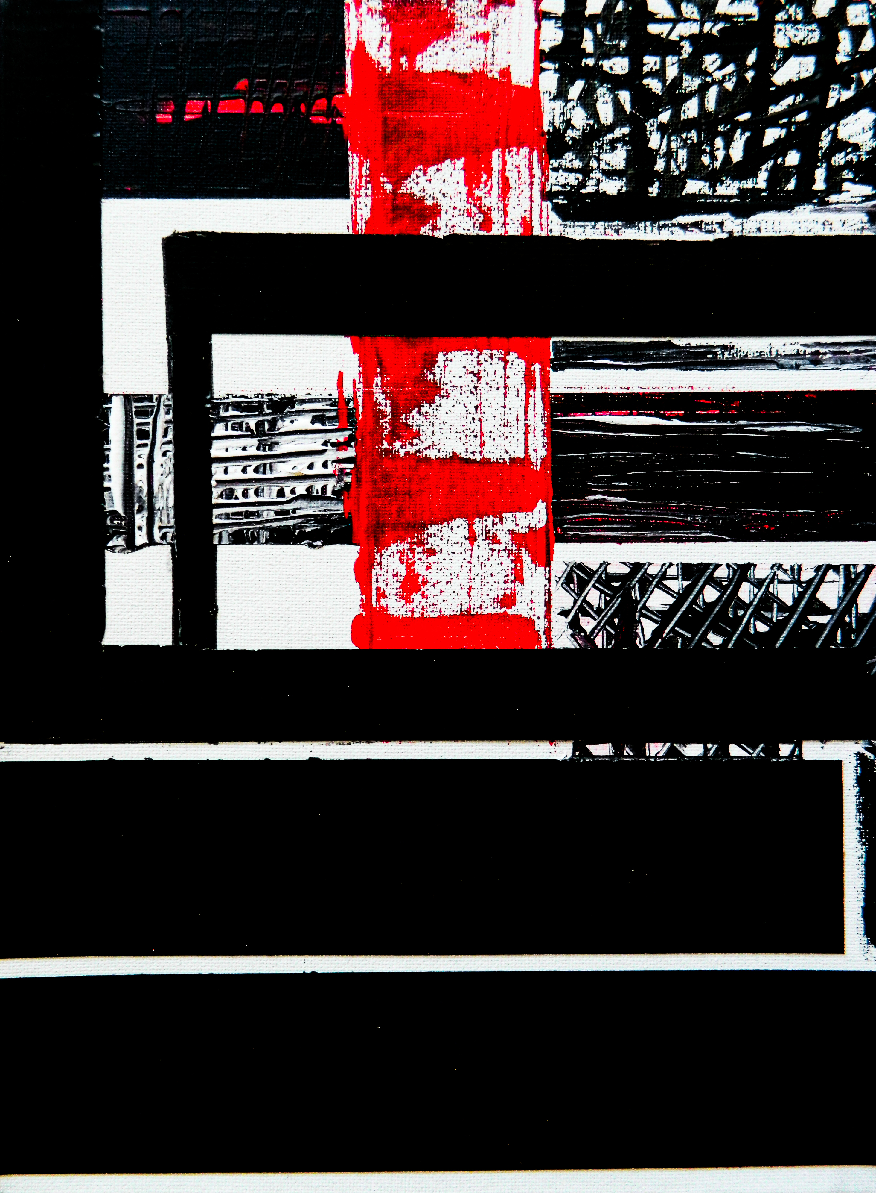
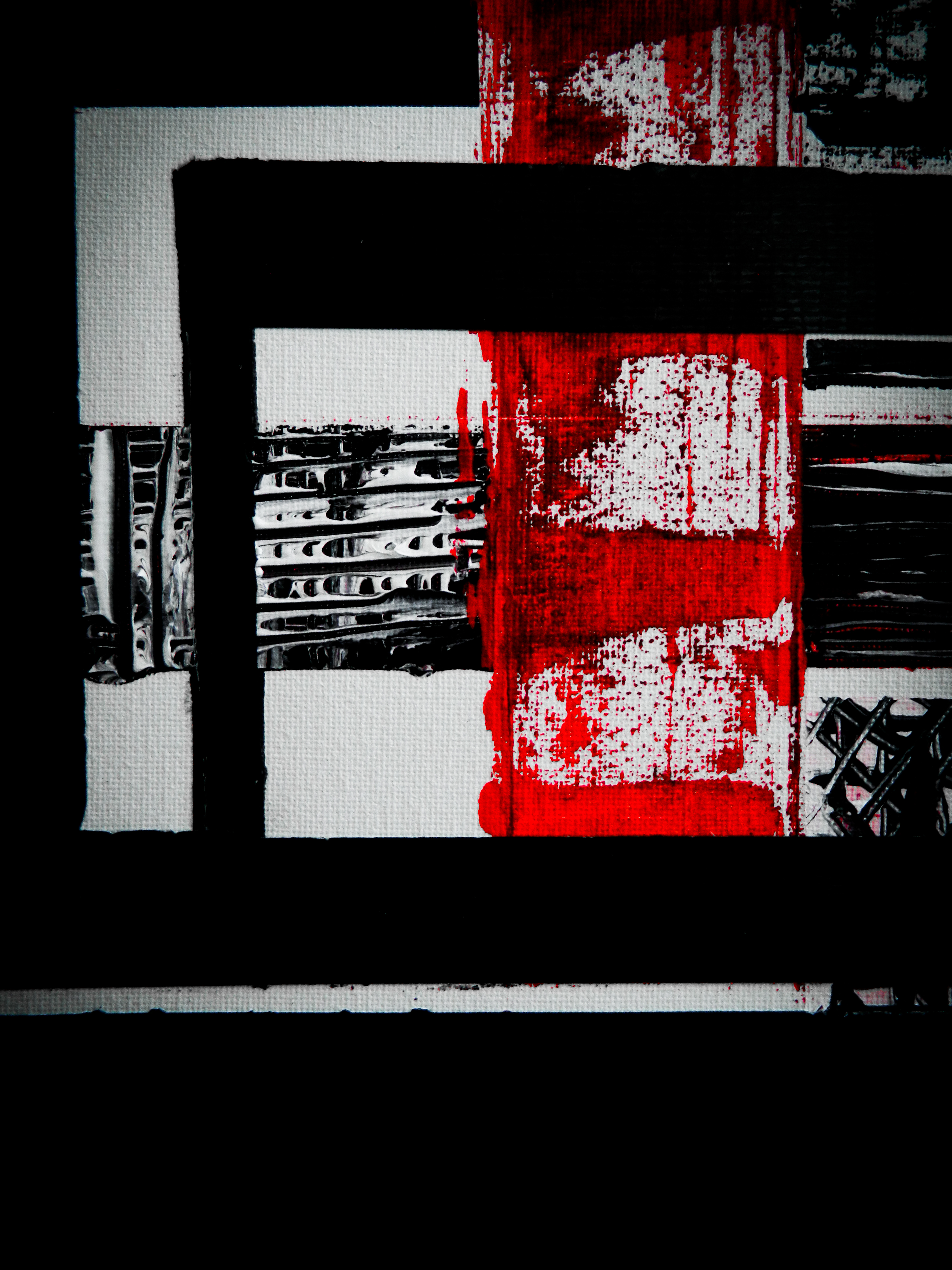
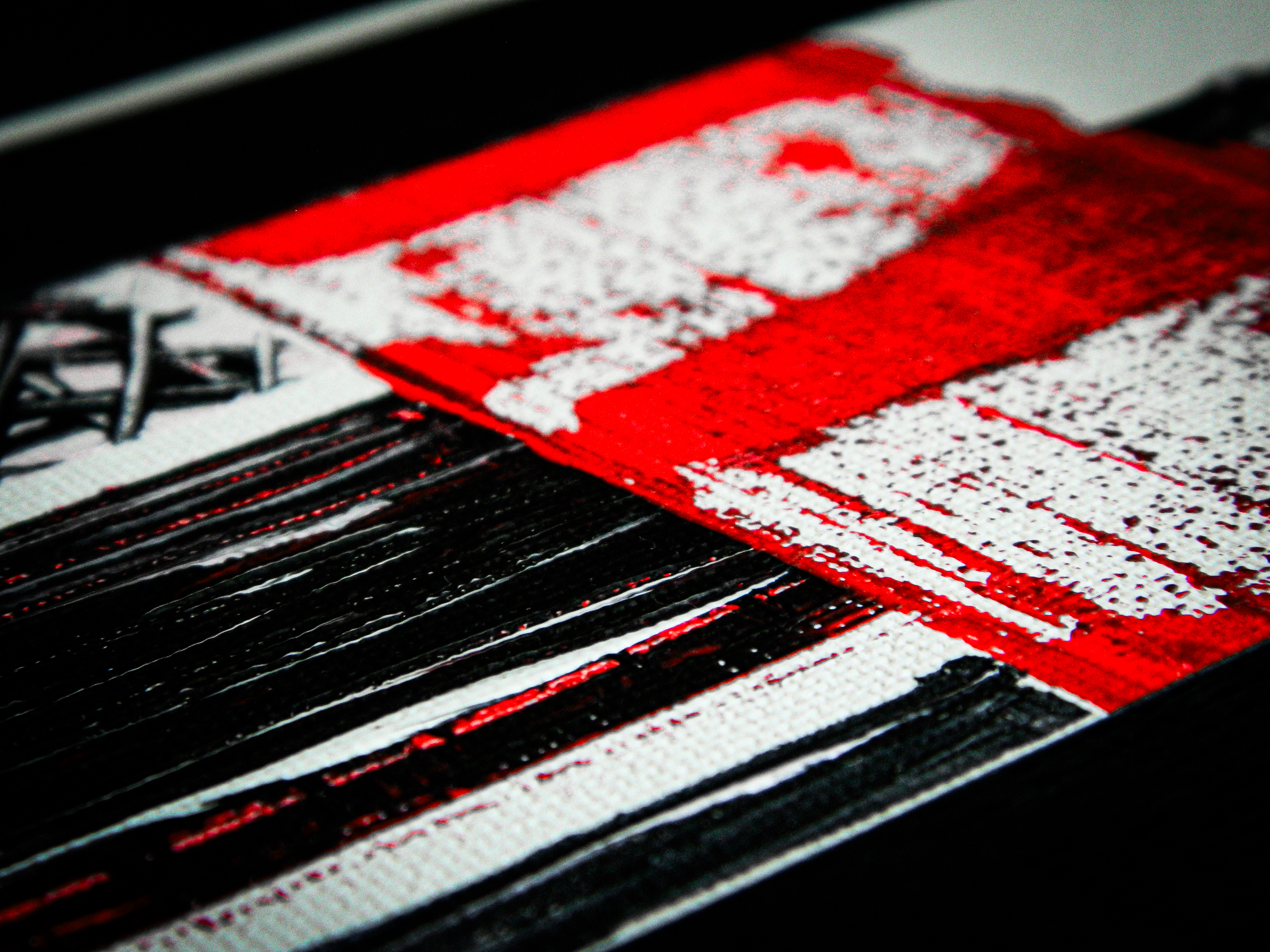
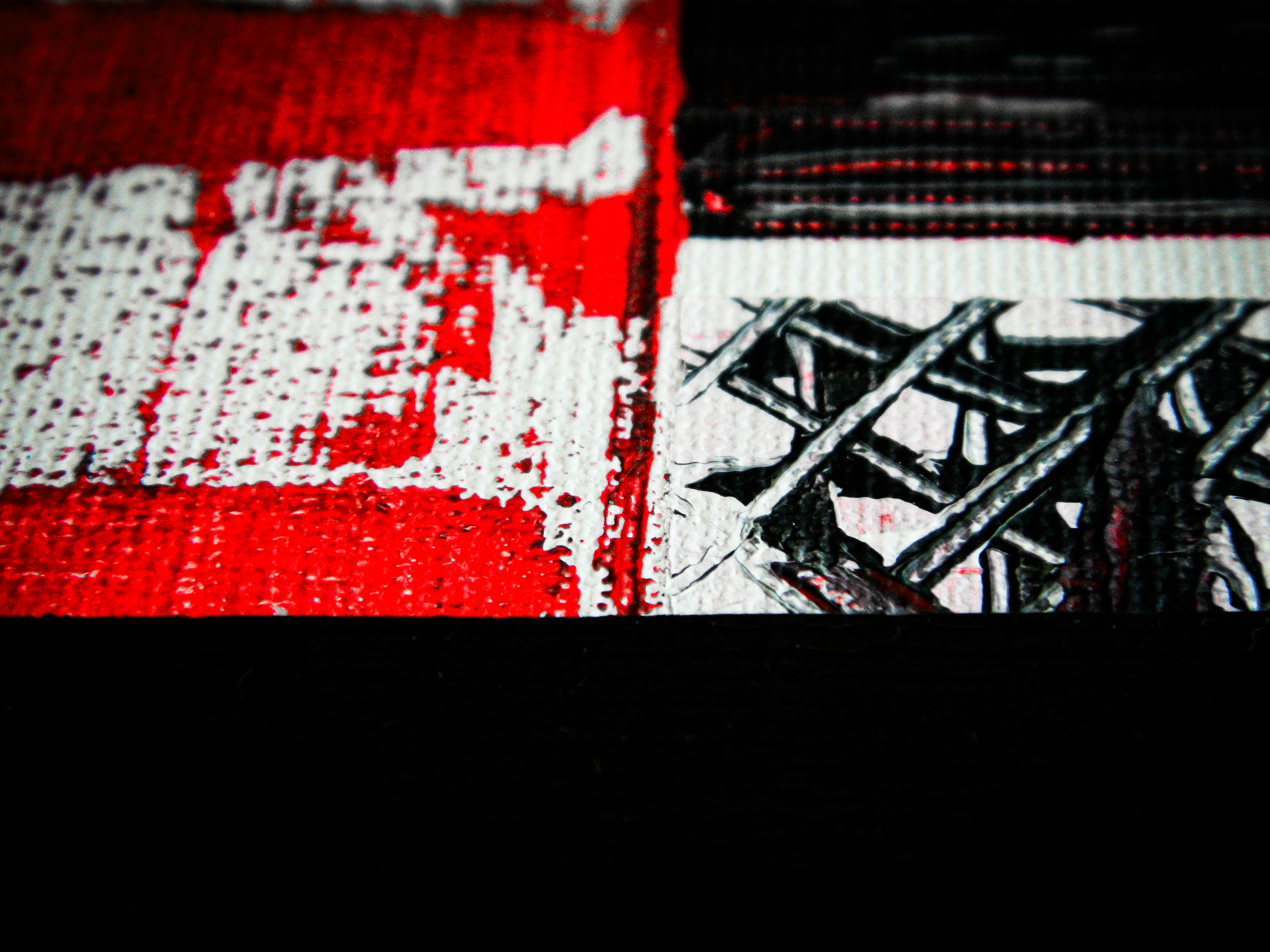
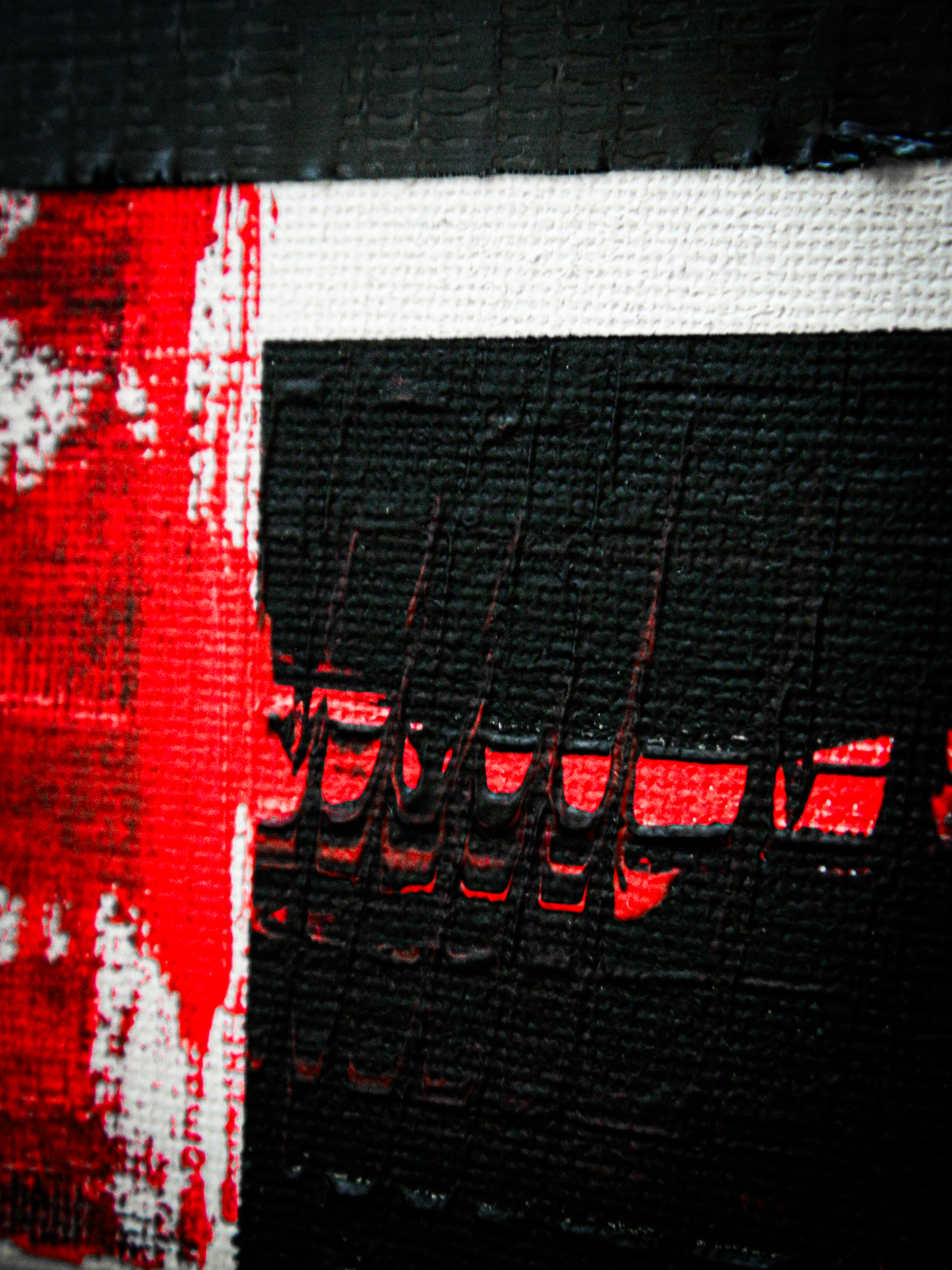
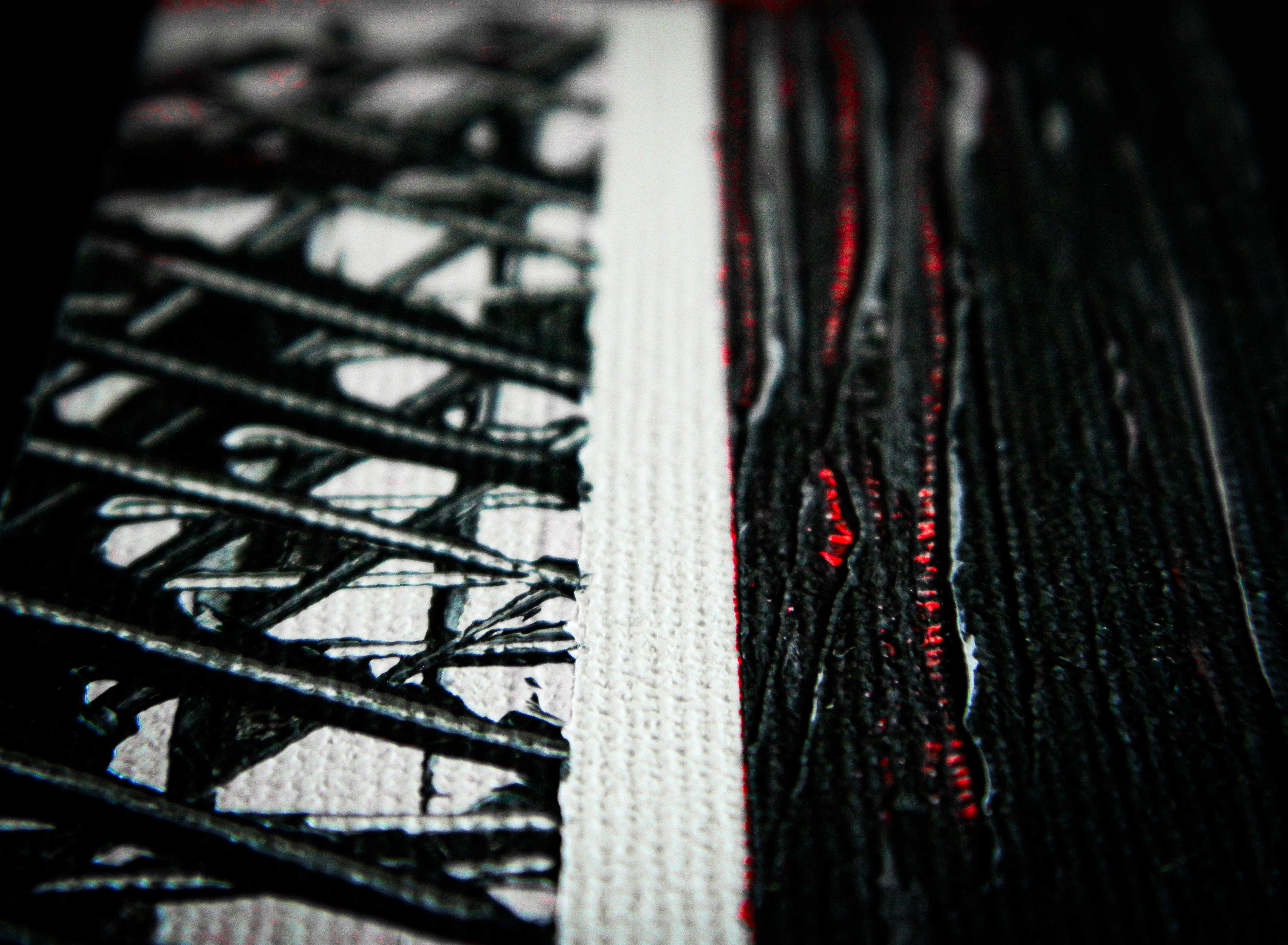
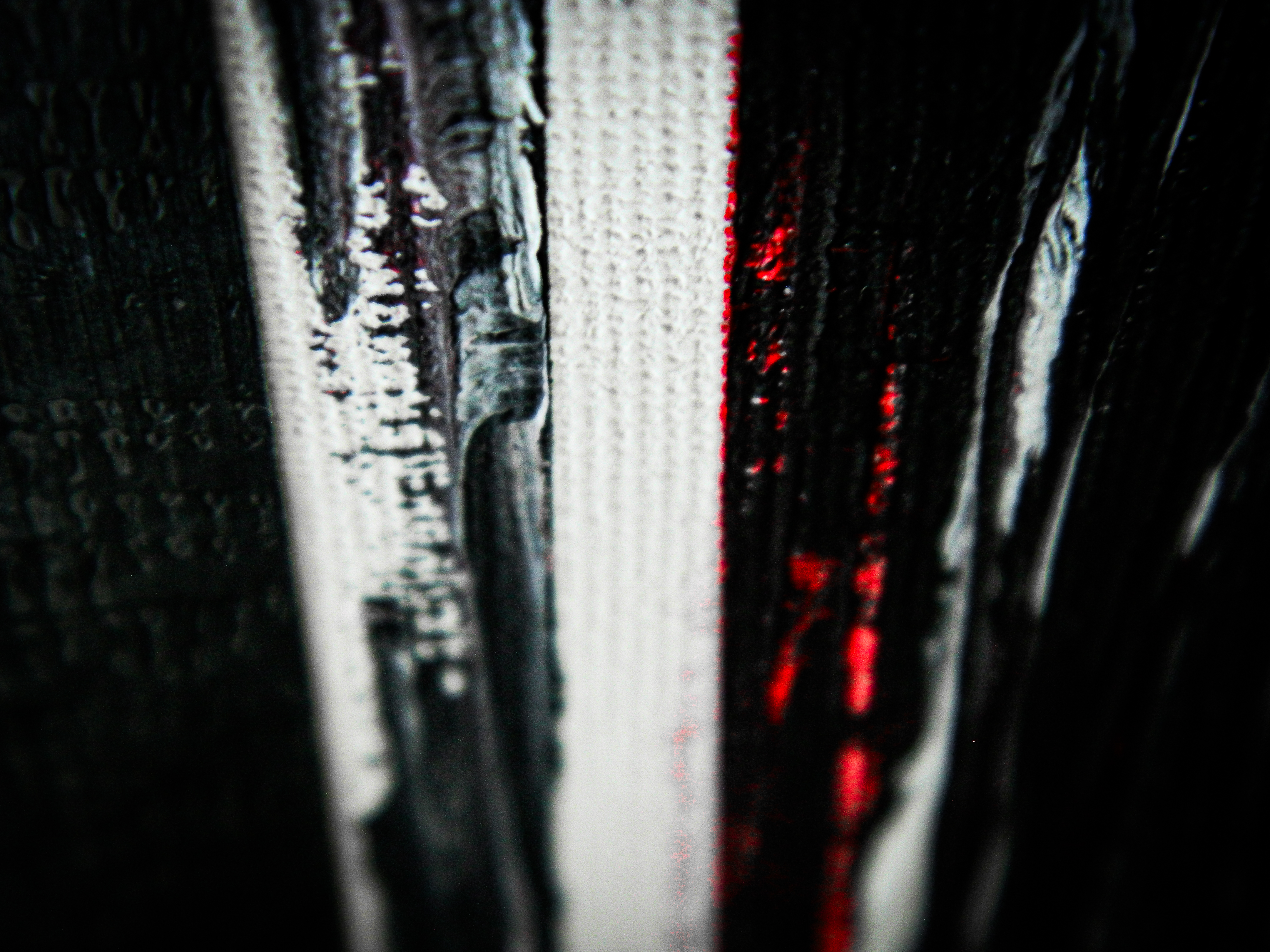
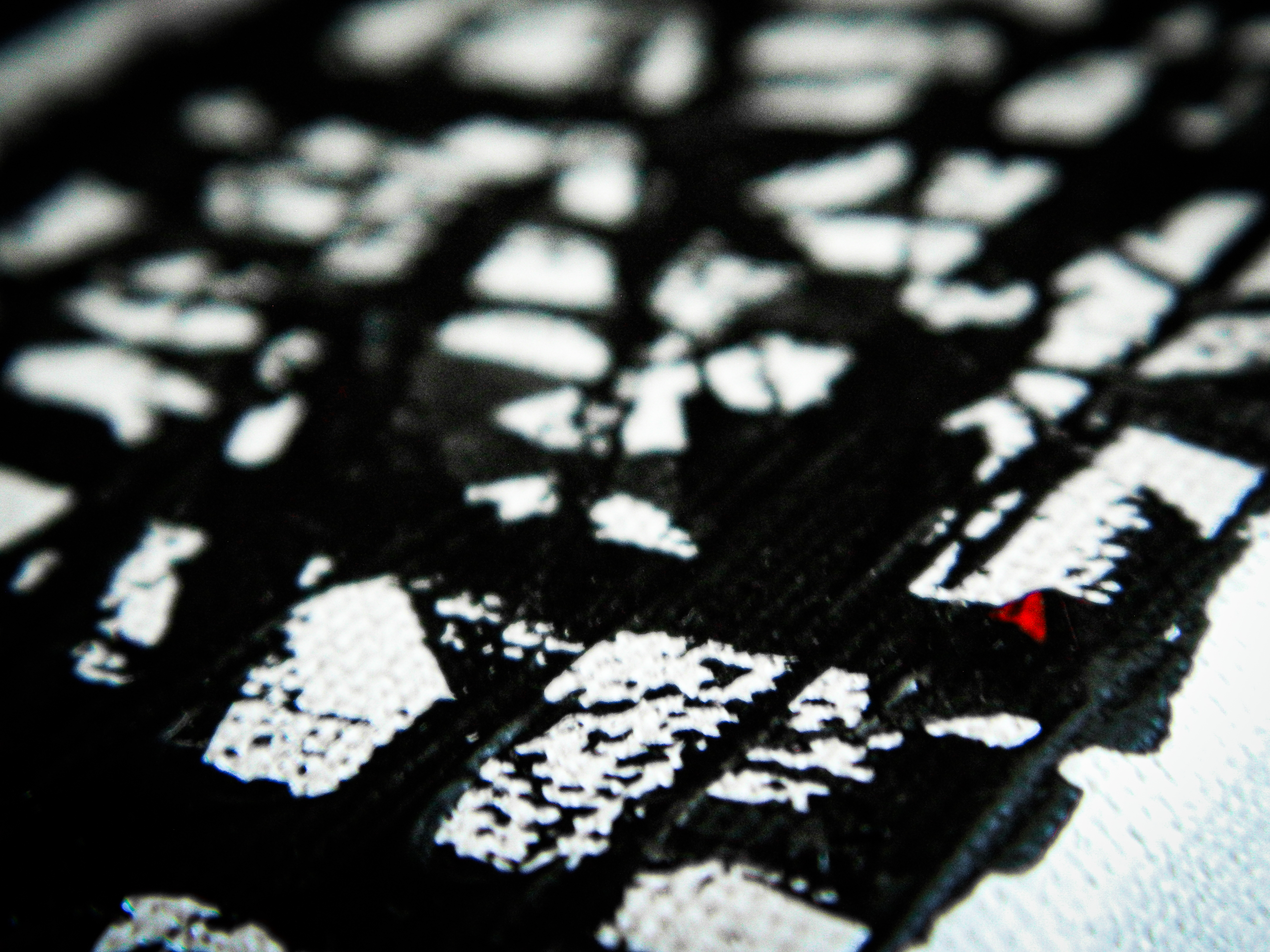
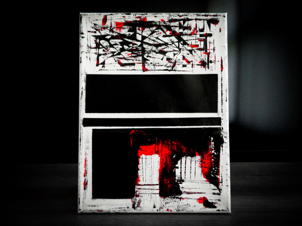
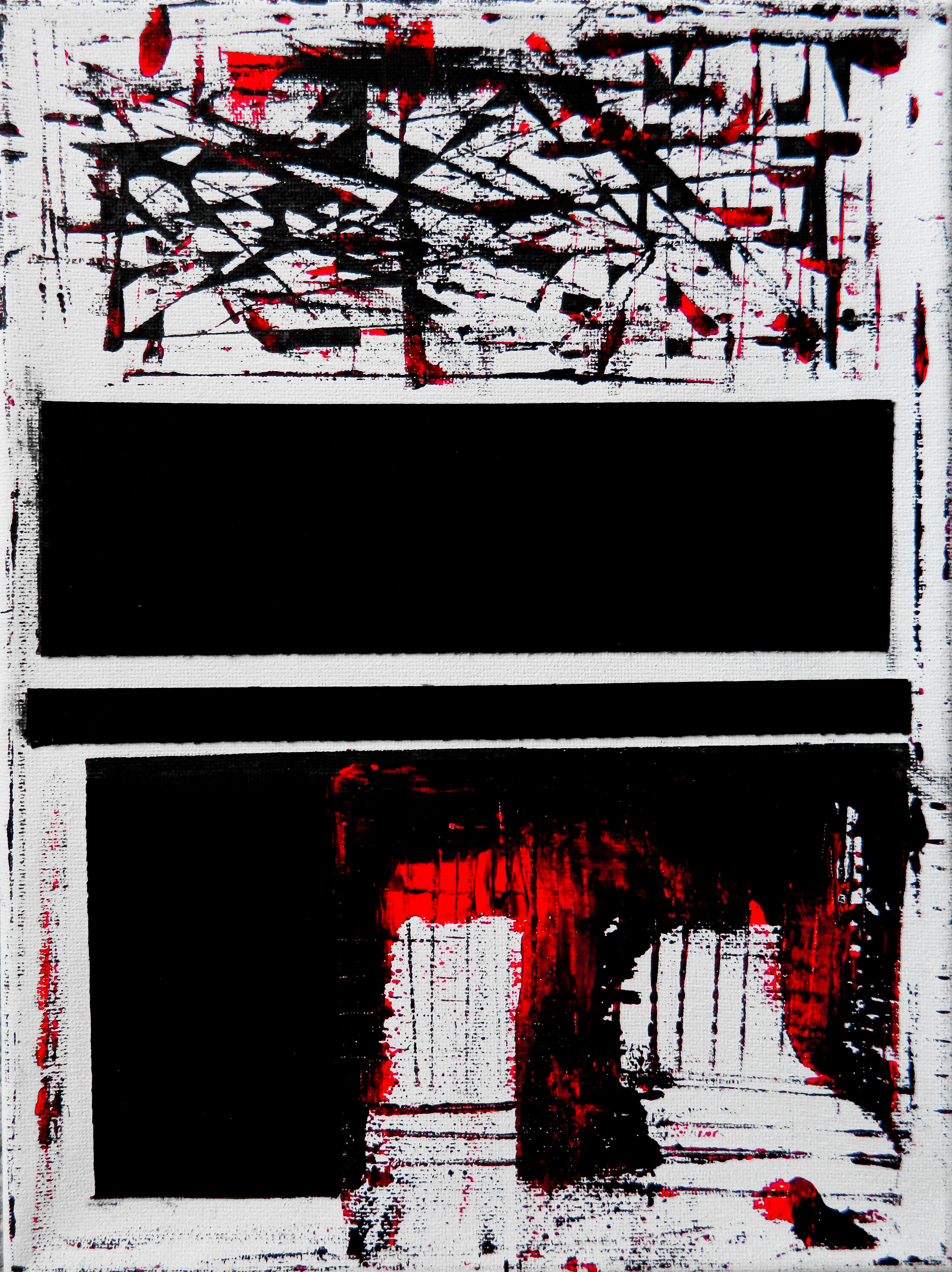
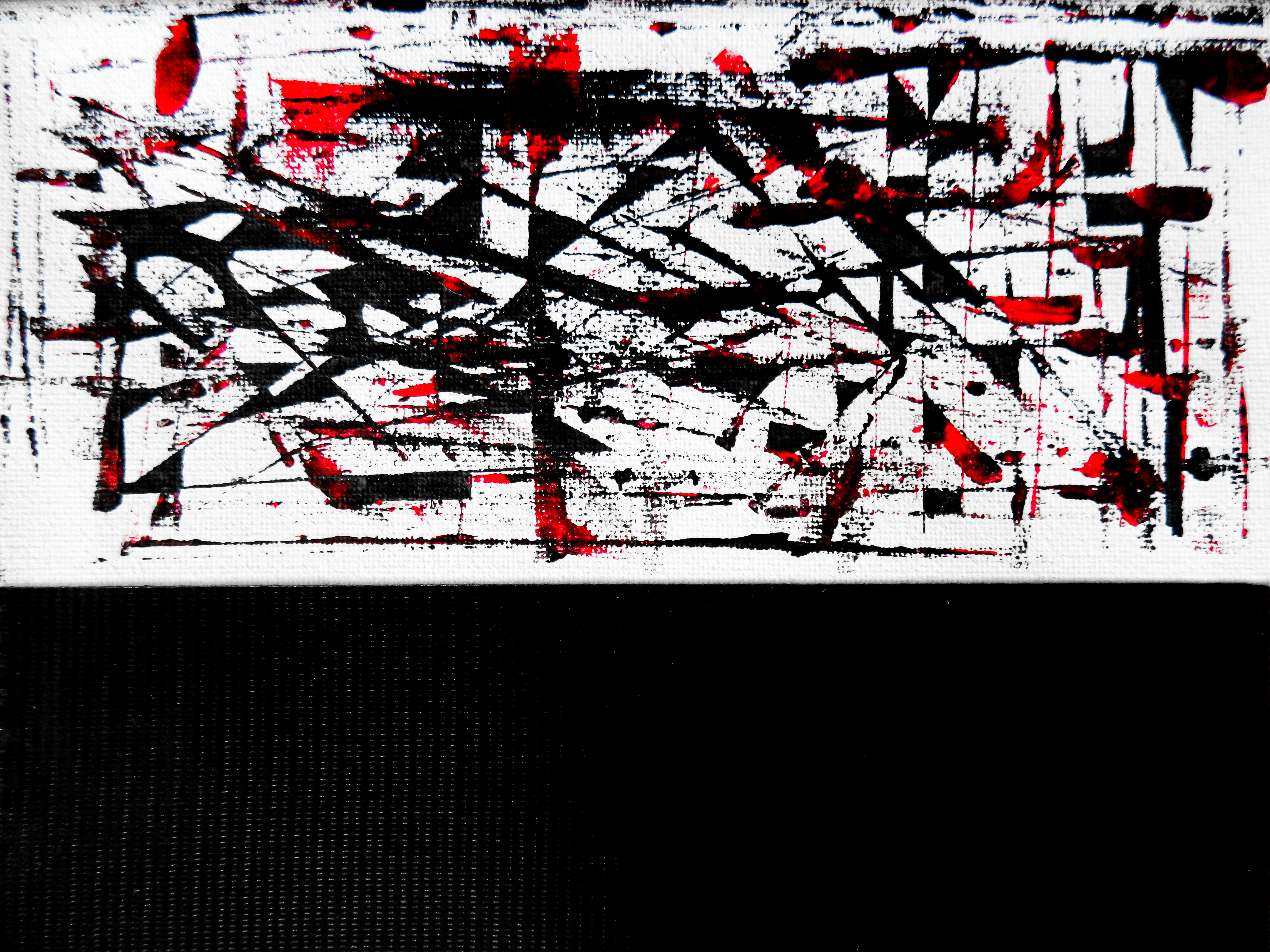
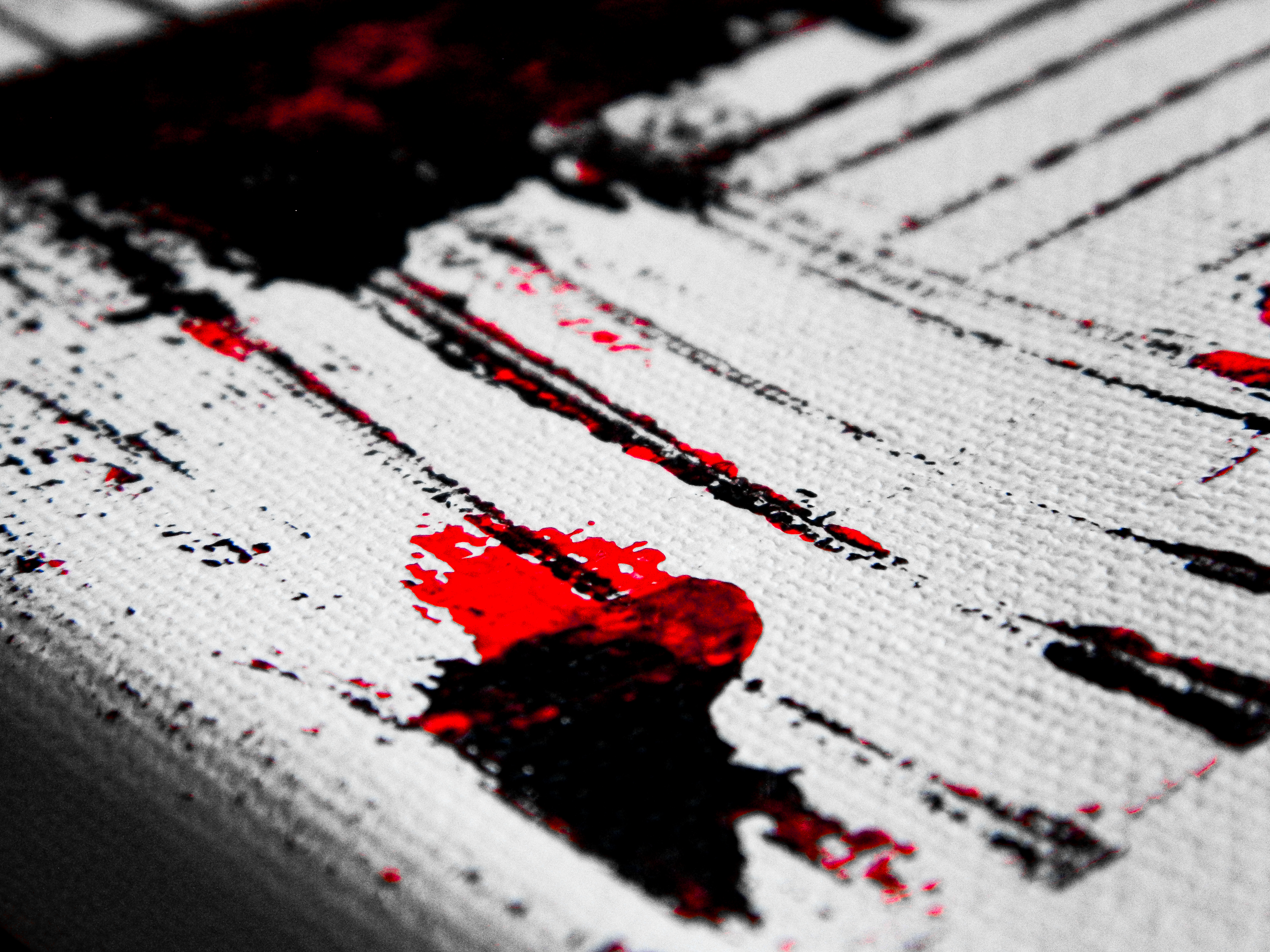
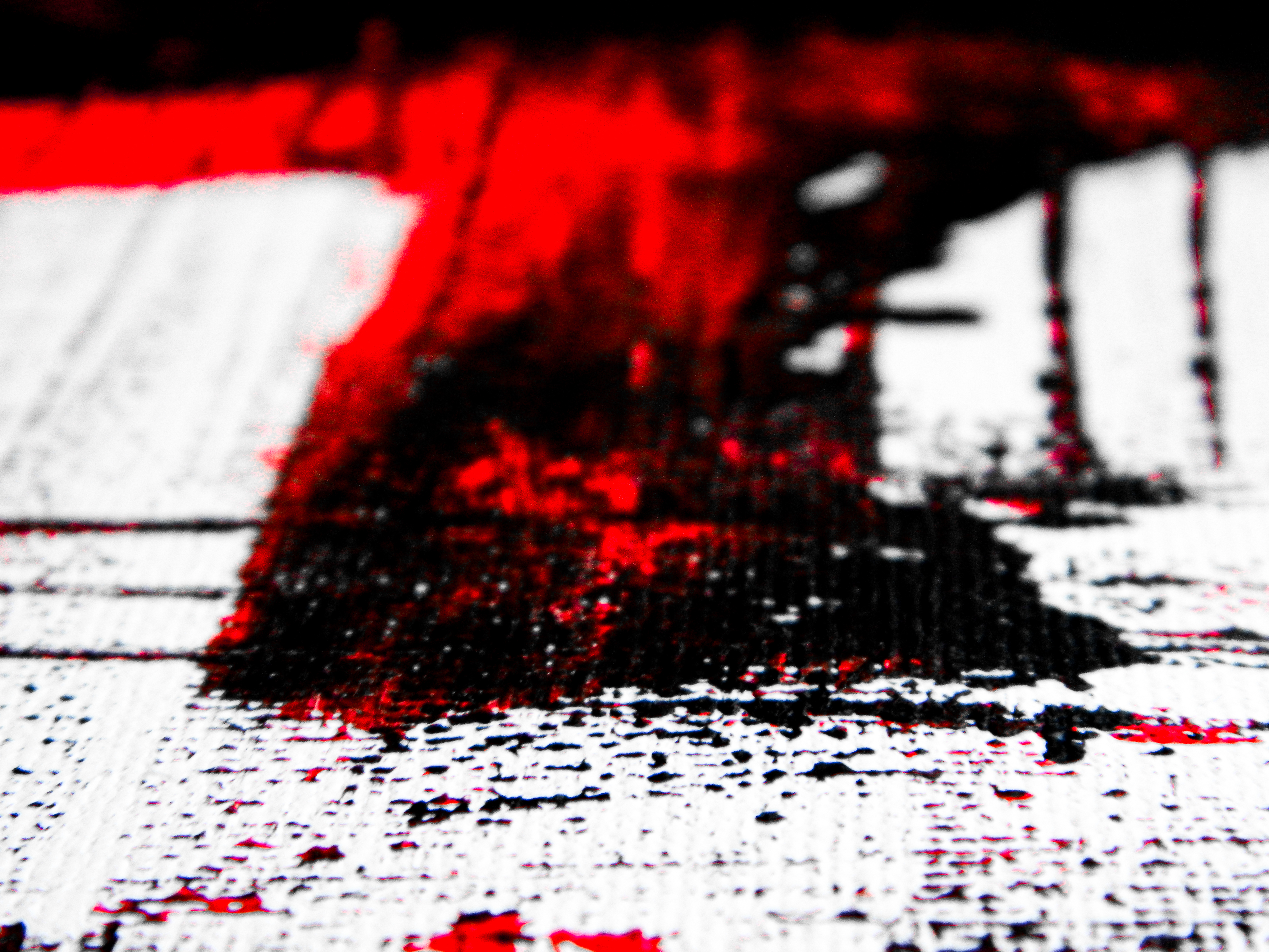
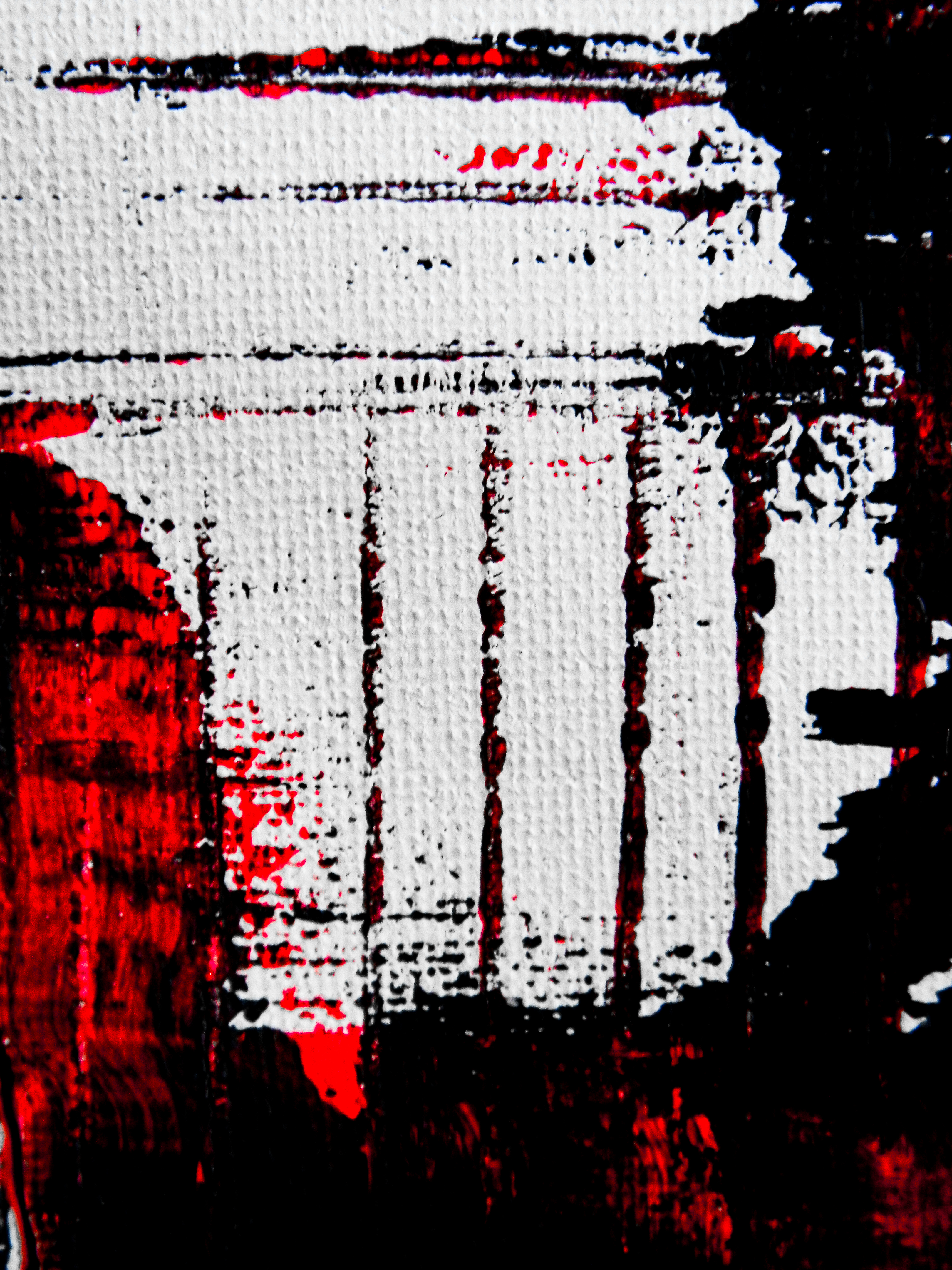
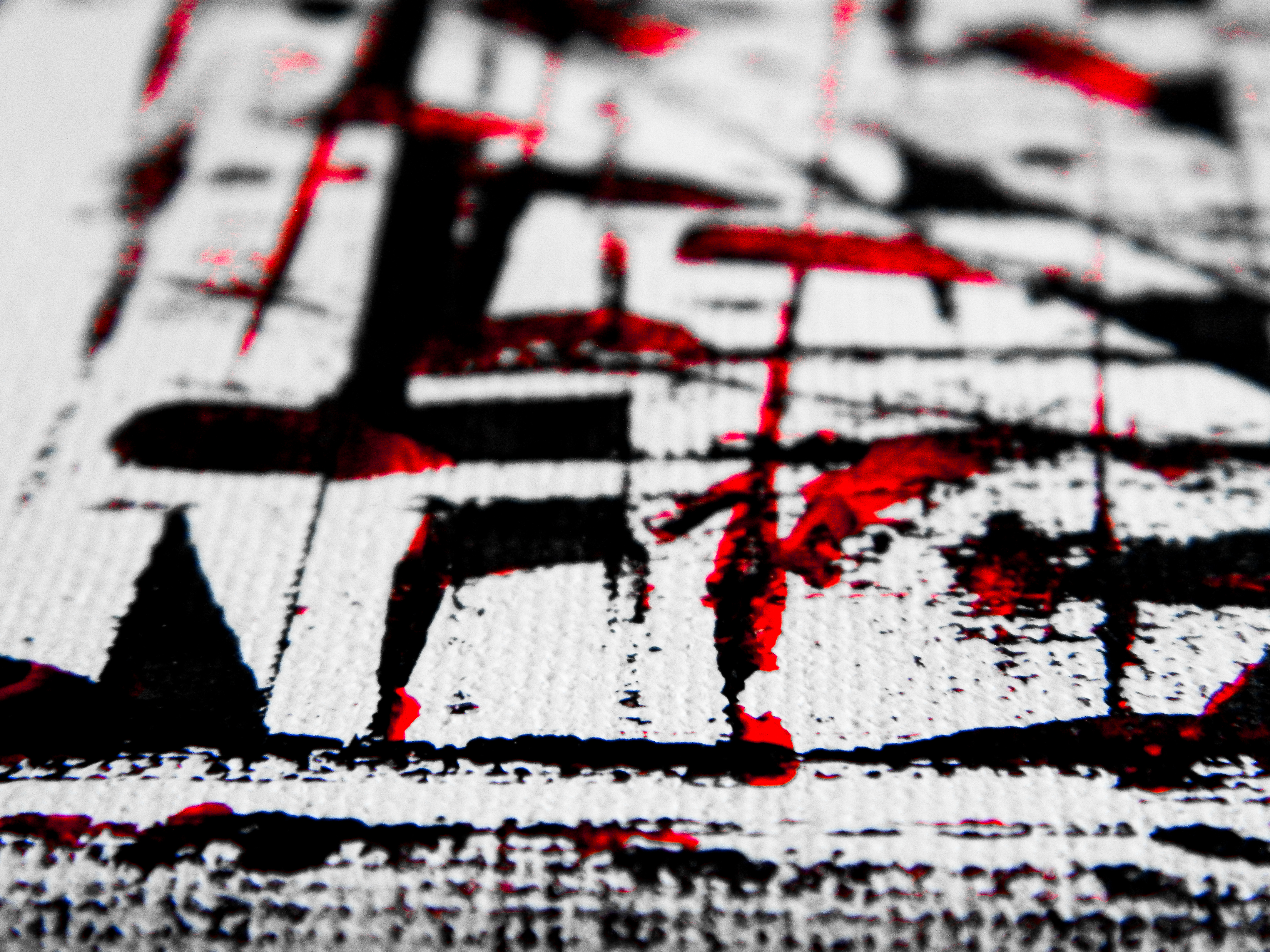
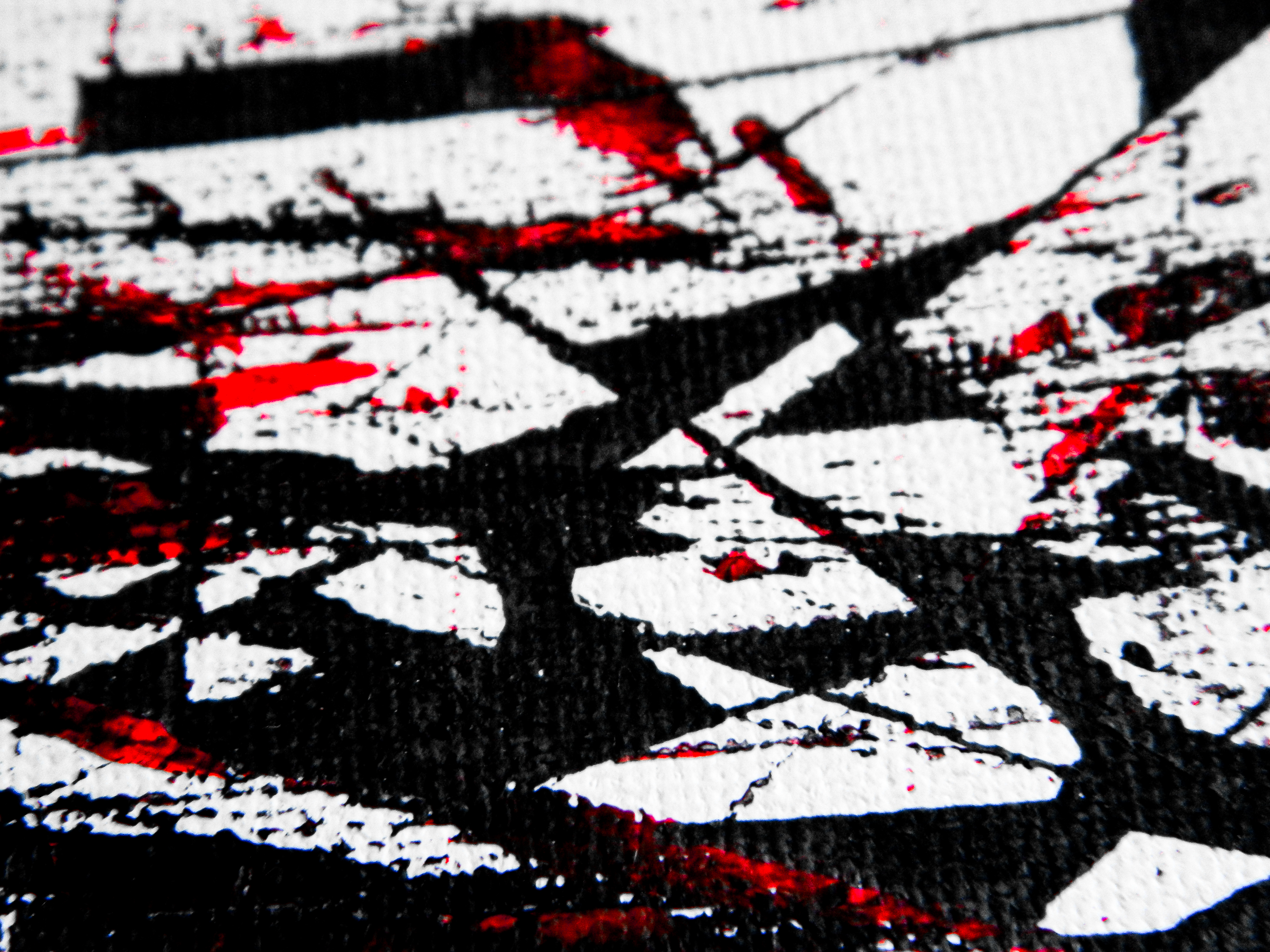
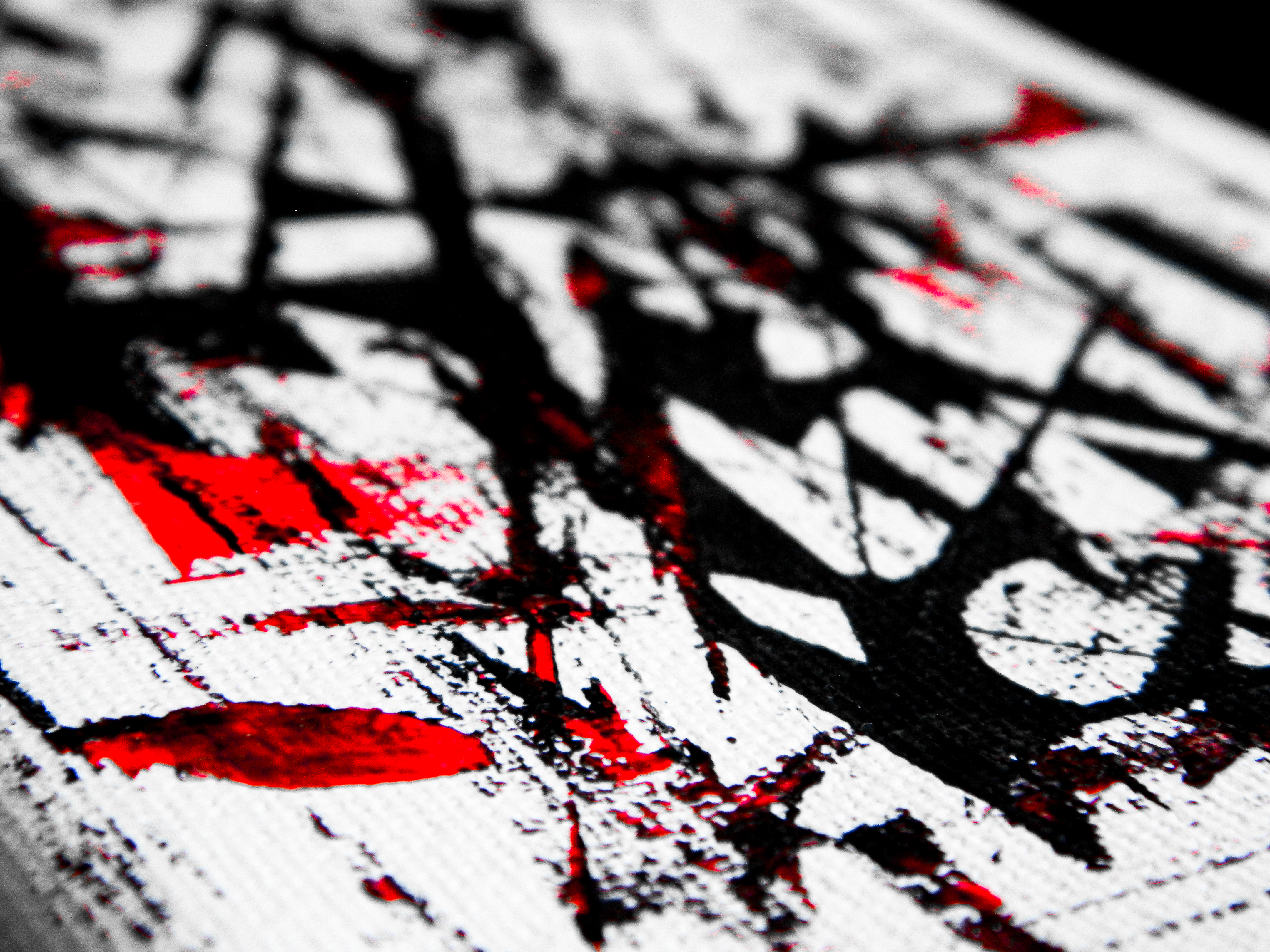
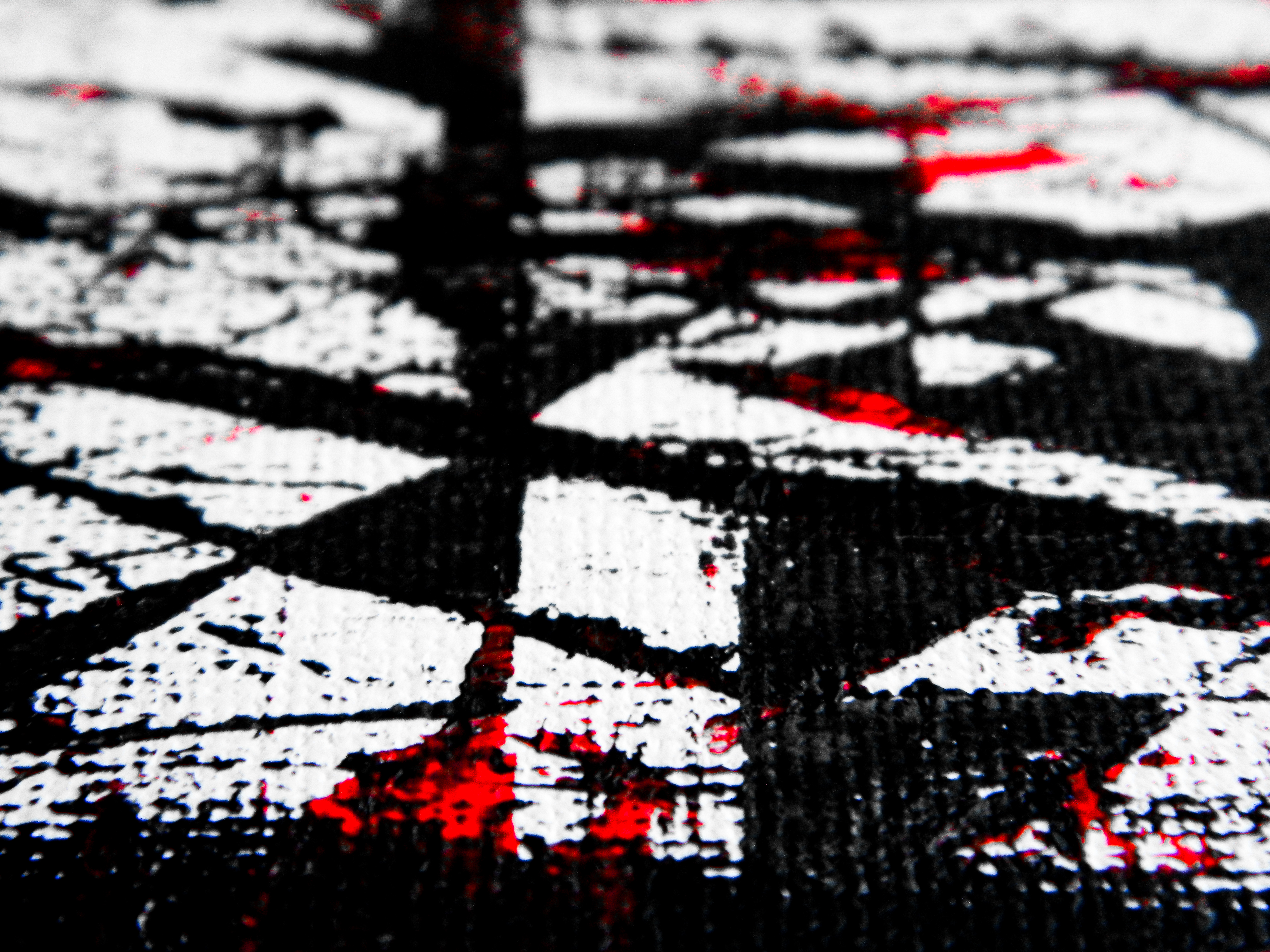
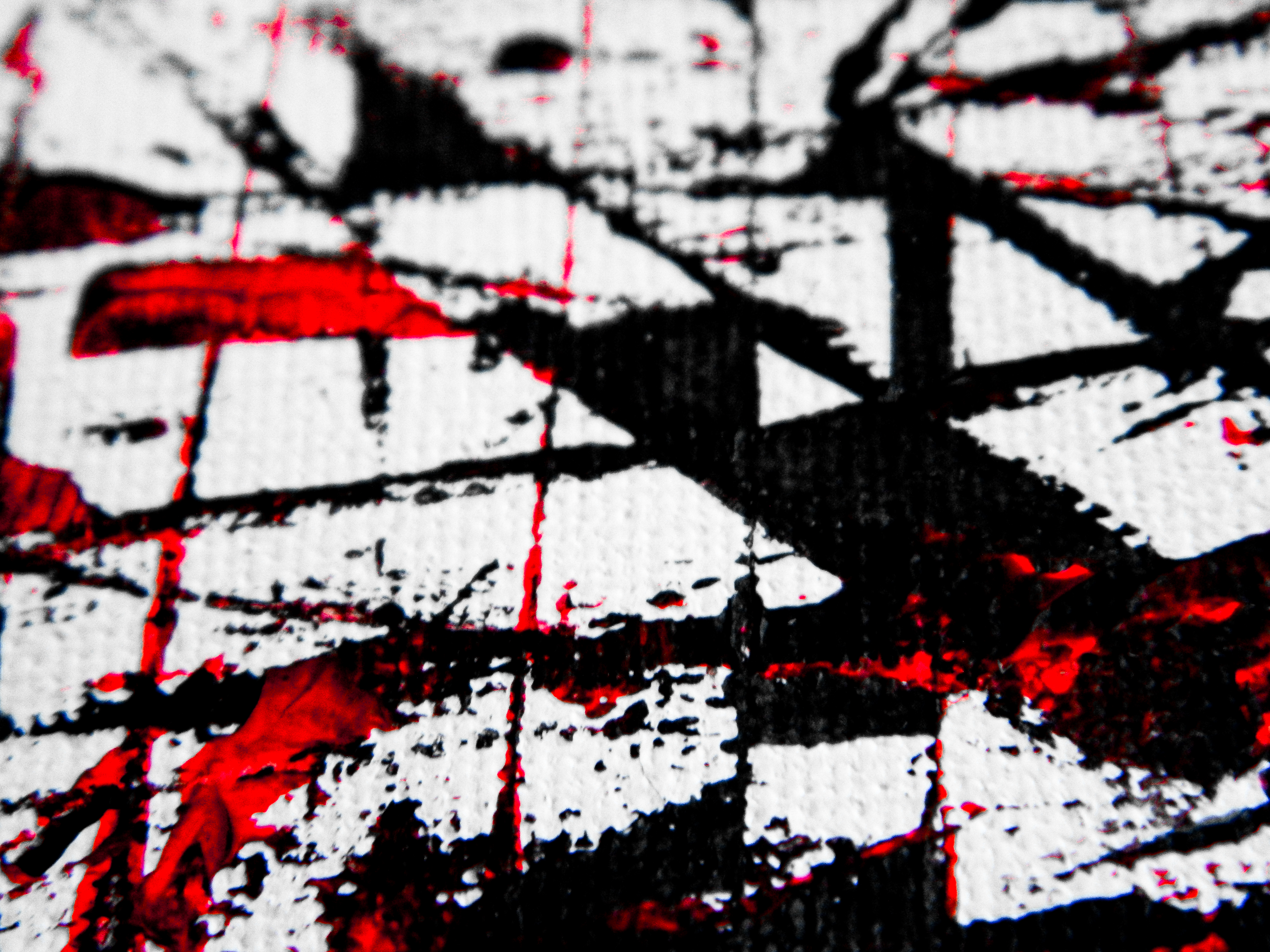
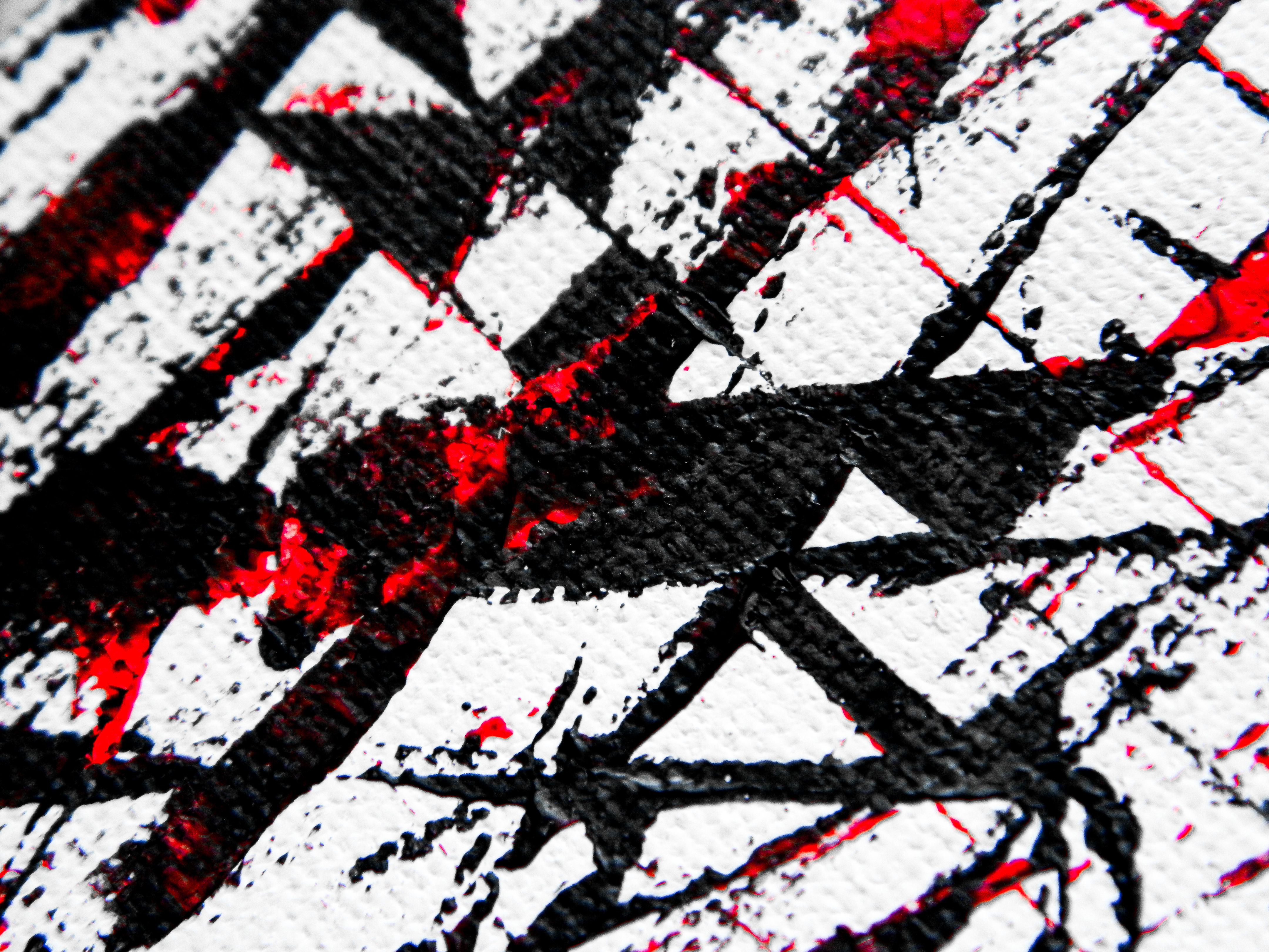
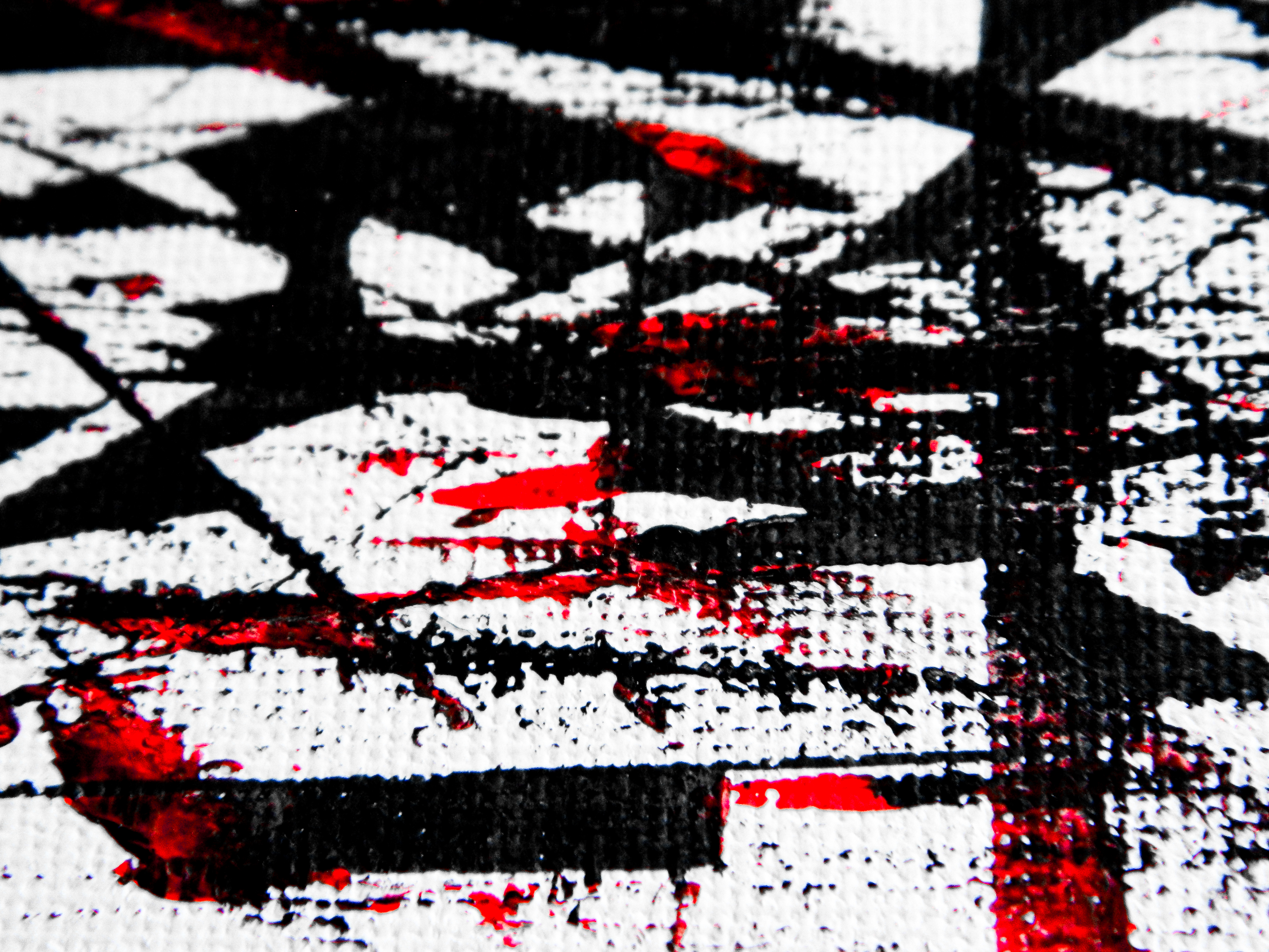
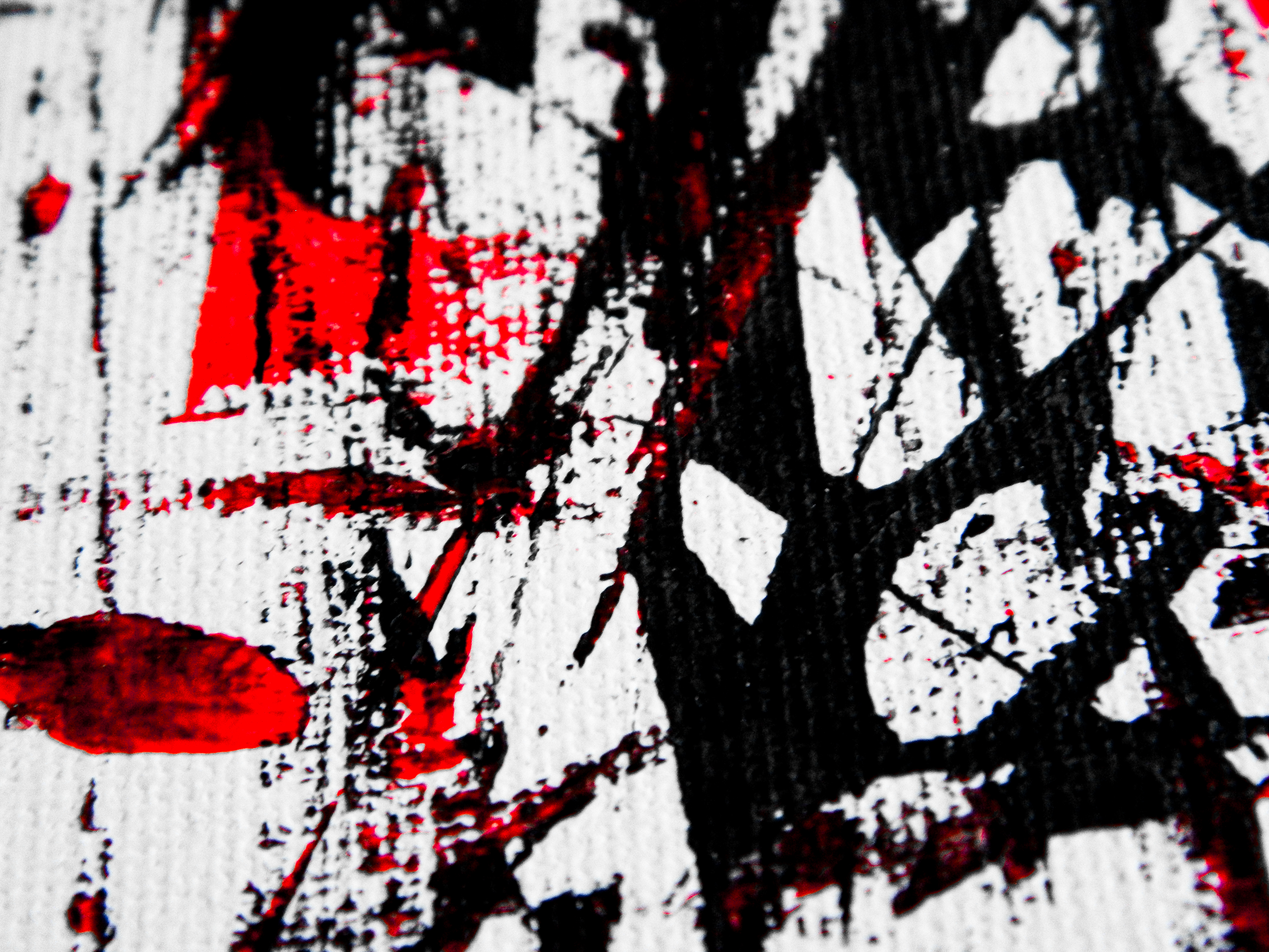
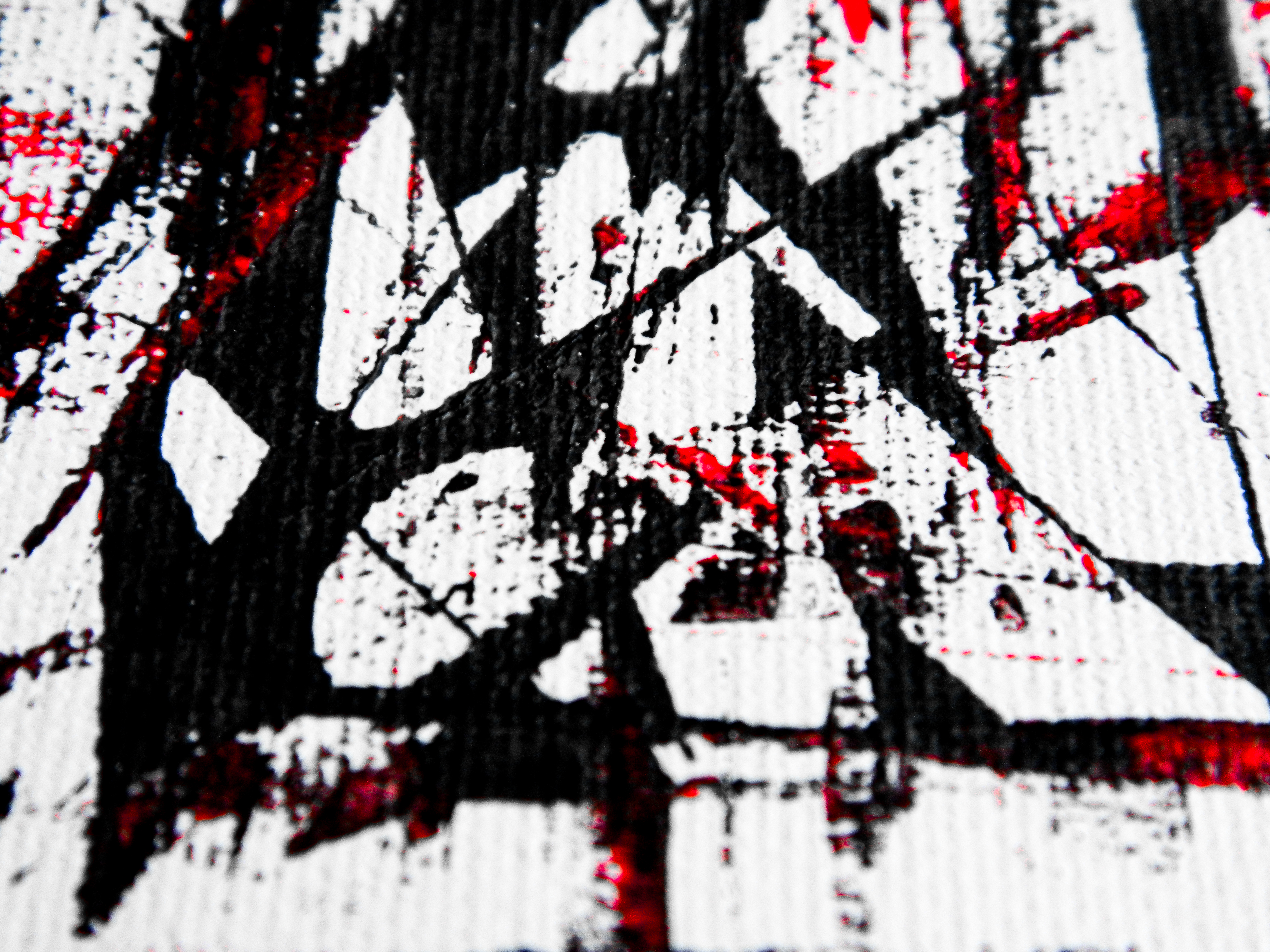
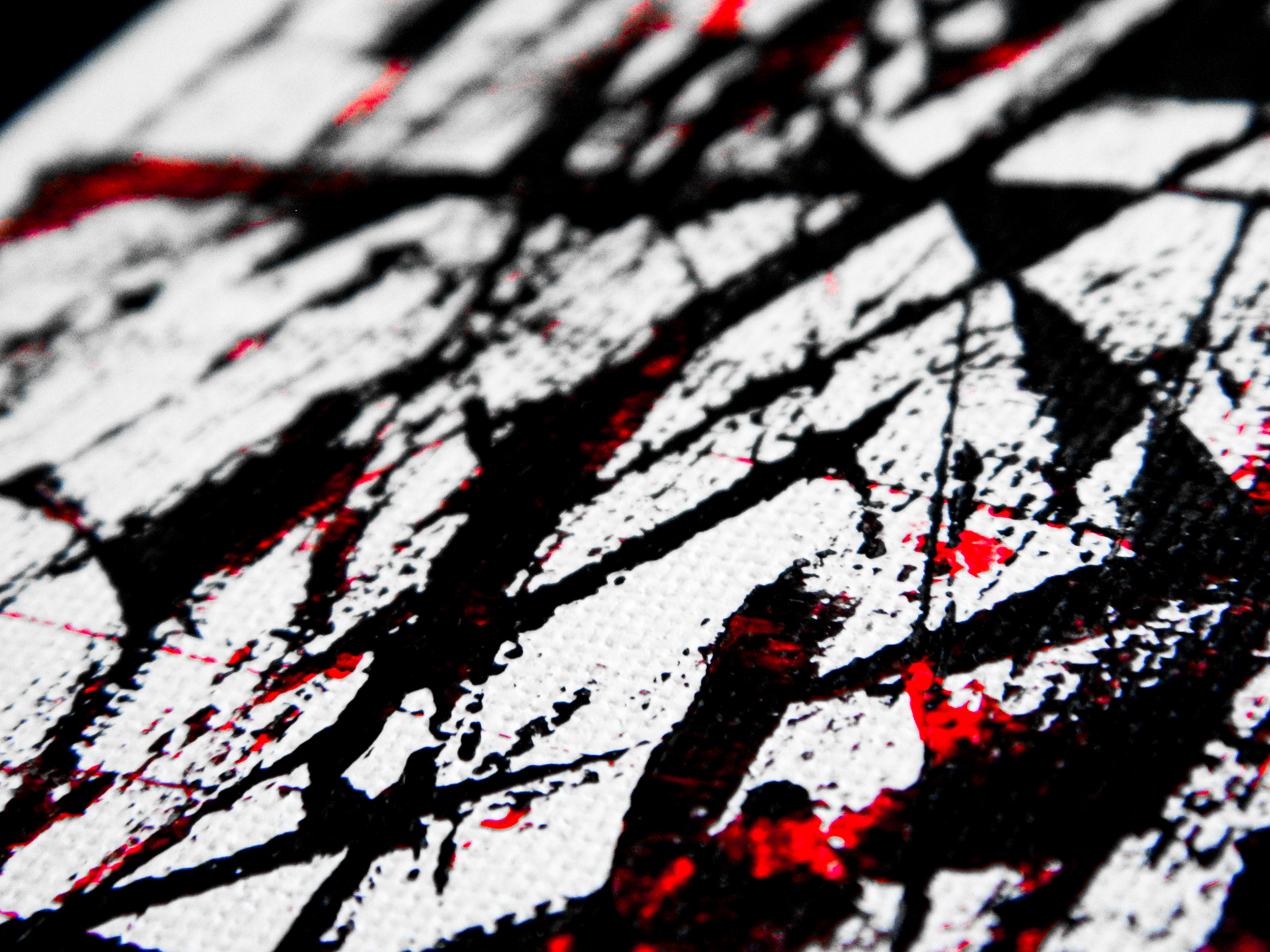
AN EXPLICATION OF BALANCE IN RED, WHITE, AND BLACK
9 x 12 in.
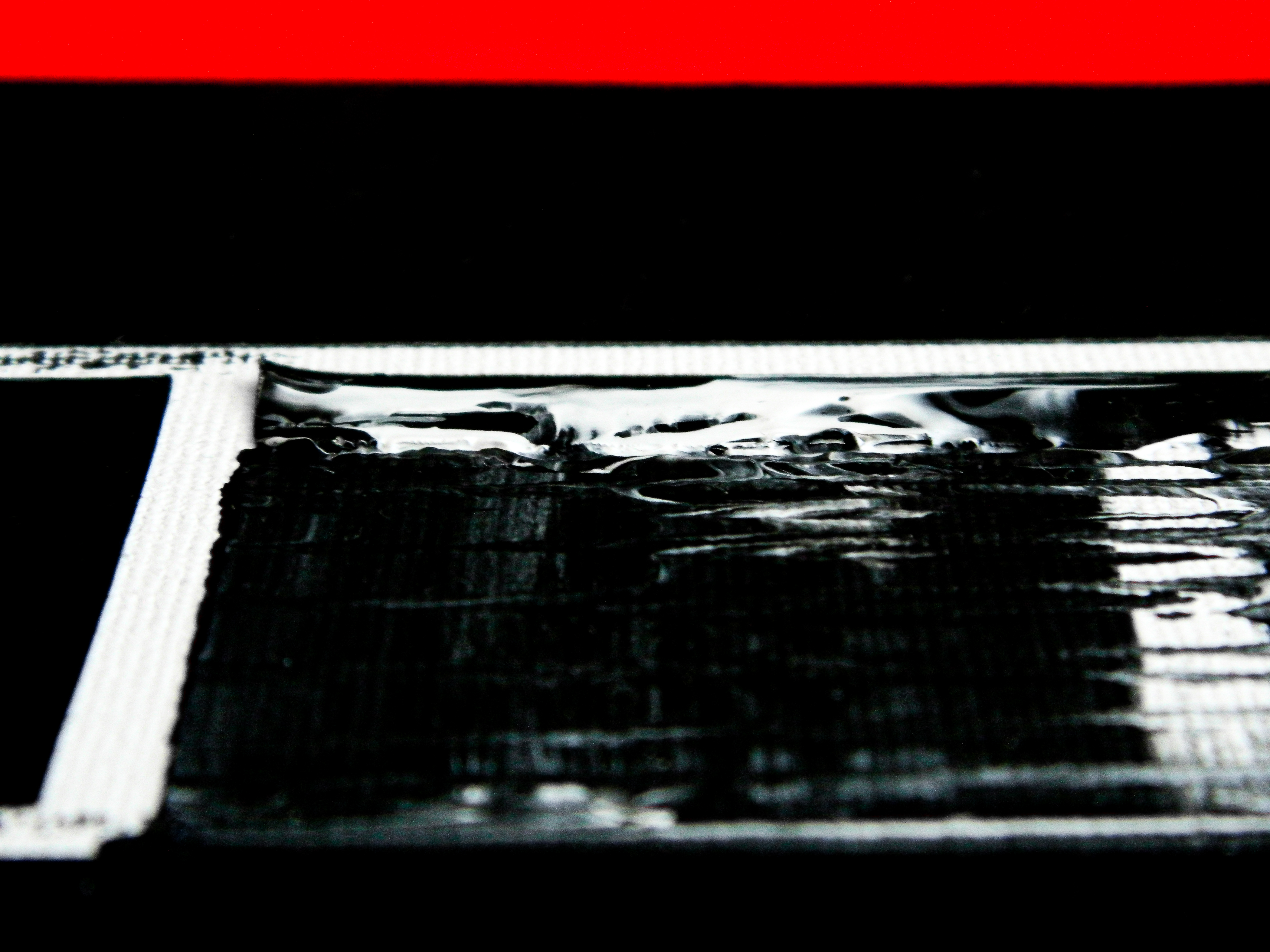
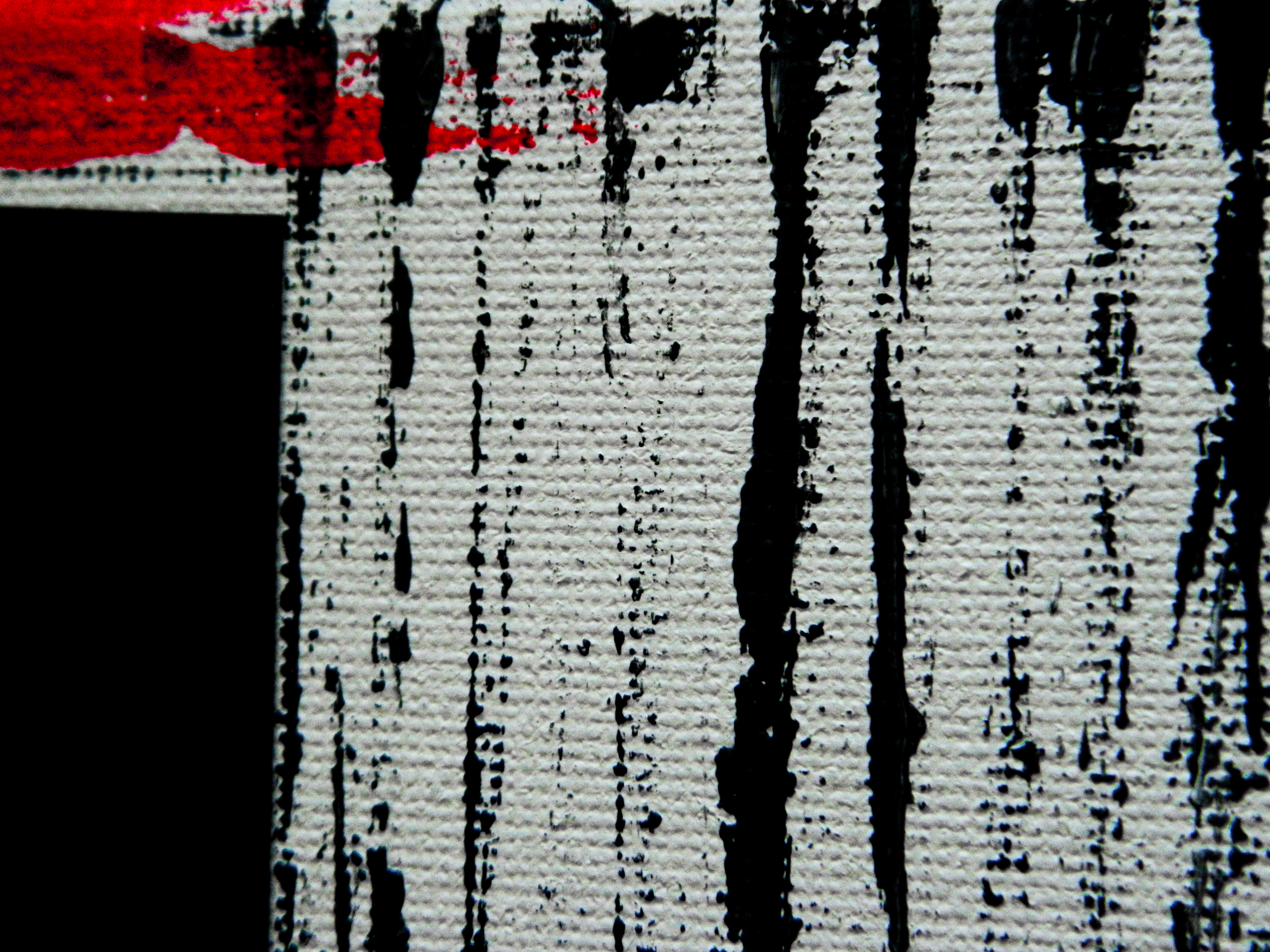
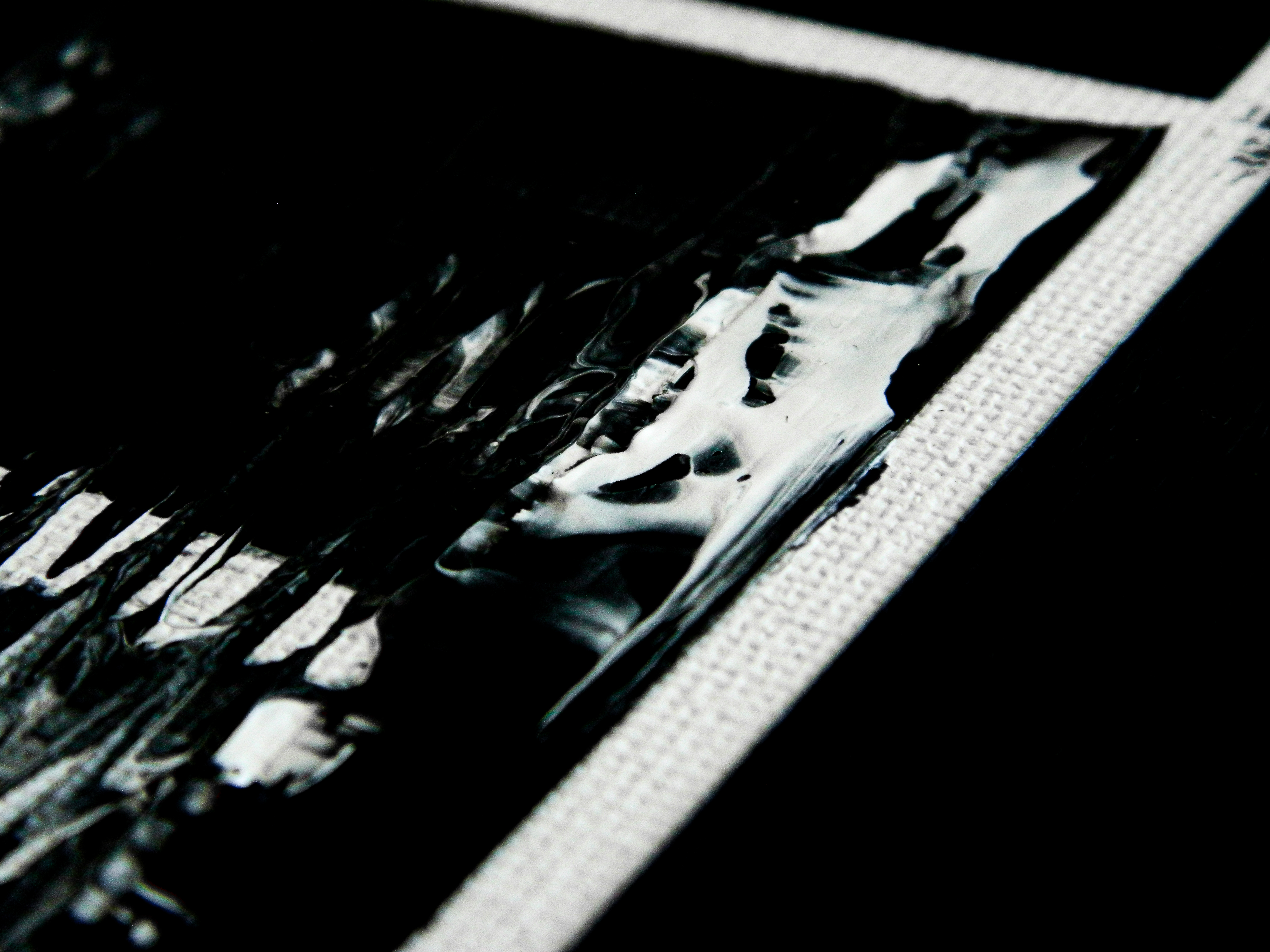
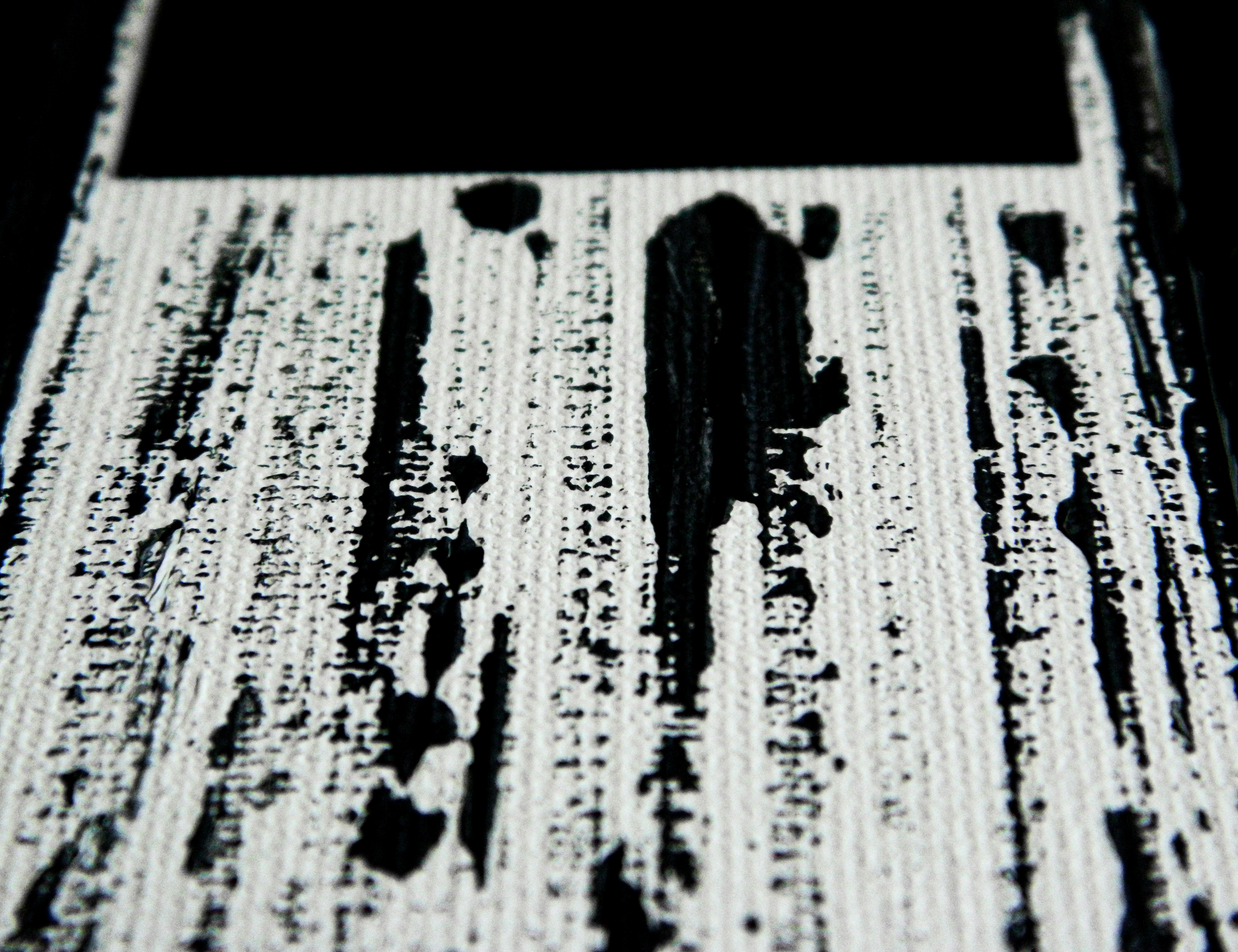
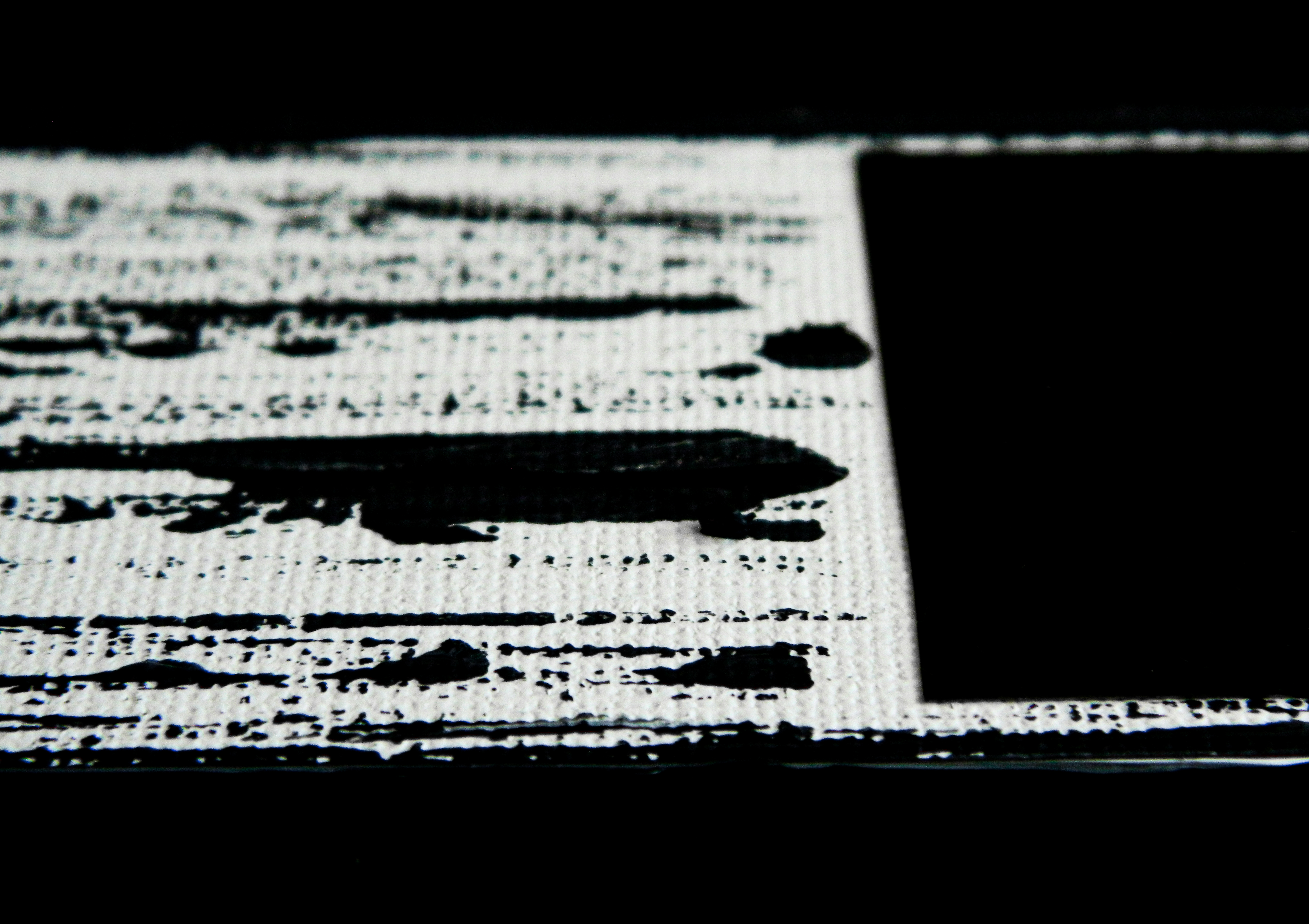
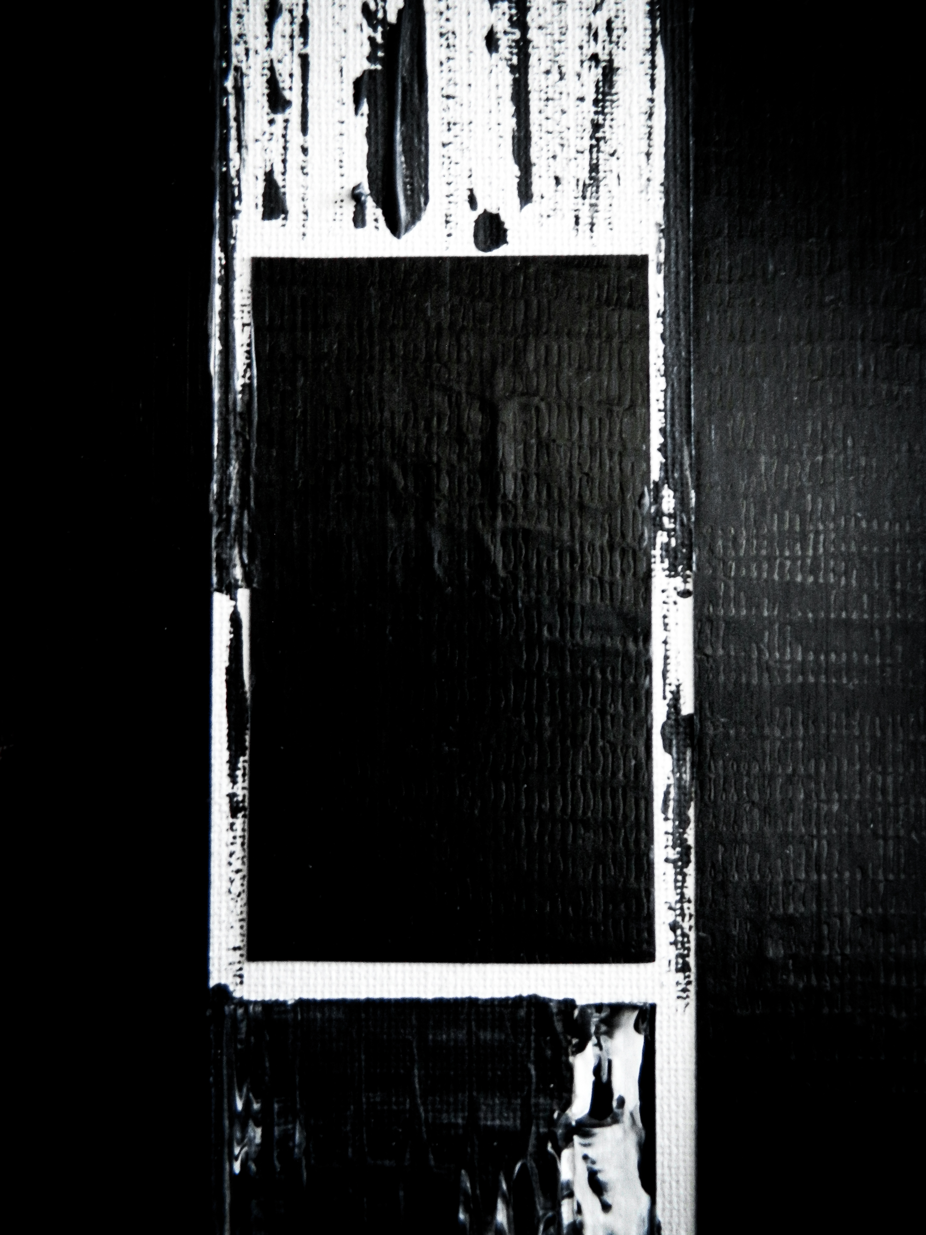
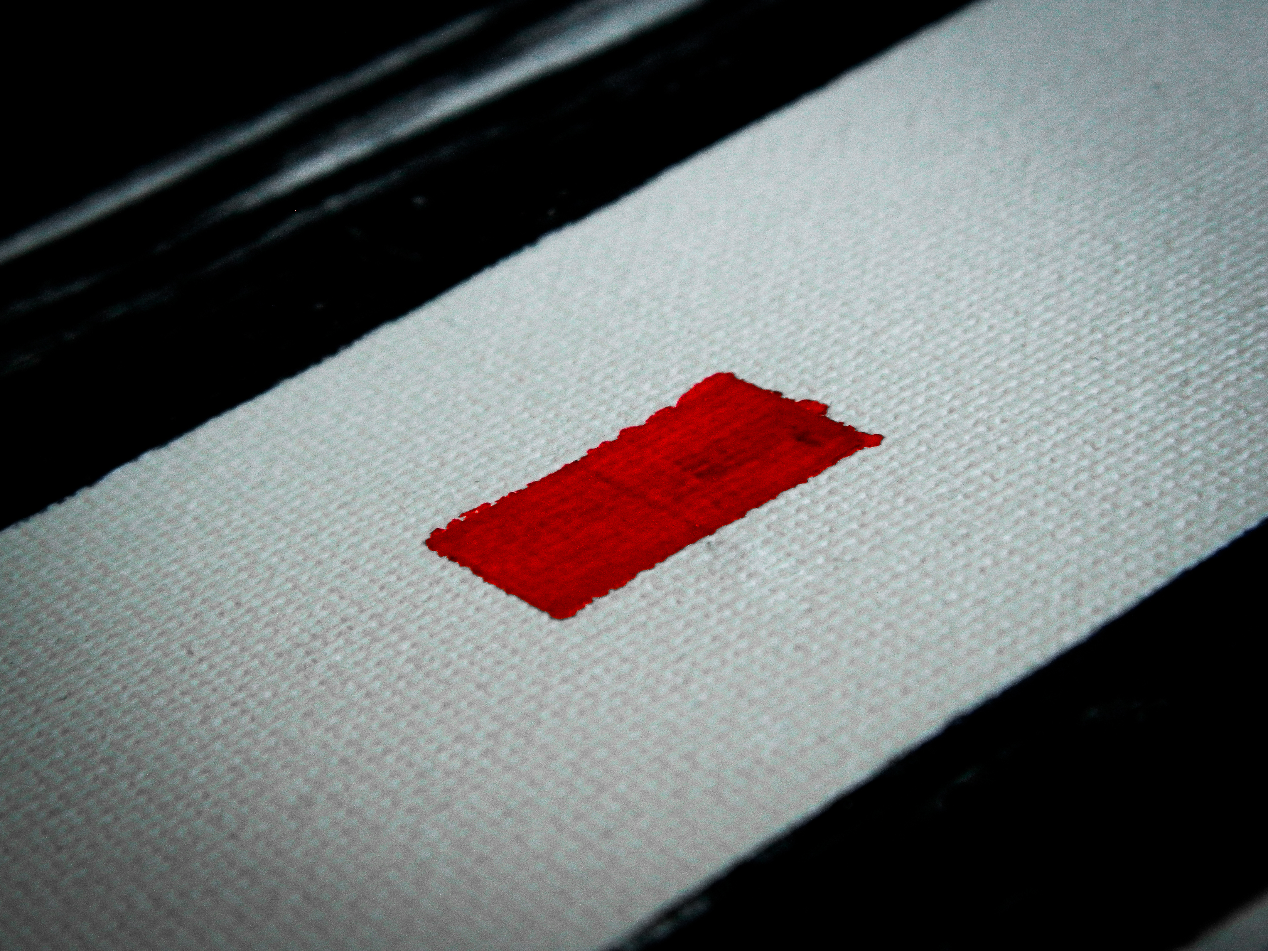
Acrylic, ink, and duct tape fixtures on canvas.
“When I was a kid, my Mom and Dad had these huge Rothko prints that just boggled my mind. I couldn’t believe how simple and profound they were, even then. I felt like I was standing in front of a wave in the ocean about to crash over me. Mark Rothko was probably the king of doing more with less and it’s a tough sell sometimes. The Color Field artists of the 50s and 60s always had my interest and respect. I wanted to shrink down the “field” to a box or square, almost like pixels on a screen, that allowed the geometry to seem like it was either correcting or deconstructing itself over the course of seven pieces, with three pieces on either side of the central singularity.”
– Quinten “Q” Avila

PART 1

PART 2


PART 3


PART 4

PART 5


PART 6

PART 7